Modern Grotesque Body

Established Typewriter + Headline
Creates crisp high-hierarchy contrast beneath Established Typewriter headlines across menus, websites and labels.
Inspect Headline specimenDisclosure: MakerFileHub may earn a commission from qualifying purchases via paid links on this page. How our links work.
Refined old-style book & correspondence typewriter serif
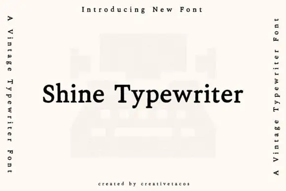
Established Typewriter blends classical old-style book serif proportions with subtle ribbon-press warmth for heirloom stationery and labels.
Paid link
Get this fontProject & layout blueprintsAt-a-glance maker compatibility
Fine grain and micro-texture excel in 300 DPI print, sublimation, and screen print rather than small vinyl weeding.
Visual anatomy & craft review
Established Typewriter blends old-style book proportions with a light ribbon-press warmth: the serifs are gracefully bracketed, the a has a teardrop counter, and the contrast is higher than a Courier-era face while remaining lower than a Didone. Because the skeleton is book-like, it sets long text comfortably at 10 pt, which is rare among typewriter revivals, and the slight ink variation keeps a page from looking mechanically even. It is a face for stationery, certificates and labels that need authority, and it pairs with itself for both headings and copy.
Antiquarian · Graceful · Literary
Two-font hierarchy recipes
Tested contrast partners — pairing Established Typewriter with grounded secondary typography.
Established Typewriter + Headline
Creates crisp high-hierarchy contrast beneath Established Typewriter headlines across menus, websites and labels.
Inspect Headline specimen
Established Typewriter + Autography
Adds a warm human signature touch for 1-to-3-word callouts without competing against structured serif capitals.
Inspect Autography specimenPractical applications
Concrete hierarchy, scale and production guidance tailored to Established Typewriter’s stroke geometry.
Old-style proportions carry a long archival text without fatigue, and the light ribbon warmth keeps a reproduction from looking like a facsimile. Bracketed serifs hold at 9 pt in a narrow measure.
Hierarchy & layout recipe
Chapter header 30 pt on a 12 mm baseline from the head, body 10/15 pt on a 95 mm measure, 20 mm margins. Genealogy table 8.5/11 pt with 4 mm rules. Certificate A4 landscape, name 22 mm, body 10/15 pt.
Pre-production check
Certificates are printed on textured parchment and a bracketed serif under 0.15 mm fills the bracket. Request a proof on the actual stock, and if the serifs close, raise the body to 11 pt rather than increasing the weight.
A bookish typewriter with lower contrast reads as an established house rather than a rustic producer, which suits an estate label. It holds at 6 pt for origin detail where a Didone would sparkle.
Hierarchy & layout recipe
Label 70 x 110 mm, name 16 mm, origin 6/8 pt, 5 mm top arc. Tin 75 x 100 mm, name 14 mm, brewing data 5.5 pt. Stamp 40 x 25 mm on a bookbinder's block, word 6 mm.
Pre-production check
Rubber stamps are pressed by hand and a 6 mm bracketed serif at high contrast prints unevenly. Cut the block with the flat-sided variant or set the stamp word at 9 mm, and press one test impression on the actual binding cloth.
A bookwarm typewriter reads as stationery kept for decades, which is what an heirloom suite is promising. It carries names and details in the same voice, so no second face is needed.
Hierarchy & layout recipe
Invitation 120 x 180 mm, names 26 pt, details 9/14 pt, 15 mm margins. Booklet A5, headings 14 pt, hymns 9/12 pt. Guest book A4 landscape, heading 20 pt, ruled lines 9 mm pitch.
Pre-production check
Invitation suites are printed on heavy cotton stock that draws ink, and a high-contrast serif thickens across the bracket. Print one proof on the final weight and check the 9 pt detail line before the full suite.
Technical & licence verification
Confirm included OTF/TTF/WOFF formats, full glyph tables and licence coverage on the live store page before batch production.
Closest visual alternatives
Matched across letterform anatomy, stroke behaviour and craft applications.
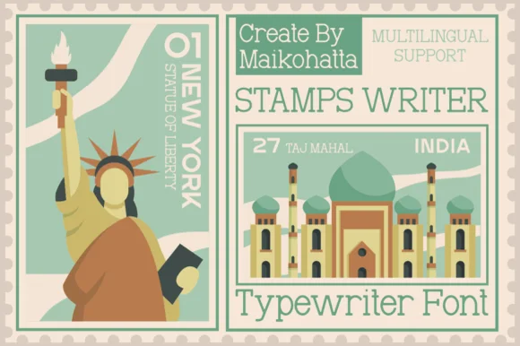
Clean travel-postage & passport monoline typewriter serif
Stamps Writer is a neat, slender monoline typewriter serif inspired by vintage postage cancels, travel passports, and archival index cards.
Ideas for this font
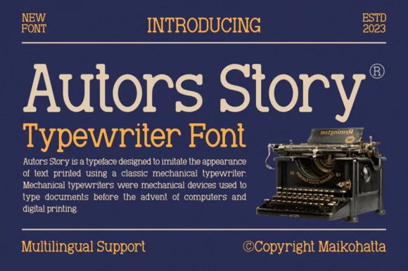
Clean classic mechanical display & text typewriter serif
Autors Story is a clean, high-legibility mechanical typewriter serif with generous x-height, curled ball terminals, and multilingual coverage.
Ideas for this font
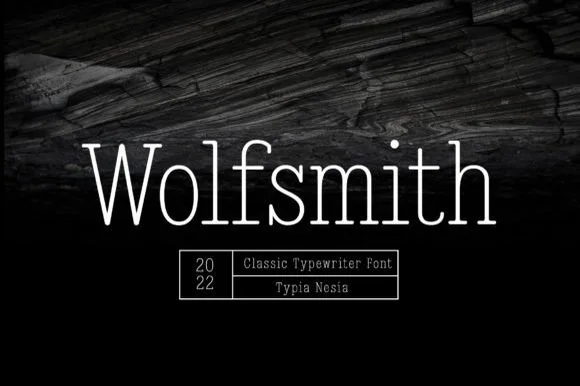
Light typewriter serif with wide spacing
Wolfsmith is a classic typewriter serif in white on dark wood: light even strokes, small slab serifs, a wide and open set, shown as one large line with a ruled box of small capitals beneath it.
Ideas for this font
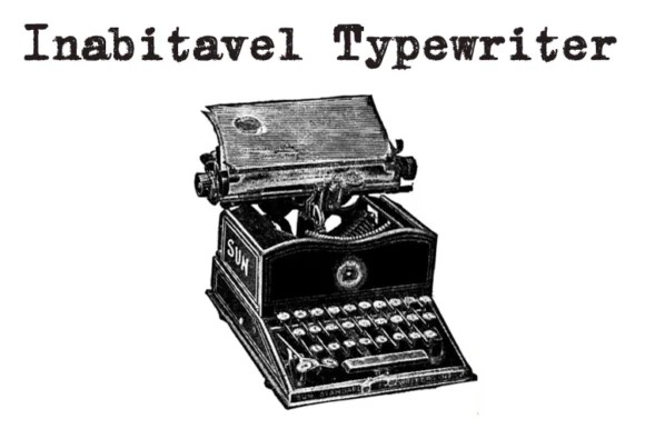
Authentic carbon-ribbon 1910 mechanical typewriter serif
Inabitavek Typewriter ('Inabitavel Typewriter') is an authentic antique mechanical-ribbon font capturing true 1910s cloth-ink strike bleed.
Ideas for this font
Same independent foundry
Allow optional Google Analytics to measure visits and catalogue actions. Your search words and notes are not included. Privacy & storage