Modern Grotesque Body

School Vintage + Memoir Slang
Creates crisp high-hierarchy contrast beneath School Vintage headlines across menus, websites and labels.
Inspect Memoir Slang specimenDisclosure: MakerFileHub may earn a commission from qualifying purchases via paid links on this page. How our links work.
Old typewriter serif with a numeral row
School Vintage is an old typewriter serif in dark ink on sage green: slab serifs with slightly rounded feet, a moderate even stroke, wide spacing, shown with a ruled caption and a full numeral row.
Paid link
Get this fontProject & layout blueprintsAt-a-glance maker compatibility
Fine grain and micro-texture excel in 300 DPI print, sublimation, and screen print rather than small vinyl weeding.
Visual anatomy & craft review
Two words are stacked at the top of the page and the face is an old typewriter serif: the serifs are small slabs with rounded feet, the stroke is even and neutral, the S closes with a soft shoulder, the a and the e keep open counters, and the letters are spaced generously so the words read as typed rather than set. The sample does the sensible thing and shows the numeral row as well, between two hyphens, which is what a buyer actually needs to check for a period face: that the figures are the same weight and width as the letters. A caption in the same face sits between two rules at the foot, and the palette is a single dark ink on sage green. School Vintage is a serif for school material, editorial pages, packaging and any design that wants a quiet documentary voice, and it works at text sizes as well as in headings.
Typewriter, quiet, period
Two-font hierarchy recipes
Tested contrast partners — pairing School Vintage with grounded secondary typography.
School Vintage + Memoir Slang
Creates crisp high-hierarchy contrast beneath School Vintage headlines across menus, websites and labels.
Inspect Memoir Slang specimen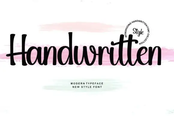
School Vintage + Handwritten
Adds a warm human signature touch for 1-to-3-word callouts without competing against structured serif capitals.
Inspect Handwritten specimenPractical applications
Concrete hierarchy, scale and production guidance tailored to School Vintage’s stroke geometry.
An old typewriter face gives a worksheet the look of a duplicated sheet, and the even weight keeps a heading readable at photocopy quality.
Hierarchy & layout recipe
Print an A4 sheet at 210 by 297 mm: set the heading at 26 pt on one line, keep 14 mm of clear ground beneath before the instructions at 11 pt, and hold 20 mm of margin on all four sides.
Pre-production check
Thin serifs can break up on a school copier; run one copy on the machine that will be used before printing a class set.
A quiet typewriter face sets a quotation apart from the body without raising its voice, which suits a piece built on documents.
Hierarchy & layout recipe
Print a 210 by 280 mm page: set the quote at 14 pt over four lines on a 90 mm measure, keep 12 mm of clear ground above and below, and hold 24 mm of margin on the outer sides.
Pre-production check
A neutral face at fourteen points can look like body text; separate it with rules or space and proof the page.
A school typewriter face suits a stationery product, and the numeral row means prices and quantities will sit in the same voice.
Hierarchy & layout recipe
Print a 60 by 40 mm label: set the product at 9 pt over two lines, keep 3.5 mm of clear ground on all four sides, and hold the label 8 mm from the top edge of the pack.
Pre-production check
A small label with a light face can look grey; print one on the real board and check the weight before the order.
Technical & licence verification
Confirm included OTF/TTF/WOFF formats, full glyph tables and licence coverage on the live store page before batch production.
Closest visual alternatives
Matched across letterform anatomy, stroke behaviour and craft applications.
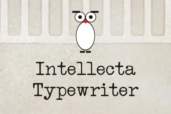
Evenly spaced typewriter-like letters with rounded slab feet
Intellecta Typewriter shows black title-case words in two lines on a pale wall-like background, where the letters carry relatively even stroke weight, broad horizontal feet and a y that drops below the second word with a short bent ending while the r finishes in a small rounded shoulder.
Ideas for this font
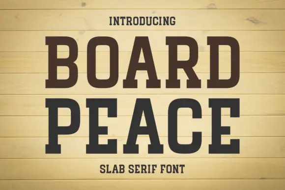
Condensed solid slabs with softly rounded rectangular bowls
Board Peace shows dark brown capitals over pale horizontal boards, where tall narrow stems end in broad rectangular feet, the B and O keep rounded rectangular counters and the R kicks outward into a fine leg.
Ideas for this font
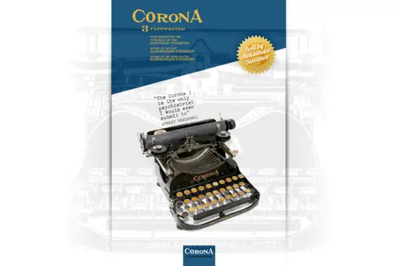
Small typewriter-style specimen presented beside a photographed machine
Corona 3 Typewriter is presented as a narrow poster dominated by a photographed machine: a small black typed sample rises above it, a yellow heading sits across the top and several tiny captions frame the illustration.
Ideas for this font
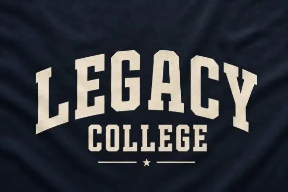
Narrow solid college capitals
Legacy College is a narrow solid college block in cream on navy heather fabric: the word is arched over a straight second line, with a rule and a star closing the composition.
Ideas for this font
Same independent foundry
Allow optional Google Analytics to measure visits and catalogue actions. Your search words and notes are not included. Privacy & storage