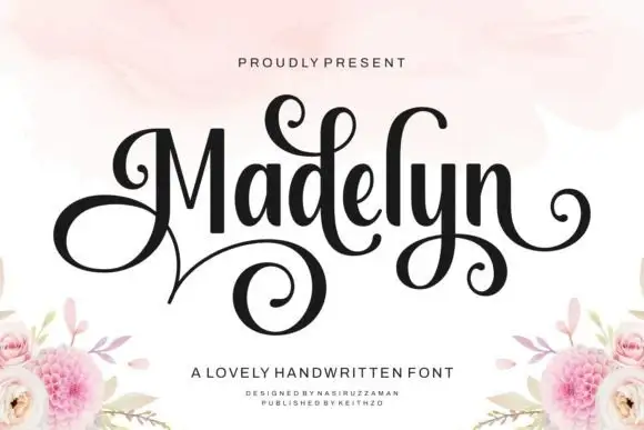
Editorial Serif Anchor

Honey and Lemon + Rosemode
Anchors Honey and Lemon's fluid strokes with crisp Roman proportions on wedding suites, headers and packaging.
Inspect Rosemode specimenDisclosure: MakerFileHub may earn a commission from qualifying purchases via paid links on this page. How our links work.
Rounded monoline script stacked with a small connector word and curly entry
Honey and Lemon is a rounded monoline script whose two main words stack with a small connector between them, the entry curling up from the left and the exit finishing flat on the right.
Paid link
Get this fontProject & layout blueprintsAt-a-glance maker compatibility
Weld or Unite overlapping script joins into one continuous vector path before sending to the blade.
Visual anatomy & craft review
The first word begins with a curled entry that rises from below the x-height, and the letters after it keep an even roundness: the h and the y close wide arches, the o and the n stay round, and the y drops a curved tail before the small connector word sits between the two lines in a lighter setting. The second word opens with an l that rises into a plain loop and ends on a flat exit. Weight is a true monoline with rounded ends, so the phrase holds at 14 pt on a label and reads as one drawn line at 80 mm on a banner. The stacked arrangement with the connector is how the face is meant to be used, and the tight interlock is what makes it work. The cream and yellow stripes, the navy ink, the white outline and the small band are presentation; the script is the words.
Rounded · Monoline · Stacked
Two-font hierarchy recipes
Tested contrast partners — pairing Honey and Lemon with grounded secondary typography.
Honey and Lemon + Rosemode
Anchors Honey and Lemon's fluid strokes with crisp Roman proportions on wedding suites, headers and packaging.
Inspect Rosemode specimen
Honey and Lemon + Clyne Sans
Keeps small-scale dates, URLs, nutrition facts and care instructions crisp and legible below script titles.
Inspect Clyne Sans specimenPractical applications
Concrete hierarchy, scale and production guidance tailored to Honey and Lemon’s stroke geometry.
The stacked script with a connector fits a narrow bottle label, and the monoline weight holds at 12 pt where a contrasted script would break.
Hierarchy & layout recipe
Set the two main words at 12 pt on a 50 by 90 mm bottle label, set the connector word at 7 pt between them, and leave 5 mm at the sides so the curls are not squeezed.
Pre-production check
A connector word under 7 pt closes up on a curved label; check a printed label on the bottle and drop the connector rather than enlarging the whole line.
The stacked lockup fills a banner in two tight lines, and the monoline stroke reads at a distance without the weight needed for a display face.
Hierarchy & layout recipe
Set the first word at 75 mm on a 1.2 m paper banner, set the connector at 35 mm, set the second word at 75 mm, and leave 30 mm at each end of the sheet.
Pre-production check
A light monoline on fabric can read thinner than expected; check a proof at final size and keep the stroke at least 3 mm at the final width.
The compact stack fits a round sticker, and the rounded monoline stays legible at 11 pt where a taller script would crowd the die.
Hierarchy & layout recipe
Set the main words at 11 pt on a 50 mm round sticker, set the connector at 6 pt between them, and leave 5 mm inside the die so the curled entry is not clipped.
Pre-production check
A die cut through a curled entry leaves a thin sliver; check the artwork against the cut and rotate the stack if the curl meets the edge.
Technical & licence verification
Confirm included OTF/TTF/WOFF formats, full glyph tables and licence coverage on the live store page before batch production.
Closest visual alternatives
Matched across letterform anatomy, stroke behaviour and craft applications.
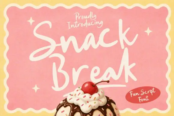
Loose upright snack-bar script
Snack Break is a loose upright script in cream on pink: soft rounded strokes, short ascenders, a large x-height and a baseline that wanders, presented inside a scalloped frame above an ice-cream sundae.
Ideas for this font
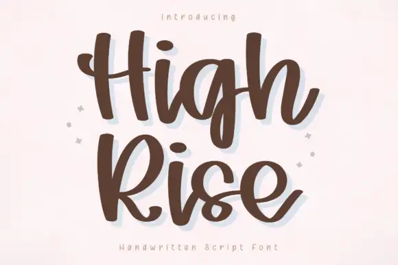
Thick relaxed script with broad strokes and deep descending loops
High Rise is a thick relaxed script with broad strokes, a loose fit and descenders that drop into deep open loops, so a two-word phrase fills a square panel comfortably.
Ideas for this font

Heavy looped script with a heart dot
Wishful Women is a heavy looped script in pink with a pale glow on a gingham ground: fat rounded strokes, tall loops on the W, a heart in place of the dot on the i and a soft outline that lifts the words off the pattern.
Ideas for this font
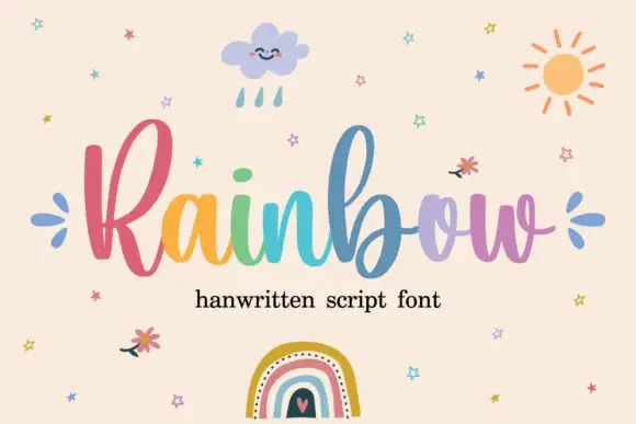
Rounded connected script with tall loops
Rainbow is a rounded connected script in which a narrow looped capital opens the word, the lowercase joins broadly and the b and l rise well above the body, so a single line reads as cheerful handwriting with a lift at the start.
Ideas for this font
Same independent foundry
Allow optional Google Analytics to measure visits and catalogue actions. Your search words and notes are not included. Privacy & storage