Editorial Serif Anchor

The Skinny + Lumera Editorial
Anchors The Skinny's fluid strokes with crisp Roman proportions on wedding suites, headers and packaging.
Inspect Lumera Editorial specimenDisclosure: MakerFileHub may earn a commission from qualifying purchases via paid links on this page. How our links work.
Very tall thin separate print
The Skinny is a very tall thin monoline print in dark grey: separate letterforms with a narrow width, a large height-to-width ratio, and rounded terminals that keep a severe face from feeling cold.
Paid link
Get this fontProject & layout blueprintsAt-a-glance maker compatibility
Weld or Unite overlapping script joins into one continuous vector path before sending to the blade.
Visual anatomy & craft review
Both words are set on one line and the face is a print rather than a script: the letters stand apart, the T is a thin stem with a wide bar, the h and the k rise as far as the capitals, the n and the e are narrow and the y drops a long straight tail. The stroke is monoline and light, the counters are tall slots rather than round bowls, and the terminals are rounded, which softens a face that would otherwise read as a technical drawing. The specimen sits inside a thin frame over a pale botanical illustration, and a tracked caption at the foot names the style as tall and thin. The Skinny is a display print for posters, packaging and modern marks: it is at its best set large and in a short line, it pairs well with a heavier face beneath, and it should not be used for anything that has to be read at a small size.
A tall thin monoline print with a modern edge
Two-font hierarchy recipes
Tested contrast partners — pairing The Skinny with grounded secondary typography.
The Skinny + Lumera Editorial
Anchors The Skinny's fluid strokes with crisp Roman proportions on wedding suites, headers and packaging.
Inspect Lumera Editorial specimen
The Skinny + Cenura
Keeps small-scale dates, URLs, nutrition facts and care instructions crisp and legible below script titles.
Inspect Cenura specimenPractical applications
Concrete hierarchy, scale and production guidance tailored to The Skinny’s stroke geometry.
A tall thin print gives a cover the airy modern look an annual wants, and the height means a long title still fits a narrow format.
Hierarchy & layout recipe
Print a 210 by 280 mm cover: set the title at 76 pt over two lines, keep 26 mm of clear ground beneath before the issue line at 10 pt, and hold 22 mm of margin on all sides.
Pre-production check
Thin monoline strokes can break on uncoated cover stock; print one cover on the intended paper and check the joins before the run.
A tall thin face on a bottle reads as a modern formula, and the narrow width fits a long product name on a short curved label.
Hierarchy & layout recipe
Print a 45 by 90 mm label: set the product name at 15 pt on two lines, keep 6 mm of clear ground beneath before the volume at 5 pt, and hold 4 mm of margin on all sides.
Pre-production check
At fifteen points a tall print has almost no stroke width; print one label on the real stock and check the thin stems before the order.
A tall thin face carries a date and a place without decoration, which is what a gallery poster needs when the artwork is doing the shouting.
Hierarchy & layout recipe
Print a 700 by 1000 mm poster: set the exhibition title at 150 pt over three lines, keep 40 mm of clear ground beneath before the private view line at 28 pt, and hold 34 mm of margin on all sides.
Pre-production check
A hairline stroke at poster size can look weak from a distance; print one proof at the final size and check the weight from across the room before the run.
Technical & licence verification
Confirm included OTF/TTF/WOFF formats, full glyph tables and licence coverage on the live store page before batch production.
Closest visual alternatives
Matched across letterform anatomy, stroke behaviour and craft applications.
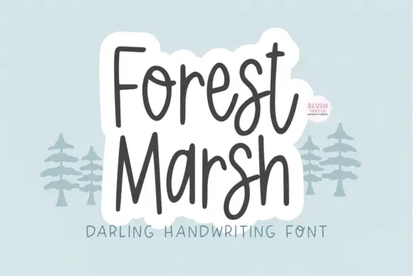
Loose upright handwriting with tall narrow frames and uneven baselines
Forest Marsh is loose upright handwriting in which the frames stay tall and narrow, the baselines drift a little and the strokes keep an even medium weight throughout.
Ideas for this font
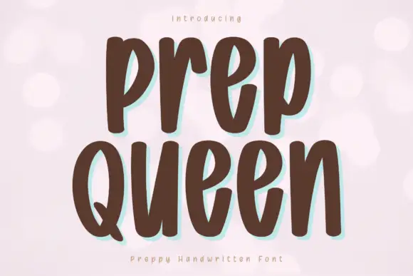
Tall heavy separate letters
Prep Queen is a tall heavy hand-drawn print in chocolate brown on pale pink: narrow letters with blunt ends, a light bounce, and a mint shadow behind each stroke.
Ideas for this font
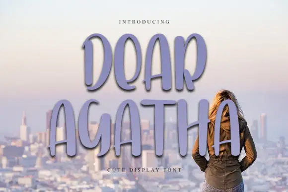
Tall rounded display capitals
Dear Agatha shows tall unjoined capitals with narrow oval bowls and softly rounded terminals, where the A, R and H stretch into long vertical proportions and the purple shadow sits behind the letters as part of the cover.
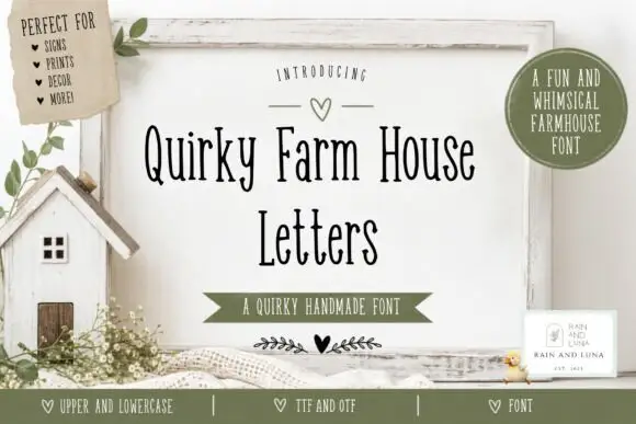
Tall narrow irregular serif letters
Quirky Farm House Letters is a tall narrow hand-drawn face with small irregular serifs, set on a painted signboard with a tiny house, sprigs and a heart, in a farmhouse palette of olive and cream.
Ideas for this font
Same independent foundry
Allow optional Google Analytics to measure visits and catalogue actions. Your search words and notes are not included. Privacy & storage