Editorial Serif Anchor

Quirky Farm House Letters + Stanza
Anchors Quirky Farm House Letters's fluid strokes with crisp Roman proportions on wedding suites, headers and packaging.
Inspect Stanza specimenDisclosure: MakerFileHub may earn a commission from qualifying purchases via paid links on this page. How our links work.
Tall narrow irregular serif letters
Quirky Farm House Letters is a tall narrow hand-drawn face with small irregular serifs, set on a painted signboard with a tiny house, sprigs and a heart, in a farmhouse palette of olive and cream.
Paid link
Get this fontProject & layout blueprintsAt-a-glance maker compatibility
Weld or Unite overlapping script joins into one continuous vector path before sending to the blade.
Visual anatomy & craft review
Quirky Farm House sits above Letters, and the lettering is tall and thin with a hand-cut irregularity: the stems vary a little in width, the serifs are short horizontal strokes that look drawn rather than constructed, the Q carries a long straight tail that drops below the line and the r and the s are squeezed. The two rows are spaced generously, which keeps a sign of six words readable at a glance. Around them a white painted frame holds a small wooden house, dried sprigs, a heart over the caption and a round olive badge, and the foot of the card lists the character coverage and the file formats in a plain tracked cap. The face is a farmhouse display for signs, labels and home decor: it needs a large size for the small serifs, and it is a natural fit for cutting and painting on timber.
A tall thin farmhouse hand in a frame
Two-font hierarchy recipes
Tested contrast partners — pairing Quirky Farm House Letters with grounded secondary typography.
Quirky Farm House Letters + Stanza
Anchors Quirky Farm House Letters's fluid strokes with crisp Roman proportions on wedding suites, headers and packaging.
Inspect Stanza specimen
Quirky Farm House Letters + Mansory
Keeps small-scale dates, URLs, nutrition facts and care instructions crisp and legible below script titles.
Inspect Mansory specimenPractical applications
Concrete hierarchy, scale and production guidance tailored to Quirky Farm House Letters’s stroke geometry.
A tall farmhouse hand matches the paintwork on a venue sign, and the narrow letters fit a long greeting on a vertical board.
Hierarchy & layout recipe
Print a 400 by 600 mm vertical board: set the greeting at 90 pt across three rows, keep 24 mm of clear ground beneath before the names at 22 pt, and hold 20 mm of border on all sides.
Pre-production check
Small hand-cut serifs erode when a board is cut; print one at the final size and check the R and the E before the set.
A farmhouse face sells the idea of a small kitchen, and the tall proportions fit a two-word product name on a narrow jar label.
Hierarchy & layout recipe
Print a 45 by 80 mm label: set the product at 14 pt on one row, keep 6 mm of clear ground beneath before the weight at 4.5 pt, and hold 4 mm from the tail of the Q to the die line.
Pre-production check
The Q tail runs off a narrow label; print one at the real size and check both ends before the order.
A hand-cut serif separates a lifestyle page from a news page, and the tall narrow letterforms fit a long heading in one line.
Hierarchy & layout recipe
Print a 230 by 300 mm opener: set the heading at 52 pt on one row, keep 18 mm of clear ground beneath before the standfirst at 10.5 pt, and hold 18 mm of margin on both sides.
Pre-production check
Thin strokes and small serifs can clog on newsprint; print one opener on the actual stock and check the letters before the issue.
Technical & licence verification
Confirm included OTF/TTF/WOFF formats, full glyph tables and licence coverage on the live store page before batch production.
Closest visual alternatives
Matched across letterform anatomy, stroke behaviour and craft applications.
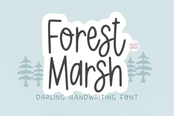
Loose upright handwriting with tall narrow frames and uneven baselines
Forest Marsh is loose upright handwriting in which the frames stay tall and narrow, the baselines drift a little and the strokes keep an even medium weight throughout.
Ideas for this font
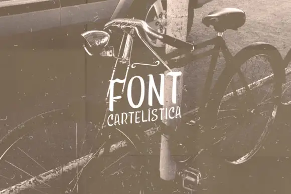
Narrow uneven vintage print
Cartelística puts narrow, unevenly weighted block capitals over a sepia bicycle photograph, with the second word set smaller and tucked beneath.
Ideas for this font
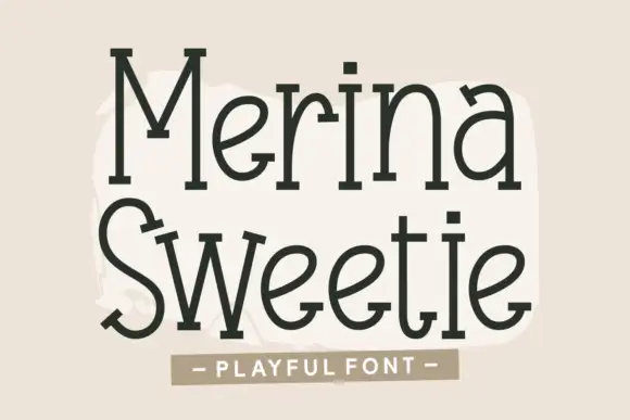
Tall quirky serif-like print
Merina Sweetie is a tall playful hand-lettering with slab-like feet: narrow letters, uneven serifs, a bouncing baseline and a warm olive-brown ink on a cream ground.
Ideas for this font
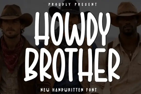
Tall condensed rounded capitals, all caps
Howdy Brother is an all-caps handwriting drawn tall and narrow with thick even strokes and rounded corners, so two stacked words fill a square frame without losing the space between them.
Ideas for this font
Allow optional Google Analytics to measure visits and catalogue actions. Your search words and notes are not included. Privacy & storage