Modern Grotesque Body

Outline + Nyxar
Creates crisp high-hierarchy contrast beneath Outline headlines across menus, websites and labels.
Inspect Nyxar specimenDisclosure: MakerFileHub may earn a commission from qualifying purchases via paid links on this page. How our links work.
Outline varsity slab display
Outline is a varsity display drawn only as an outline: bold college capitals with square shoulders, a double contour that steps inward, and no fill at all, set white on a textured olive green with a banner rule beneath.
Paid link
Get this fontProject & layout blueprintsAt-a-glance maker compatibility
Sturdy stroke walls and open counters weed cleanly on adhesive vinyl, HTV apparel film, and cut cardstock.
Visual anatomy & craft review
The two words are stacked and the construction is the classic athletic block, but every letter is hollow: an outer contour follows the shape, a second line steps inward, and the space between them is left open, so the ground shows through both the counters and the outline. Because the stems are wide, the double line reads clearly even at a distance, and the counter shapes stay square and generous. Spacing is tight, which keeps the pair as one block, and the outline construction means the face depends entirely on contrast with the ground rather than on the weight of ink. The ground is a worn olive green with a scuffed texture, and the two caption lines sit inside a ribbon banner at the foot, so the specimen reads as a team plate rather than a poster.
Varsity, outlined, athletic, bold
Two-font hierarchy recipes
Tested contrast partners — pairing Outline with grounded secondary typography.
Outline + Nyxar
Creates crisp high-hierarchy contrast beneath Outline headlines across menus, websites and labels.
Inspect Nyxar specimen
Outline + Thick Black
Adds a warm human signature touch for 1-to-3-word callouts without competing against structured serif capitals.
Inspect Thick Black specimenPractical applications
Concrete hierarchy, scale and production guidance tailored to Outline’s stroke geometry.
An outline varsity face reads as team lettering and uses far less ink than a solid block, which matters on a large sign where a solid face would dominate the wall.
Hierarchy & layout recipe
Print 1,000 by 500 mm: the team name at 200 mm cap height in a single colour outline, the motto in a 30 mm solid sans, and a 6 mm border. Keep the outline stroke at least 4 mm wide so it survives the print at banner scale.
Pre-production check
Check the outline at full size, where a stroke under 3 mm can break in the printer's resolution; widen it. Confirm the 30 mm motto reads from eight metres and that the open counters do not fill with the ground colour.
An outline face lets a club print merchandise in one colour on a dark ground and still read as varsity lettering, which keeps a small run affordable.
Hierarchy & layout recipe
Print a 260 mm chest graphic: the club name at 80 mm cap height as a single-colour outline, the town name in a 10 mm solid sans beneath, and a 2 mm keyline. Keep every outline stroke at least 1.2 mm so the screen holds it.
Pre-production check
Check the screen at actual mesh, where a 1 mm outline clogs; thicken it for the garment. Wash-test one shirt and confirm the outline stays continuous after the first wash.
An outline block gives a sports annual a cover that reads as team kit without a photograph of a shirt, and the hollow letters sit well over an image.
Hierarchy & layout recipe
Set the title at 130 pt in two lines over a dark photograph, the year in a 12 pt sans at the foot, and a 0.5 pt rule at the head. Keep the outline white and the photograph's mid-tones dark enough that the double contour stays visible.
Pre-production check
Check the outline over the photograph, where a busy background can fill the open letters and make the word unreadable; add a scrim behind the title only. Confirm the 12 pt year reads at newsstand distance and that the rule clears the title.
Technical & licence verification
Confirm included OTF/TTF/WOFF formats, full glyph tables and licence coverage on the live store page before batch production.
Closest visual alternatives
Matched across letterform anatomy, stroke behaviour and craft applications.
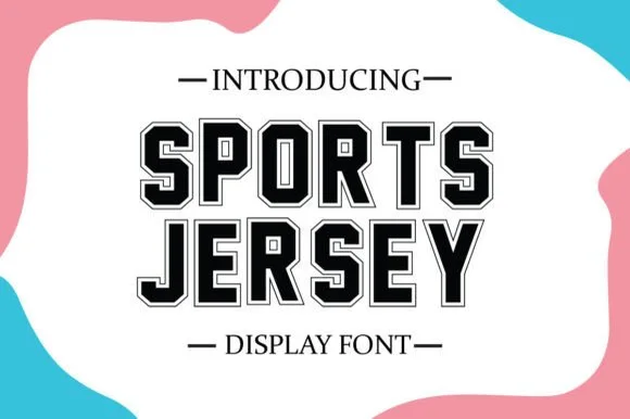
Built-in inline-outlined collegiate jersey slab serif
Sports Jersey features a built-in crisp hairline outer contour around bold octagonal varsity slabs—giving you instant 2-layer jersey framing in one keystroke!
Ideas for this font
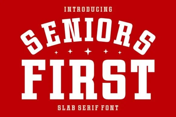
Chunky varsity block athletic slab serif
Seniors First is a solid, single-layer collegiate block slab serif with stout rectangular feet, chamfered bowls, and punchy athletic balance.
Ideas for this font
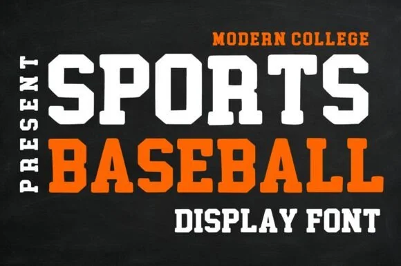
Clean solid modern collegiate octagonal slab serif
Sports Baseball is a clean, solid modern collegiate slab serif with crisp 45-degree chamfered corners and zero grunge.
Ideas for this font
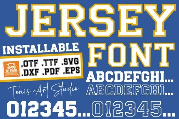
Dual-case solid/outline jersey slab + full SVG/DXF/EPS cut bundle
Jersey Outline delivers solid athletic slabs on uppercase, double-line outlined slabs on lowercase, matching '0–9' digits, AND.SVG/.DXF/.PDF/.EPS cut files!
Ideas for this font
Same independent foundry
Allow optional Google Analytics to measure visits and catalogue actions. Your search words and notes are not included. Privacy & storage