Neutral Sans Workhorse

Dinosaur + Modern Limited
Lets Dinosaur own the focal silhouette while handling secondary copy, sizing and subheads cleanly.
Inspect Modern Limited specimenDisclosure: MakerFileHub may earn a commission from qualifying purchases via paid links on this page. How our links work.
Heavy block capitals cut through by distinct dinosaur silhouettes
Dinosaur sets heavy square capitals in solid colours and cuts a dinosaur silhouette out of each letter, so a word reads as a row of coloured blocks with prehistoric animals standing in the counters.
Paid link
Get this fontProject & layout blueprintsAt-a-glance maker compatibility
Sturdy stroke walls and open counters weed cleanly on adhesive vinyl, HTV apparel film, and cut cardstock.
Visual anatomy & craft review
DINO over SAUR fills the card on a deep green ground, and each letter is a flat square block in red, yellow, teal, lime or purple with a dinosaur knocked out of it in the background colour: a T-rex in the D, a long-necked sauropod in the N, a raptor in the O. The blocks butt against one another with no spacing, so the two rows read as a single slab, and the silhouettes are drawn at a size that fills each shape without breaking its contour. A caption at the foot names the set as a kids' decorative face. The construction is a cut-out font: every letter is a solid shape with a hole, which means it prints in one colour per letter and also cuts cleanly from vinyl and paper.
Heavy block capitals cut through by distinct dinosaur silhouettes
Two-font hierarchy recipes
Tested contrast partners — pairing Dinosaur with grounded secondary typography.
Dinosaur + Modern Limited
Lets Dinosaur own the focal silhouette while handling secondary copy, sizing and subheads cleanly.
Inspect Modern Limited specimen
Dinosaur + Majestic Letters
Grounds bold display lettering with classic typographic authority on posters, badges and apparel.
Inspect Majestic Letters specimenPractical applications
Concrete hierarchy, scale and production guidance tailored to Dinosaur’s stroke geometry.
The silhouettes name the theme in one word, and the flat blocks read across a garden where an outlined face would break up among the decorations.
Hierarchy & layout recipe
Print a 500 by 350 mm board: set the greeting at 90 pt across two rows, keep 24 mm of clear ground between the rows, and hold 26 mm of border so no silhouette is cut.
Pre-production check
Knocked-out shapes fill in below 20 pt; print one sign at the finished size and check the raptor before the set.
The lettering suits a family audience in a natural history hall, and the solid blocks stay legible on a leaflet that will be read in poor light.
Hierarchy & layout recipe
Print an A4 family trail: set the header at 40 pt on one row, keep 15 mm of clear ground beneath before the first stop at 11 pt, and hold 16 mm of margin at both sides.
Pre-production check
Small silhouettes read as holes; print one leaflet at the finished size and check the T-rex first.
The face gives a garment tag an idea rather than a slogan, and the flat blocks print on a woven label where a gradient would not.
Hierarchy & layout recipe
Print a 45 by 35 mm woven label: set the brand name at 12 pt on one row, keep 4 mm of clear ground beneath before the size at 4 pt, and hold 3 mm from the block edge to the label border.
Pre-production check
Woven labels lose holes; print one label on the real weave and check that each letter still reads before the order.
Technical & licence verification
Confirm included OTF/TTF/WOFF formats, full glyph tables and licence coverage on the live store page before batch production.
Closest visual alternatives
Matched across letterform anatomy, stroke behaviour and craft applications.
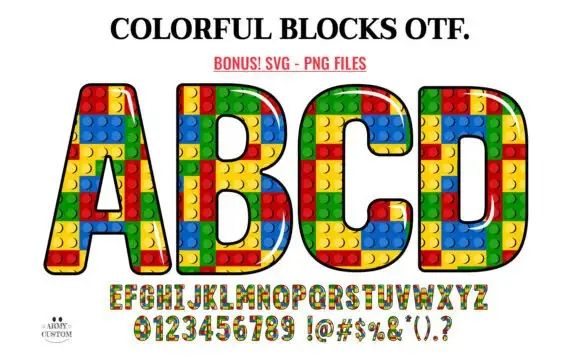
Outlined block capitals filled with colourful studded rectangles
Colorful Blocks builds every letter from a grid of plastic bricks, fills them in primary red, yellow, green and blue, and adds a glossy highlight and a heavy black contour around the whole shape.
Ideas for this font
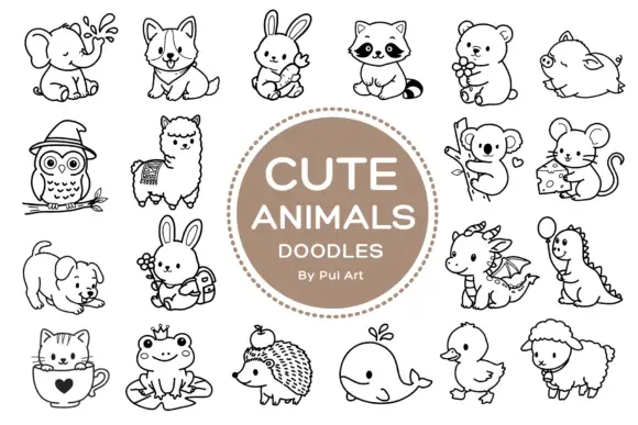
Rounded black outline animal dingbats with simple expressions and props
Cute Animals Doodles is a typable collection of about two dozen animals — elephant, corgi, bunny, raccoon, bear, owl, alpaca, koala, mouse, hedgehog, whale, duck, sheep, a small dragon — each drawn in one even black line.
Ideas for this font
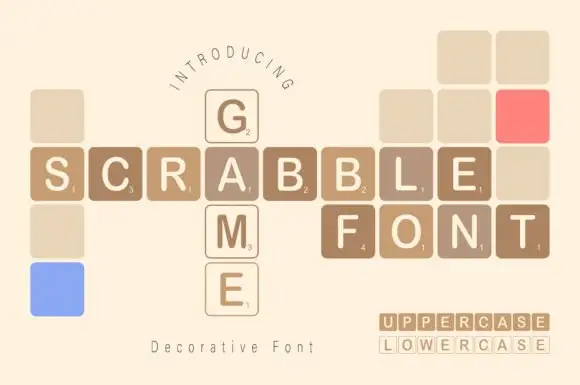
Game-tile display
Scrabble Game is a novelty display on cream: plain capitals set inside rounded square tiles with small numerals in the lower corner, arranged on a grid as a crossword, with blank and coloured tiles filling the gaps and a small format line at the lower right.
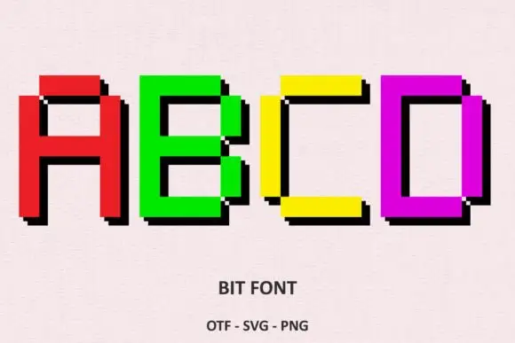
Bright rectangular pixel-style capitals with hard black offset shadows
Bit Font draws heavy capitals on a coarse pixel grid, gives each letter a solid colour, and steps a black shadow one block to the right so every word looks extruded by two rows of pixels.
Ideas for this font
Same independent foundry
Allow optional Google Analytics to measure visits and catalogue actions. Your search words and notes are not included. Privacy & storage