Editorial Serif Anchor

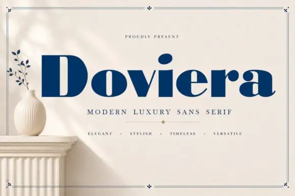
September + Kernova
Anchors September's fluid strokes with crisp Roman proportions on wedding suites, headers and packaging.
Inspect Kernova specimenDisclosure: MakerFileHub may earn a commission from qualifying purchases via paid links on this page. How our links work.
Chunky playful print with organic shapes
September is a chunky playful handwritten print in black on cream, surrounded by soft olive shapes, leaves and a daisy, with a pill caption in the same palette.
Paid link
Get this fontProject & layout blueprintsAt-a-glance maker compatibility
Weld or Unite overlapping script joins into one continuous vector path before sending to the blade.
Visual anatomy & craft review
September fills the card in a fat hand-drawn print: rounded strokes, small round counters, a tall ascender on the t, a tail on the S that curls under the word and a bounce that makes the letters sit at slightly different heights. The letters are unjoined and generous, so the word reads as a friendly written sign rather than as lettering. Around it, soft olive-green organic blobs run off the left and top edges, a drawn heart sits above the word, a leafy sprig and a daisy fill the corners and a scatter of dots balances the top right. The captions are set in a plain sans and in an olive pill, and one line names the character coverage. The face is a cheerful print for packaging, cards and small brands: it needs size for the bounce to read, and it works best in one ink on a warm ground.
A chunky playful hand on cream
Two-font hierarchy recipes
Tested contrast partners — pairing September with grounded secondary typography.
September + Kernova
Anchors September's fluid strokes with crisp Roman proportions on wedding suites, headers and packaging.
Inspect Kernova specimen
September + Cenura
Keeps small-scale dates, URLs, nutrition facts and care instructions crisp and legible below script titles.
Inspect Cenura specimenPractical applications
Concrete hierarchy, scale and production guidance tailored to September’s stroke geometry.
The name and the warm palette suit an early autumn market, and a simple board printed in one ink is what a stall can actually make before opening.
Hierarchy & layout recipe
Print a 500 by 350 mm board: set the market name at 90 pt on one row, keep 24 mm of clear ground beneath before the date at 20 pt, and hold 22 mm of border on all sides.
Pre-production check
The bounce makes a long word look unsteady at large size; print one board at the final size and check the baseline before the set.
A warm hand sets a seasonal tone, and the extra characters in the specimen mean a scent name in another language is covered.
Hierarchy & layout recipe
Print a 55 by 45 mm label: set the scent at 13 pt on one row, keep 5 mm of clear ground beneath before the weight at 4.5 pt, and hold 4 mm from the lowest tail to the die line.
Pre-production check
The tail of the S can cross a die on a small label; print one at the real size and check both ends before the order.
The palette and the drawn leaves place the card in a season, and the cheerful hand fits a birthday rather than a formal occasion.
Hierarchy & layout recipe
Print a 105 by 148 mm card: set the greeting at 30 pt on one row, keep 14 mm of clear ground beneath before the message at 9 pt, and hold 12 mm of margin on all sides.
Pre-production check
Olive green on cream can look muted on a home printer; print one card on the actual machine and check the contrast before the batch.
Technical & licence verification
Confirm included OTF/TTF/WOFF formats, full glyph tables and licence coverage on the live store page before batch production.
Closest visual alternatives
Matched across letterform anatomy, stroke behaviour and craft applications.
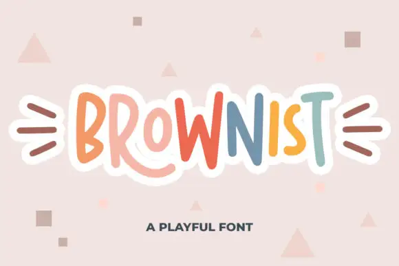
Irregular tall playful capitals in alternating colours with uneven weights
Brownist is playful capital lettering in which each letter is drawn at a different height and weight, with rounded corners and small banners on both sides of the word.
Ideas for this font
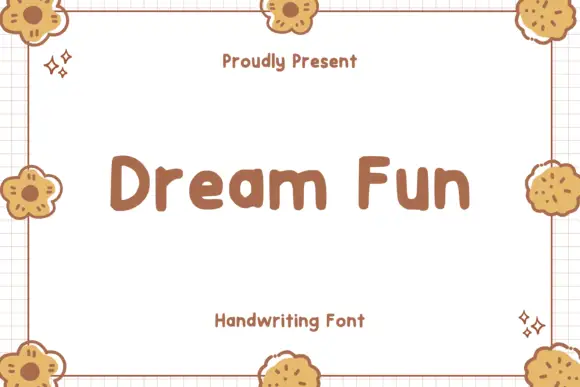
Soft chunky separate letters
Dream Fun sets soft chunky letters as separate rounded shapes, with even weight, generous counters and a playful hand-drawn edge that never turns into a script.
Ideas for this font
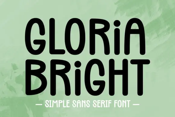
Rounded upright capitals with dotted i forms and softly arched A tops
Gloria Bright is a rounded upright hand in which the capitals stand tall, the A arches softly at its apex, the i keeps a dot at capital height and the strokes stay even but slightly uneven, so a line reads as hand-lettered capitals.
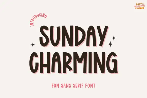
Narrow bouncing handwritten caps
Sunday Charming is a narrow handwritten display in dark brown with a pink offset shadow on a warm off-white ground: irregular capitals with arched A tops and a slightly bouncing baseline, set in two lines with small sparkles at the sides, a curved line at the upper left and a plain line beneath.
Ideas for this font
Same independent foundry
Allow optional Google Analytics to measure visits and catalogue actions. Your search words and notes are not included. Privacy & storage