Editorial Serif Anchor

Dream Fun + Aureline
Anchors Dream Fun's fluid strokes with crisp Roman proportions on wedding suites, headers and packaging.
Inspect Aureline specimenDisclosure: MakerFileHub may earn a commission from qualifying purchases via paid links on this page. How our links work.
Soft chunky separate letters
Dream Fun sets soft chunky letters as separate rounded shapes, with even weight, generous counters and a playful hand-drawn edge that never turns into a script.
Paid link
Get this fontProject & layout blueprintsAt-a-glance maker compatibility
Weld or Unite overlapping script joins into one continuous vector path before sending to the blade.
Visual anatomy & craft review
The specimen sits inside a decorative cookie frame on a cream card, and the letters are drawn as bold rounded blocks rather than as a script: separate letterforms, thick even stems, small soft corners and slightly uneven widths that keep the line from looking like a geometric sans. Counters are large, so the face holds up at small sizes, and the baseline is almost level, which makes the playfulness come from the shapes rather than from a bounce. The frame and the small printed notes above and below are artwork and listing labels; the alphabet itself is a flat single-colour set.
Chunky · Soft · Rounded
Two-font hierarchy recipes
Tested contrast partners — pairing Dream Fun with grounded secondary typography.
Dream Fun + Aureline
Anchors Dream Fun's fluid strokes with crisp Roman proportions on wedding suites, headers and packaging.
Inspect Aureline specimen
Dream Fun + Swaraga
Keeps small-scale dates, URLs, nutrition facts and care instructions crisp and legible below script titles.
Inspect Swaraga specimenPractical applications
Concrete hierarchy, scale and production guidance tailored to Dream Fun’s stroke geometry.
Chunky separate letters stay readable at small label sizes and cut as individual shapes, which is what a party-bag sticker needs.
Hierarchy & layout recipe
Set the name at 18 pt on a 40 mm round label, keep it to one word, and leave 5 mm between the letters and the die-cut edge on every side of the circle.
Pre-production check
Rounded corners are the first thing a cheap die cuts off; check the label die against the letter shapes.
Soft rounded blocks set a welcoming tone for a children's reading corner while staying legible from across the whole room.
Hierarchy & layout recipe
Set the heading at 3-inch height on A3, keep it to two words only, and leave 10 cm of white space around the sign so the rounded shapes read as deliberate.
Pre-production check
The even weight is fine at large sizes, but the corners soften further on fabric printing; test if the sign is going on cloth.
Chunky rounded letters suit a children's craft product and print cleanly on kraft board in one flat colour with no outline or second pass.
Hierarchy & layout recipe
Set the heading at 48 pt on the front panel, keep the contents list in a plain sans at 9 pt below it, and leave 12 mm of white space between the two text blocks on the panel.
Pre-production check
On kraft board the ink spreads, so the counters in e and a can close; check one printed sample first.
Technical & licence verification
Confirm included OTF/TTF/WOFF formats, full glyph tables and licence coverage on the live store page before batch production.
Closest visual alternatives
Matched across letterform anatomy, stroke behaviour and craft applications.
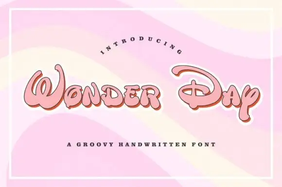
Groovy rounded hand lettering
Wonder Day is a groovy hand-lettered display in pink with a copper shadow and a thick white outline, set on a pastel wave ground: fat rounded letters with a strong forward lean and a roller-coaster bounce.
Ideas for this font
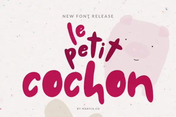
Very heavy rounded marker letters
Le Petit Cochon is a very heavy rounded hand in berry pink on speckled cream: fat rounded strokes, letters of deliberately different sizes and a baseline that bounces so the phrase looks stacked by hand.
Ideas for this font
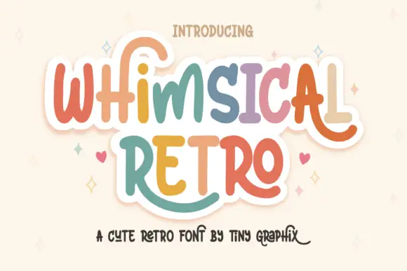
Rounded upright letters with long curled terminals
Whimsical Retro mixes soft upright letterforms with unusually long curled terminals, set over a pastel layered fill inside a thin outline on a warm paper ground.
Ideas for this font
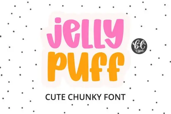
Chunky upright letters with curved lower ends and open counters
Jelly Puff is chunky upright lettering in which the strokes stay thick and even, the lower ends curl to one side and the counters stay open, so a word reads as something drawn with a fat marker.
Ideas for this font
Allow optional Google Analytics to measure visits and catalogue actions. Your search words and notes are not included. Privacy & storage