Editorial Serif Anchor

Brownist + Flowsky Editorial
Anchors Brownist's fluid strokes with crisp Roman proportions on wedding suites, headers and packaging.
Inspect Flowsky Editorial specimenDisclosure: MakerFileHub may earn a commission from qualifying purchases via paid links on this page. How our links work.
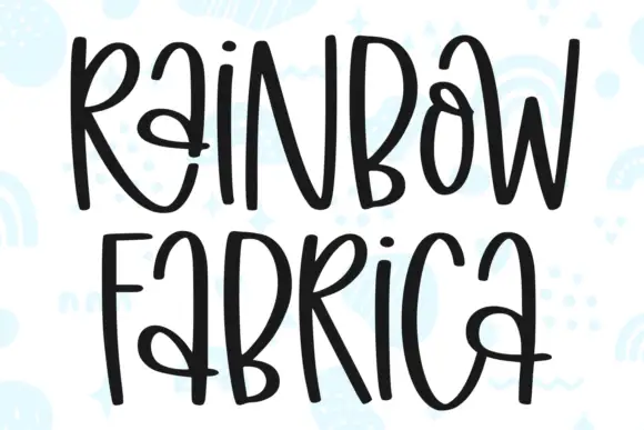
Irregular tall playful capitals in alternating colours with uneven weights
Brownist is playful capital lettering in which each letter is drawn at a different height and weight, with rounded corners and small banners on both sides of the word.
Paid link
Get this fontProject & layout blueprintsAt-a-glance maker compatibility
Weld or Unite overlapping script joins into one continuous vector path before sending to the blade.
Visual anatomy & craft review
Nothing in the word matches. The B is tall and narrow, the R is wider with a curled leg, the O is a soft ellipse, the W is built from four uneven diagonals, the N is short and the I and the S vary again, and the letters bounce above and below an imaginary baseline. Weights flicker between thin and medium, and the corners are rounded so no stroke ends sharply, which is what gives the word its hand-drawn playfulness. The irregularity is deliberate: it makes the phrase read as a doodle rather than as a set line, and it holds up because the strokes stay simple and open. The pastel ground, the coloured lettering, the small triangles and the two side banners are presentation; the lettering is the word.
Playful · Irregular · Tall
Two-font hierarchy recipes
Tested contrast partners — pairing Brownist with grounded secondary typography.
Brownist + Flowsky Editorial
Anchors Brownist's fluid strokes with crisp Roman proportions on wedding suites, headers and packaging.
Inspect Flowsky Editorial specimen
Brownist + Bargain Condensed
Keeps small-scale dates, URLs, nutrition facts and care instructions crisp and legible below script titles.
Inspect Bargain Condensed specimenPractical applications
Concrete hierarchy, scale and production guidance tailored to Brownist’s stroke geometry.
The uneven letters read as hand-drawn playfulness, and the varied heights give a short greeting energy that a tidy display face cannot match on a small card.
Hierarchy & layout recipe
Set the greeting at 44 pt on a 148 by 105 mm card, keep the date and address in a 9 pt sans, and leave 12 mm below the letters so the uneven descenders have air.
Pre-production check
A hand-drawn card printed in one colour loses its bounce; keep the letters in two or three inks and check the proof at final size.
The irregular caps suit a playroom, and the varied heights keep a short name interesting across a wide banner without illustration.
Hierarchy & layout recipe
Set the name at 80 mm on a 1.2 m fabric banner, keep the age at 50 mm beneath it, and leave 30 mm at each end so the uneven letters finish inside the hem.
Pre-production check
Cut fabric letters lift at the rounded corners; check one applied letter and add a small overlap at each end before cutting the set.
The playful caps signal a children's product, and the simple open strokes stay readable on a small woven label where a detailed script would clot.
Hierarchy & layout recipe
Set the brand at 11 pt on a 30 by 50 mm label, keep the size in a 5 pt sans, and leave 4 mm of margin so the rounded corners are not caught by the stitch line.
Pre-production check
Woven labels round off uneven heights; check a woven sample and simplify the most irregular letter rather than the whole word.
Technical & licence verification
Confirm included OTF/TTF/WOFF formats, full glyph tables and licence coverage on the live store page before batch production.
Closest visual alternatives
Matched across letterform anatomy, stroke behaviour and craft applications.
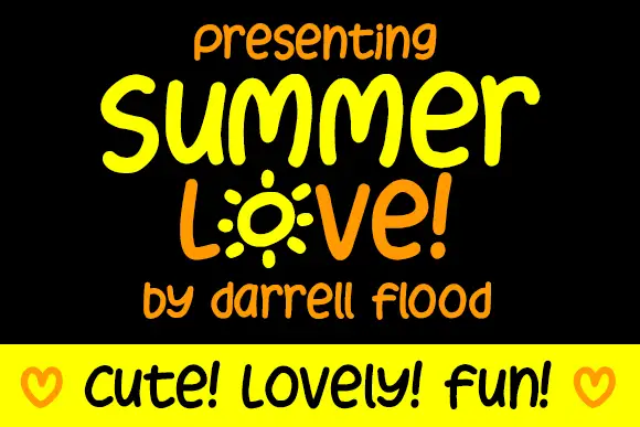
Display
Summer Love is a rounded marker alphabet: friendly handwriting with a thick even stroke, a bouncing baseline and rounded terminals, with one letter drawn as a sunburst and a cheerful tone throughout.
Ideas for this font
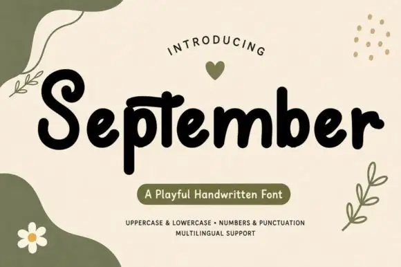
Chunky playful print with organic shapes
September is a chunky playful handwritten print in black on cream, surrounded by soft olive shapes, leaves and a daisy, with a pill caption in the same palette.
Ideas for this font
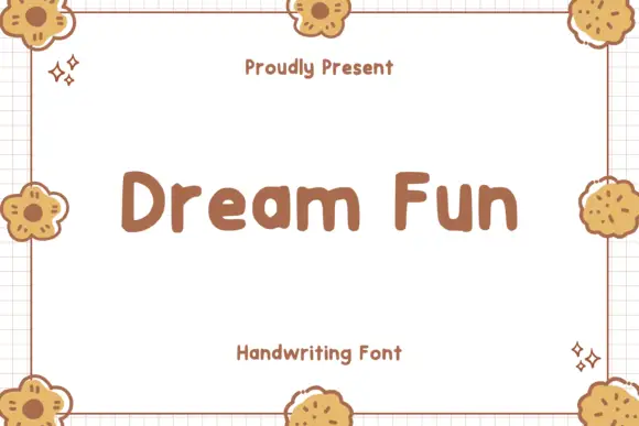
Soft chunky separate letters
Dream Fun sets soft chunky letters as separate rounded shapes, with even weight, generous counters and a playful hand-drawn edge that never turns into a script.
Ideas for this font
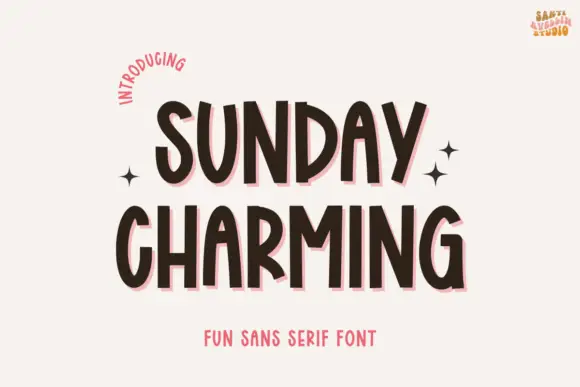
Narrow bouncing handwritten caps
Sunday Charming is a narrow handwritten display in dark brown with a pink offset shadow on a warm off-white ground: irregular capitals with arched A tops and a slightly bouncing baseline, set in two lines with small sparkles at the sides, a curved line at the upper left and a plain line beneath.
Ideas for this font
Same independent foundry
Allow optional Google Analytics to measure visits and catalogue actions. Your search words and notes are not included. Privacy & storage