Editorial Serif Anchor

Gloria Bright + Stanza
Anchors Gloria Bright's fluid strokes with crisp Roman proportions on wedding suites, headers and packaging.
Inspect Stanza specimenDisclosure: MakerFileHub may earn a commission from qualifying purchases via paid links on this page. How our links work.
Rounded upright capitals with dotted i forms and softly arched A tops
Gloria Bright is a rounded upright hand in which the capitals stand tall, the A arches softly at its apex, the i keeps a dot at capital height and the strokes stay even but slightly uneven, so a line reads as hand-lettered capitals.
Paid link
Get this fontProject & layout blueprintsAt-a-glance maker compatibility
Weld or Unite overlapping script joins into one continuous vector path before sending to the blade.
Visual anatomy & craft review
The O closes a tall oval, the G opens a narrow curve, the B and R carry broad bodies, and the i sits as a dotted form inside a row of capitals, so the rhythm shifts letter to letter. The mixed height is the character: the dotted letters break an otherwise even capital line, which is why a test of the actual character map matters before a title is set. Because the forms are wide, the face wants 30 pt and generous tracking, and it welds for cutting from 1.1 inches of x-height. The green brush texture, the pale ground and the white subtitle are presentation; the black lettered line is the face.
Rounded · Hand-shaped · Mixed height
Two-font hierarchy recipes
Tested contrast partners — pairing Gloria Bright with grounded secondary typography.
Gloria Bright + Stanza
Anchors Gloria Bright's fluid strokes with crisp Roman proportions on wedding suites, headers and packaging.
Inspect Stanza specimen
Gloria Bright + Memoir Slang
Keeps small-scale dates, URLs, nutrition facts and care instructions crisp and legible below script titles.
Inspect Memoir Slang specimenPractical applications
Concrete hierarchy, scale and production guidance tailored to Gloria Bright’s stroke geometry.
The rounded hand suits a maker's label, and the even strokes stay clear at 22 pt on a 55 mm jar label with a plain scent line.
Hierarchy & layout recipe
Print a 55 by 45 mm label: set the studio name at 22 pt, set the scent at 9 pt in a sans beneath, and keep 6 mm of clear border so the rounded terminals stay inside.
Pre-production check
Dotted letters printed at 14 pt read as stray marks; check the label and keep the name at 20 pt or above.
The hand-lettered capitals suit a printed sign, and the rounded forms hold a two-word greeting at 48 mm on an A4 sheet read from a doorway.
Hierarchy & layout recipe
Print an A4 sign: set the greeting at 48 mm on two lines, keep 18 mm between the rows, and keep 20 mm of border all round so the arch of the A stays whole.
Pre-production check
An arched A printed close to the sheet edge looks clipped; check the imposed sign and keep 18 mm of ground.
The hand-shaped line suits a small kraft tag, and the even weight keeps a one-word mark readable at 20 pt with a punched hole.
Hierarchy & layout recipe
Print a 40 by 80 mm tag: set the word at 20 pt, punch a 3 mm hole 9 mm from the top edge, and keep 8 mm of clear card between that hole and the tallest letter.
Pre-production check
A tag punched through a rounded terminal tears at the fold; check the die and shift the hole 4 mm clear of the stroke.
Technical & licence verification
Confirm included OTF/TTF/WOFF formats, full glyph tables and licence coverage on the live store page before batch production.
Closest visual alternatives
Matched across letterform anatomy, stroke behaviour and craft applications.
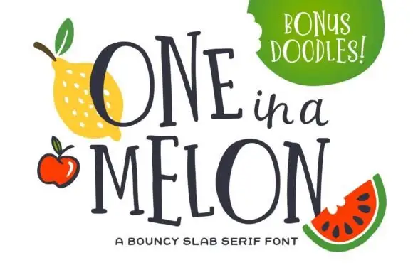
Bouncy narrow slab capitals
One in a Melon is a bouncy narrow slab serif in navy: tall condensed capitals, uneven baseline, squared serifs and a small script word set between the two lines of display.
Ideas for this font
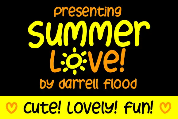
Display
Summer Love is a rounded marker alphabet: friendly handwriting with a thick even stroke, a bouncing baseline and rounded terminals, with one letter drawn as a sunburst and a cheerful tone throughout.
Ideas for this font
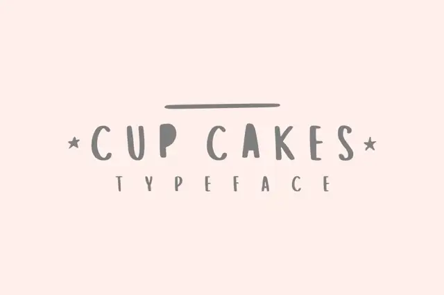
Narrow irregular capitals with filled-looking P and A interiors in the sample
Cup Cakes draws tall skinny capitals by hand, keeps the widths uneven and the strokes slightly bowed, and sets a short word between two small stars on a plain cream ground.
Ideas for this font
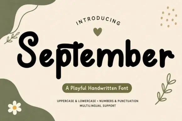
Chunky playful print with organic shapes
September is a chunky playful handwritten print in black on cream, surrounded by soft olive shapes, leaves and a daisy, with a pill caption in the same palette.
Ideas for this font
Same independent foundry
Allow optional Google Analytics to measure visits and catalogue actions. Your search words and notes are not included. Privacy & storage