Editorial Serif Anchor

Sunday Charming + Glofi
Anchors Sunday Charming's fluid strokes with crisp Roman proportions on wedding suites, headers and packaging.
Inspect Glofi specimenDisclosure: MakerFileHub may earn a commission from qualifying purchases via paid links on this page. How our links work.
Narrow bouncing handwritten caps
Sunday Charming is a narrow handwritten display in dark brown with a pink offset shadow on a warm off-white ground: irregular capitals with arched A tops and a slightly bouncing baseline, set in two lines with small sparkles at the sides, a curved line at the upper left and a plain line beneath.
Paid link
Get this fontProject & layout blueprintsAt-a-glance maker compatibility
Weld or Unite overlapping script joins into one continuous vector path before sending to the blade.
Visual anatomy & craft review
The plate sets two words stacked and lets the irregularity carry the character: the A has an arched top, the baseline rises and falls, and a pink offset sits behind the brown, which reads as a printed misregistration rather than as a shadow. That construction sets a moderate size floor, because the counters in the narrow letters close first, and the bounce means a layout should not depend on a strict baseline. The sparkles and the curved line are supplied decoration, and the plain line beneath is product copy. Because the letters are narrow and casual, the face suits a card, a label and a sign for a small business, and it is most at home in two or three short words.
Handwritten, narrow, playful, casual
Two-font hierarchy recipes
Tested contrast partners — pairing Sunday Charming with grounded secondary typography.
Sunday Charming + Glofi
Anchors Sunday Charming's fluid strokes with crisp Roman proportions on wedding suites, headers and packaging.
Inspect Glofi specimen
Sunday Charming + Montreal
Keeps small-scale dates, URLs, nutrition facts and care instructions crisp and legible below script titles.
Inspect Montreal specimenPractical applications
Concrete hierarchy, scale and production guidance tailored to Sunday Charming’s stroke geometry.
A bouncing handwritten face sets a friendly card, and the offset shadow gives a two-colour print a designed feel. The bounce feels handmade.
Hierarchy & layout recipe
A6 card: the greeting at 26 pt, the details in a 9.5 pt sans, and the date at 8.5 pt. Keep 15 mm margins and print two colours on a cream card. Leave 12 mm at the foot for the time and the address line here.
Pre-production check
Check the 26 pt greeting at home-print resolution, where a narrow counter can close; keep it open. Confirm the 9.5 pt details keep a 4.5:1 contrast and that the offset stays even.
A casual handwritten label reads as a small shop, and the narrow letters fit a long product name on a small die. It reads as a shop sign.
Hierarchy & layout recipe
Print a 55 by 80 mm label: the shop at 12 pt, the product at 8 pt, and the weight at 7 pt. Keep 5 mm inside the die and keep the offset shadow above 0.5 mm.
Pre-production check
Check the 12 pt shop on a small die, where the offset can merge with the letter; keep 0.5 mm of gap. Confirm the 7 pt weight reads at arm's length and that the label takes a fold.
A handwritten banner reads as handmade, and the narrow letters fit a long greeting across a narrow strip. It reads as a hand lettered strip.
Hierarchy & layout recipe
Print a 600 by 150 mm banner: the greeting at 45 mm cap height, the date at 18 mm, and two colours on a card stock. Keep 15 mm margins and punch holes clear of the sparkles.
Pre-production check
Check the banner at 45 mm, where the bounce can make the line look crooked; set it on a straight guide. Confirm the date reads at two metres and that the banner hangs level.
Technical & licence verification
Confirm included OTF/TTF/WOFF formats, full glyph tables and licence coverage on the live store page before batch production.
Closest visual alternatives
Matched across letterform anatomy, stroke behaviour and craft applications.
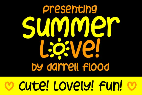
Display
Summer Love is a rounded marker alphabet: friendly handwriting with a thick even stroke, a bouncing baseline and rounded terminals, with one letter drawn as a sunburst and a cheerful tone throughout.
Ideas for this font
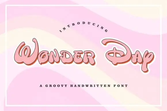
Groovy rounded hand lettering
Wonder Day is a groovy hand-lettered display in pink with a copper shadow and a thick white outline, set on a pastel wave ground: fat rounded letters with a strong forward lean and a roller-coaster bounce.
Ideas for this font
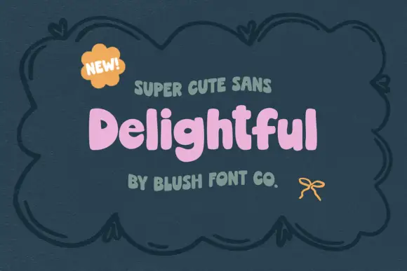
Chunky soft mixed case with uneven shoulders and a rounded g descender
Delightful shows a small pink mixed-case title inside a dark drawn frame, where broad irregular strokes form soft rounded bowls, the e opens compactly and a curved g drops below a lowercase row whose h and l rise above it.
Ideas for this font
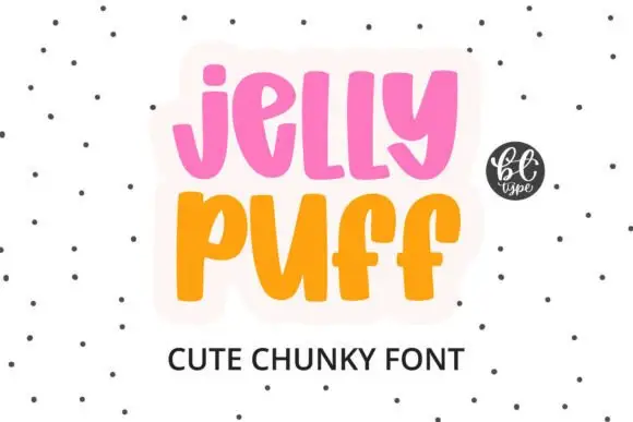
Chunky upright letters with curved lower ends and open counters
Jelly Puff is chunky upright lettering in which the strokes stay thick and even, the lower ends curl to one side and the counters stay open, so a word reads as something drawn with a fat marker.
Ideas for this font
Same independent foundry
Allow optional Google Analytics to measure visits and catalogue actions. Your search words and notes are not included. Privacy & storage