Modern Grotesque Body

Senior + Headline
Creates crisp high-hierarchy contrast beneath Senior headlines across menus, websites and labels.
Inspect Headline specimenDisclosure: MakerFileHub may earn a commission from qualifying purchases via paid links on this page. How our links work.
Rounded western slab with an offset shadow
Senior 2 is a western display face in cream on a dark, printed scene: fat rounded slab capitals with a hard offset shadow, softened corners and an aged surface, framed by scrollwork, stars and a desert horizon behind them.
Paid link
Get this fontProject & layout blueprintsAt-a-glance maker compatibility
Sturdy stroke walls and open counters weed cleanly on adhesive vinyl, HTV apparel film, and cut cardstock.
Visual anatomy & craft review
Two words are stacked and fill the frame, and the face is a western display with a rounded finish: the stems are thick, the slab serifs have their corners rounded off, the S and the G close into soft shoulders, the R carries a curved leg and the letters carry a hard copy of themselves offset down and to the right, which reads as a printed drop rather than a digital shadow. The surface is aged: the interior of each letter breaks into small pale patches and thin scratches, evenly enough that the word stays readable at a distance. Behind the block a printed desert scene sits in dusty reds and browns, with a low sun, mesas, a cactus and a scatter of stars, and ornamental scrolls and a banner close the composition above and below. Senior 2 is a display face for posters, apparel, craft signs and packaging with a vintage American feel, and it needs short words at a large size and a dark ground behind the block.
Rounded, extruded, aged
Two-font hierarchy recipes
Tested contrast partners — pairing Senior with grounded secondary typography.
Senior + Headline
Creates crisp high-hierarchy contrast beneath Senior headlines across menus, websites and labels.
Inspect Headline specimen
Senior + I Heart You
Adds a warm human signature touch for 1-to-3-word callouts without competing against structured serif capitals.
Inspect I Heart You specimenPractical applications
Concrete hierarchy, scale and production guidance tailored to Senior’s stroke geometry.
A rounded western face with a hard shadow looks printed on a board rather than set, and the aged surface suits a poster about old machines.
Hierarchy & layout recipe
Print a 420 by 594 mm poster: set the title at 120 pt over two lines, keep 40 mm of clear ground beneath before the date at 22 pt, and hold 26 mm of margin on all four sides.
Pre-production check
An offset shadow at large sizes throws the block off centre; build the shadow into the artwork and check the optical centring on proof.
A rounded western face is at home on a sauce bottle, and the heavy rounded letters stay readable on a curved surface where fine type distorts.
Hierarchy & layout recipe
Print a 60 by 95 mm label: set the brand at 20 pt on one line, keep 7 mm of clear ground beneath before the flavour at 6 pt, and hold 5 mm of margin on all four sides.
Pre-production check
A shadow on a curved label can look lopsided; print one on the real bottle and check the block against the curve.
A fat western block carries across a field, and the offset shadow keeps the letters apart where a plain face would blur at distance.
Hierarchy & layout recipe
Print a 1200 by 500 mm banner: set the greeting at 200 pt over two lines, keep 45 mm of clear ground beneath before the details at 36 pt, and hold 32 mm of border on all four sides.
Pre-production check
Aged texture disappears at field distance; keep the texture subtle and proof the banner from the stands before printing.
Technical & licence verification
Confirm included OTF/TTF/WOFF formats, full glyph tables and licence coverage on the live store page before batch production.
Closest visual alternatives
Matched across letterform anatomy, stroke behaviour and craft applications.
Bold retro western slab with keyline
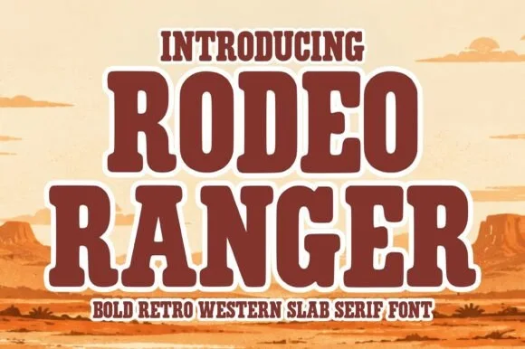
Rodeo Ranger is a bold retro western slab in brown with a cream keyline: heavy rounded slab serifs, thick uniform strokes, slightly wide proportions, and a raised three-dimensional edge that lifts the word off a desert illustration.
Ideas for this font
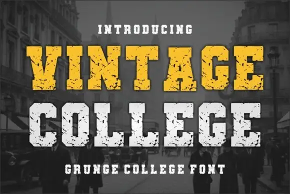
Grunge college slab with picket serifs
Vintage College is a grunge college slab in worn yellow and white on a dark street photograph: fat capitals with picket serifs, a heavy even weight and a scratched surface that eats into every edge.
Ideas for this font
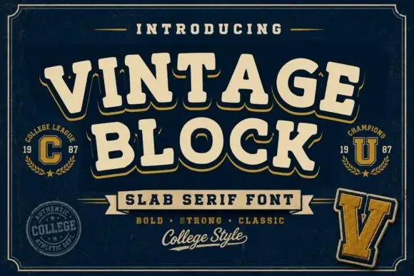
College block slab
Vintage Block is a college block slab in cream with a gold shadow on navy: heavy caps with squared serifs, a high waist and closed counters, set on two lines with small seal badges, a rule-and-ribbon device and a script line at the foot.
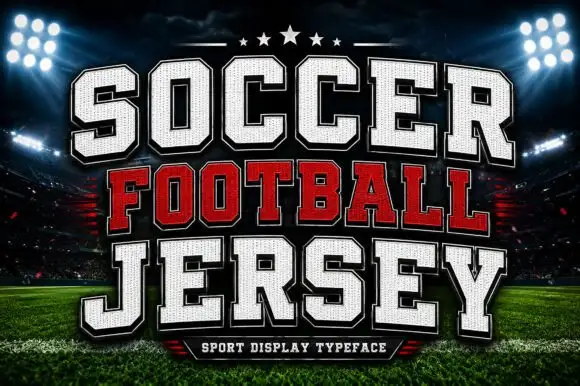
Layered athletic jersey capitals with a stitched fill and star detail
Soccer Football Jersey is a layered athletic capital alphabet in which each letter carries a stitched fill, a heavy keyline and an offset shadow, so a team name reads as the appliqué on a match jersey.
Same independent foundry
Allow optional Google Analytics to measure visits and catalogue actions. Your search words and notes are not included. Privacy & storage