Modern Grotesque Body

Rodeo Ranger + Kohilo
Creates crisp high-hierarchy contrast beneath Rodeo Ranger headlines across menus, websites and labels.
Inspect Kohilo specimenDisclosure: MakerFileHub may earn a commission from qualifying purchases via paid links on this page. How our links work.
Bold retro western slab with keyline
Rodeo Ranger is a bold retro western slab in brown with a cream keyline: heavy rounded slab serifs, thick uniform strokes, slightly wide proportions, and a raised three-dimensional edge that lifts the word off a desert illustration.
Paid link
Get this fontProject & layout blueprintsAt-a-glance maker compatibility
Sturdy stroke walls and open counters weed cleanly on adhesive vinyl, HTV apparel film, and cut cardstock.
Visual anatomy & craft review
The two words are stacked and centred, and the drawing is a friendly western slab rather than a hard-edged one: the serifs are rounded at the corners, the stems are thick and even, and the O stays almost circular, so the word reads as a fairground sign rather than a wanted poster. A cream keyline follows the contour of each letter at a constant offset and a second, darker edge sits behind it, which gives the type a height without a drop shadow and holds it against the busy ground. Spacing is tight, so the keylines of adjacent letters nearly meet, and the word stays on one band across the poster. The ground is a flat, warm illustration of mesas and desert scrub with a sunset sky, and the caption beneath the words is set in the same slab at a third of the size, which is how the family is meant to be used.
Western, bold, retro, outlined
Two-font hierarchy recipes
Tested contrast partners — pairing Rodeo Ranger with grounded secondary typography.
Rodeo Ranger + Kohilo
Creates crisp high-hierarchy contrast beneath Rodeo Ranger headlines across menus, websites and labels.
Inspect Kohilo specimen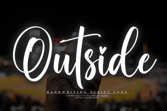
Rodeo Ranger + Outside
Adds a warm human signature touch for 1-to-3-word callouts without competing against structured serif capitals.
Inspect Outside specimenPractical applications
Concrete hierarchy, scale and production guidance tailored to Rodeo Ranger’s stroke geometry.
A bold slab with a keyline reads at a distance and looks like a painted fairground sign, which suits an event that sells itself on atmosphere rather than detail.
Hierarchy & layout recipe
A2 portrait: the words at 120 mm cap height in two lines, the keyline at 4 mm, the dates in a 16 mm sans, and the venue at 10 mm. Keep the type on the sky band so the keyline has contrast, and leave 20 mm margins.
Pre-production check
Check the keyline at 4 mm on the printed poster, where it must stay an even width around the serifs; inspect the curved corners of the R. Confirm the 16 mm dates read at four metres and that the second line clears the illustration's horizon.
A western slab with a keyline gives a sauce bottle the look of a fairground product, and the outlined construction holds on a label that is seen at shelf distance.
Hierarchy & layout recipe
Print a 70 by 110 mm label: the name at 22 pt with a 1 mm keyline, the flavour in 7 pt caps, and the volume in 6.5 pt. Keep 5 mm clear inside the die so the keyline never touches the edge and use two inks on a kraft stock.
Pre-production check
Check the 1 mm keyline at 22 pt on kraft, where it can fill and merge with the letter; increase the offset slightly for that stock. Confirm the 6.5 pt volume reads on the curve and that the keyline stays even where the label wraps.
A rounded western slab is friendly rather than severe, which suits a family farm stand where a harsher distressed face would look unfriendly.
Hierarchy & layout recipe
Print 600 by 400 mm: the words at 100 mm cap height, the prices in a 24 mm slab beneath, and a 6 mm keyline around the group. Keep 30 mm margins and print on a pale ground so the brown keyline reads as a shadow rather than as an outline.
Pre-production check
Check the keyline against the pale ground at full size, where a light offset can look like a printing misregistration; darken the offset layer. Confirm the 24 mm prices read from five metres and that no keyline crosses the board's mounting holes.
Technical & licence verification
Confirm included OTF/TTF/WOFF formats, full glyph tables and licence coverage on the live store page before batch production.
Closest visual alternatives
Matched across letterform anatomy, stroke behaviour and craft applications.
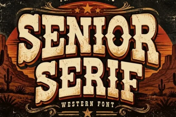
Rounded western slab with an offset shadow
Senior 2 is a western display face in cream on a dark, printed scene: fat rounded slab capitals with a hard offset shadow, softened corners and an aged surface, framed by scrollwork, stars and a desert horizon behind them.
Ideas for this font
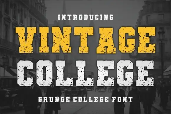
Grunge college slab with picket serifs
Vintage College is a grunge college slab in worn yellow and white on a dark street photograph: fat capitals with picket serifs, a heavy even weight and a scratched surface that eats into every edge.
Ideas for this font
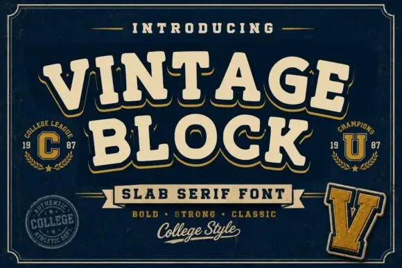
College block slab
Vintage Block is a college block slab in cream with a gold shadow on navy: heavy caps with squared serifs, a high waist and closed counters, set on two lines with small seal badges, a rule-and-ribbon device and a script line at the foot.
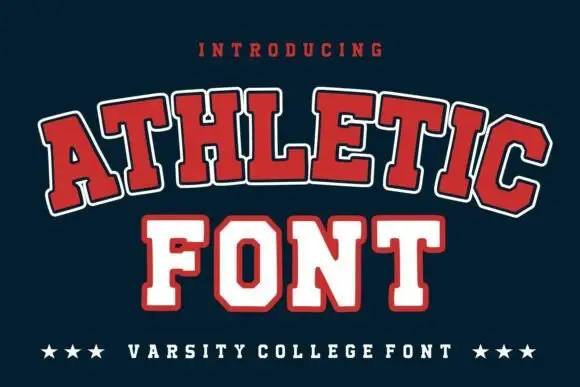
Broad outlined collegiate slabs with clipped corners in an arched specimen
Athletic is a broad collegiate slab in which the capitals clip their corners, the feet run wide and a pale and dark outline separate the fill from the ground, so a team name reads as an arched badge letter.
Same independent foundry
Allow optional Google Analytics to measure visits and catalogue actions. Your search words and notes are not included. Privacy & storage