Editorial Serif Anchor

Cup Cakes + The Avenue Editorial
Anchors Cup Cakes's fluid strokes with crisp Roman proportions on wedding suites, headers and packaging.
Inspect The Avenue Editorial specimenDisclosure: MakerFileHub may earn a commission from qualifying purchases via paid links on this page. How our links work.
Narrow irregular capitals with filled-looking P and A interiors in the sample
Cup Cakes draws tall skinny capitals by hand, keeps the widths uneven and the strokes slightly bowed, and sets a short word between two small stars on a plain cream ground.
Paid link
Get this fontProject & layout blueprintsAt-a-glance maker compatibility
Weld or Unite overlapping script joins into one continuous vector path before sending to the blade.
Visual anatomy & craft review
The name runs in warm grey across the centre, the C drawn narrow and the A with a soft apex, and the letters sit on a rule that runs above and a tracked caption below. Nothing is aligned to a strict grid, so the word reads as something lettered on a card rather than set from a font, and that unevenness is consistent enough to look intentional. There is no second weight and no ornament beyond the stars. It suits a small shop sign, a label or a menu header, and it stops working when the line gets long, because the narrow forms and the uneven rhythm make a sentence hard to scan.
Narrow irregular capitals with filled-looking P and A interiors in the sample
Two-font hierarchy recipes
Tested contrast partners — pairing Cup Cakes with grounded secondary typography.
Cup Cakes + The Avenue Editorial
Anchors Cup Cakes's fluid strokes with crisp Roman proportions on wedding suites, headers and packaging.
Inspect The Avenue Editorial specimen
Cup Cakes + Limited Coffee
Keeps small-scale dates, URLs, nutrition facts and care instructions crisp and legible below script titles.
Inspect Limited Coffee specimenPractical applications
Concrete hierarchy, scale and production guidance tailored to Cup Cakes’s stroke geometry.
The hand-drawn letters read as lettering on the counter rather than a printed brand, and the tall forms fit a long shop name above a till.
Hierarchy & layout recipe
Print a 500 by 200 mm board: set the shop name at 50 mm on one row, keep 16 mm of clear ground beneath before the hours at 10 mm, and keep 22 mm of border so the uneven edges stay inside the frame.
Pre-production check
Hand-drawn widths vary; check the layout at final size before the board is made. Check one finished piece before the rest are produced.
The plain hand lettering suits a note that goes with a gift, and the light strokes stay legible on an uncoated note card.
Hierarchy & layout recipe
Print a 105 by 148 mm card: set the greeting at 28 pt across one row, keep 14 mm of clear ground beneath before the message at 9 pt, and keep 12 mm of margin on each side of the fold.
Pre-production check
Uneven strokes thin on cheap card; check a printed sample before the batch. Get a physical proof from the printer before the run.
A hand-lettered header takes the formality out of a cooking sheet, and the tall forms stay readable at the size of a classroom handout.
Hierarchy & layout recipe
Print an A4 worksheet: set the header at 32 pt on one row, keep 12 mm of clear ground beneath before the ingredients at 11 pt, and keep 16 mm of margin on both sides of the sheet.
Pre-production check
Fine strokes blur on a school copier; check one copy before printing the class set. Approve only after seeing it printed at the final size.
Technical & licence verification
Confirm included OTF/TTF/WOFF formats, full glyph tables and licence coverage on the live store page before batch production.
Closest visual alternatives
Matched across letterform anatomy, stroke behaviour and craft applications.
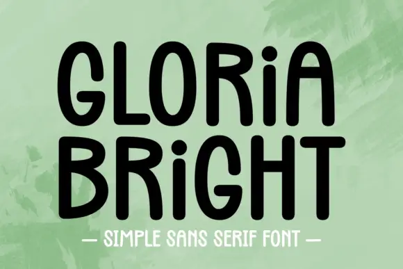
Rounded upright capitals with dotted i forms and softly arched A tops
Gloria Bright is a rounded upright hand in which the capitals stand tall, the A arches softly at its apex, the i keeps a dot at capital height and the strokes stay even but slightly uneven, so a line reads as hand-lettered capitals.
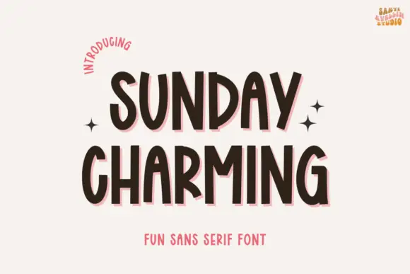
Narrow bouncing handwritten caps
Sunday Charming is a narrow handwritten display in dark brown with a pink offset shadow on a warm off-white ground: irregular capitals with arched A tops and a slightly bouncing baseline, set in two lines with small sparkles at the sides, a curved line at the upper left and a plain line beneath.
Ideas for this font
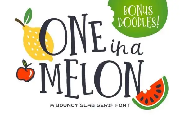
Bouncy narrow slab capitals
One in a Melon is a bouncy narrow slab serif in navy: tall condensed capitals, uneven baseline, squared serifs and a small script word set between the two lines of display.
Ideas for this font
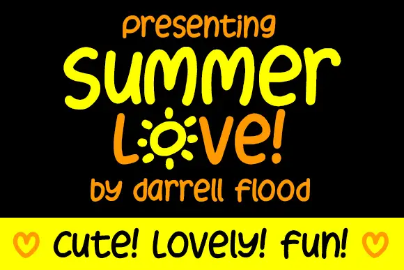
Display
Summer Love is a rounded marker alphabet: friendly handwriting with a thick even stroke, a bouncing baseline and rounded terminals, with one letter drawn as a sunburst and a cheerful tone throughout.
Ideas for this font
Same independent foundry
Allow optional Google Analytics to measure visits and catalogue actions. Your search words and notes are not included. Privacy & storage