Editorial Serif Anchor

Buffalo + Things
Anchors Buffalo's fluid strokes with crisp Roman proportions on wedding suites, headers and packaging.
Inspect Things specimenDisclosure: MakerFileHub may earn a commission from qualifying purchases via paid links on this page. How our links work.
Broad monoline signature script with open capitals
Buffalo is a monoline signature script that holds one even stroke from the first capital to the last exit, with a wide-open capital B and a double f whose two ascenders stand straight up out of the x-height band.
Paid link
Get this fontProject & layout blueprintsAt-a-glance maker compatibility
Weld or Unite overlapping script joins into one continuous vector path before sending to the blade.
Visual anatomy & craft review
The capital B is the widest letter in the sample: its upper bowl is small and closes early, while the lower bowl drops below the baseline and opens into the join, so the letter looks drawn in one movement rather than assembled from two curves. The double f keeps two vertical ascenders at the same height with a single crossbar running through both, which produces the only straight lines in an otherwise round word. Weight never changes, no stroke thins at a turn, and the joins sit low and slack so letters keep their own interior space. The y descender stays a straight diagonal without a loop. Terminals are rounded and slightly blunt, which is what keeps the sample reading as a felt-tip signature and not as calligraphy. The dark forest photograph and the tracked caps line beneath are presentation; the script is the word.
Broad · Even · Friendly
Two-font hierarchy recipes
Tested contrast partners — pairing Buffalo with grounded secondary typography.
Buffalo + Things
Anchors Buffalo's fluid strokes with crisp Roman proportions on wedding suites, headers and packaging.
Inspect Things specimen
Buffalo + Monure
Keeps small-scale dates, URLs, nutrition facts and care instructions crisp and legible below script titles.
Inspect Monure specimenPractical applications
Concrete hierarchy, scale and production guidance tailored to Buffalo’s stroke geometry.
An even monoline signature reads as a person's name rather than a company logo, which is what a one-guide operation is selling, and the open capital B stays recognisable when the mark is reduced to a 12 mm badge on a map.
Hierarchy & layout recipe
Set the name at 26 pt on the cover of a 105 by 210 mm trail card, keep the route list in a condensed sans at 7 pt, and hold 12 mm clear above the signature so the taller f ascenders are not crowded by the header rule.
Pre-production check
Screen printing on a fabric badge spreads the stroke by about a tenth of a millimetre; check a sewn sample and open the joins if the monoline starts to close into a blob.
A low-contrast signature holds its weight when printed small at the foot of a page, where a high-contrast script would lose its hairlines entirely, and the slack joins keep the name readable at 10 pt.
Hierarchy & layout recipe
Set the signature at 10 pt after the final paragraph with 8 mm of space above, keep the body in a 9.5 pt serif, and repeat the same signature at 20 pt on the cover so the two sizes match.
Pre-production check
Newsprint absorbs ink unevenly and a rounded terminal can look ragged; print one copy on the actual stock and confirm the ends do not fray before the issue is set.
The broad even stroke sits comfortably on a small card and reads as a handwritten note, which is the point of a thank-you that goes into a paper bag with a purchase, and the open capitals do not fill the card with ink.
Hierarchy & layout recipe
Set the greeting at 20 pt on a 90 by 55 mm card, set the shop name in a small caps serif at 6 pt at the foot, and keep a 7 mm margin all round so the y descender never touches the trim.
Pre-production check
Folded cards are cut after printing, and a descender that lands near the fold will crack; check the fold position against the y before the run is guillotined.
Technical & licence verification
Confirm included OTF/TTF/WOFF formats, full glyph tables and licence coverage on the live store page before batch production.
Closest visual alternatives
Matched across letterform anatomy, stroke behaviour and craft applications.
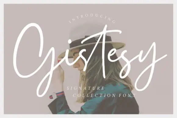
Loose signature script with tall capitals and an open, uneven rhythm
Gistesy is a loose signature script in which the capital rises very tall, the following letters drop small and the rhythm stays uneven enough to read as a real signature.
Ideas for this font
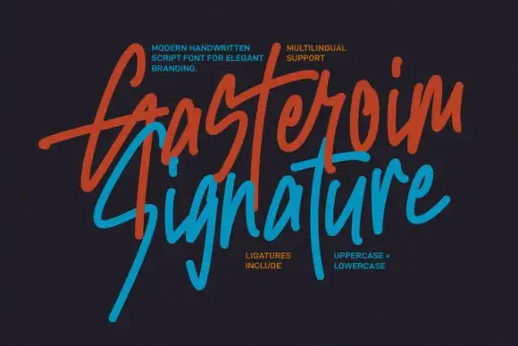
Tall energetic brush signature with long slanted ascenders
Gasteroim Signature is a tall brushed signature whose ascenders run three times the x-height and lean hard right, with quick flicks and broken joins that make the word look written fast rather than composed.
Ideas for this font
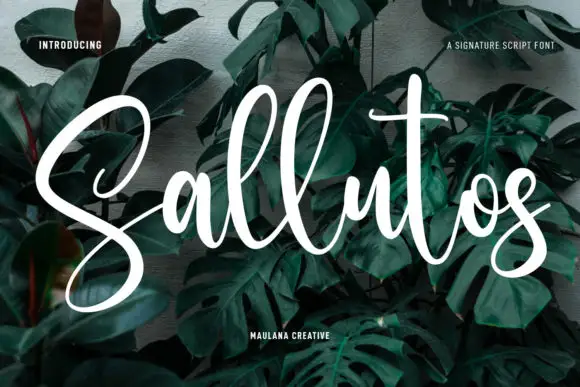
Thick monoline signature script
Sallutos is a signature script in white on a dark green leaf photograph: thick monoline letters, tall looped capitals, a flowing connection from the first letter to the last, and a long exit stroke that lifts off the word.
Ideas for this font
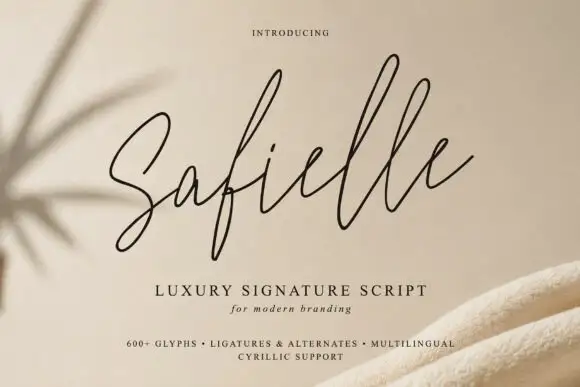
Very fine rising signature loops
Safielle is a very fine signature script in black on sand: hairline monoline strokes, tall narrow loops that rise well above the x-height and a lifted final stroke that ends the word with an open rise.
Ideas for this font
Same independent foundry
Allow optional Google Analytics to measure visits and catalogue actions. Your search words and notes are not included. Privacy & storage