High-Contrast Display Serif

Mama Claus + Kernova
Pairs sculptural editorial warmth with Mama Claus's clean modern geometry.
Inspect Kernova specimenDisclosure: MakerFileHub may earn a commission from qualifying purchases via paid links on this page. How our links work.
Heavy condensed bold sans
Mama Claus is a heavy condensed sans in red on cream: very thick stems, narrow counters, flat terminals and a tall x-height, with two stacked lines filling the plate and a tracked caption beneath, so the pair reads as a modern poster headline rather than a period display.
Paid link
Get this fontProject & layout blueprintsAt-a-glance maker compatibility
Sturdy stroke walls and open counters weed cleanly on adhesive vinyl, HTV apparel film, and cut cardstock.
Visual anatomy & craft review
The two words are set at the same width and the drawing is a grotesque pushed to its heaviest: the stems are wider than the counters, the joins are square, and the shoulders of the letters are tight, which makes the word read as a solid band with slots cut through it. The condensed width is what allows the heavy weight to stay readable: each letter is narrow enough that the mass never becomes one grey block, and the spacing is tight so the pair holds together. Because the weight is extreme, the face needs a display size and a flat ground, both of which the specimen supplies, with the red on cream doing the contrast work. A small tracked introduction above and a format line beneath are set in a light grotesque, and they are there to give the heavy display a scale reference rather than to decorate the plate.
Bold, condensed, heavy, modern
Two-font hierarchy recipes
Tested contrast partners — pairing Mama Claus with grounded secondary typography.
Mama Claus + Kernova
Pairs sculptural editorial warmth with Mama Claus's clean modern geometry.
Inspect Kernova specimen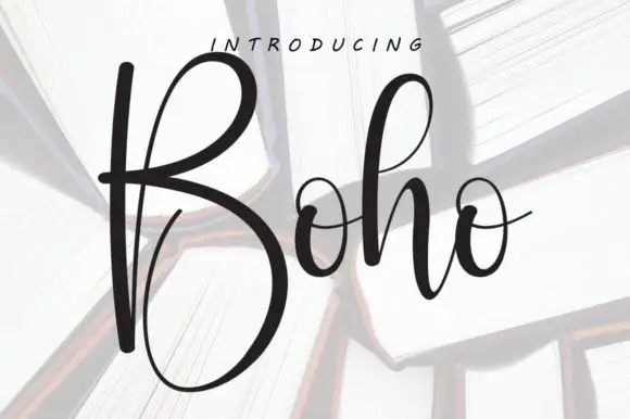
Mama Claus + Boho
Introduces organic movement on pull-quotes, signatures and gift tags.
Inspect Boho specimenPractical applications
Concrete hierarchy, scale and production guidance tailored to Mama Claus’s stroke geometry.
A heavy condensed sans reads on a fascia from across a street and prints as one flat colour, and the narrow width lets a two-word name sit on a band above a small door.
Hierarchy & layout recipe
Set the wordmark at 90 mm cap height on a 3,000 mm fascia, 20 pt on a card, and 11 pt on a cup stamp. Keep one colour and build a lighter companion weight for the address line so the mark stays the only heavy element.
Pre-production check
Check the 11 pt stamp, where the narrow counters can fill; keep the size above 9 pt or use the companion weight. Confirm the fascia letters read at forty metres and that the mark stamps cleanly on a curved cup.
A heavy condensed title gives a cover the confidence of a poster and lets a short masthead hold the top of the page while a photograph fills the rest without a scrim.
Hierarchy & layout recipe
Set the title at 120 mm cap height across 210 mm, the cover lines in a 9 pt grotesque, and the price at 7 pt. Keep the title in the upper third on a flat or dark area, and let the cover lines sit in the lower third.
Pre-production check
Check the title at 120 mm, where the tight spacing can merge two letters; open it by 10 units. Confirm the cover lines read at newsstand distance and that the title still parses at thumbnail size in an online listing.
A heavy condensed display fills a banner with a short phrase without shrinking the height, and the flat weight prints cheaply on vinyl where a script would need finer registration.
Hierarchy & layout recipe
Print 900 by 400 mm: the name at 160 mm cap height, the age in a 60 mm sans, and a 6 mm rule. Keep 30 mm margins, print one colour on a mid ground, and keep the two lines justified to the same width so the block looks intentional.
Pre-production check
Check the banner at six metres, where the narrow counters can close at distance; open the tracking slightly. Confirm the 60 mm age reads at four metres and that the eyelets clear the rule by 20 mm.
Technical & licence verification
Confirm included OTF/TTF/WOFF formats, full glyph tables and licence coverage on the live store page before batch production.
Closest visual alternatives
Matched across letterform anatomy, stroke behaviour and craft applications.
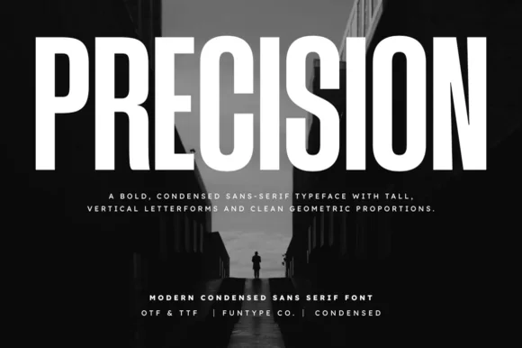
Tall ultra-condensed geometric headline grotesk
Precision is a bold, ultra-condensed sans serif typeface with tall vertical pillars, tight flat-sided counters, and clean modernist snap.
Ideas for this font
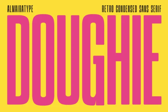
Ultra-tall 5:1 pillar-condensed retro poster sans
Doughie is an ultra-tall, compressed retro condensed sans stretching rounded-corner vertical pillars edge-to-edge across posters and packaging!
Ideas for this font

Ultra-narrow 6:1 skyscraper condensed editorial sans (OTF & TTF)
Homies is an extreme 6:1 ultra-condensed sans serif packing razor-slim, towering vertical bars for high-fashion streetwear & album art (OTF & TTF).
Ideas for this font
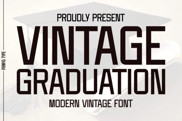
Condensed modern vintage sans
Vintage Graduation is a condensed sans in near-black on a pale ground, set over a graduation cap: tall narrow caps with flat terminals, a high waist, closed counters and tight spacing, arranged on two lines with a tracked label above and beneath in the same face.
Ideas for this font
Same independent foundry
Allow optional Google Analytics to measure visits and catalogue actions. Your search words and notes are not included. Privacy & storage