Neutral Sans Workhorse

Crafter Pieces + Cenura
Lets Crafter Pieces own the focal silhouette while handling secondary copy, sizing and subheads cleanly.
Inspect Cenura specimenDisclosure: MakerFileHub may earn a commission from qualifying purchases via paid links on this page. How our links work.
A mixed-style capital title combining slabs, narrow serifs and stencil-like interruptions
Crafter Pieces combines visibly different capital constructions in one black title, where a broad slab-like R sits beside a thin serif C, a sharply split A and narrow ornamental verticals, and the lower line adds another heavy P and a divided C.
Paid link
Get this fontProject & layout blueprintsAt-a-glance maker compatibility
Open counter bridges hold interior islands intact on laser-cut wood, acrylic, and mylar stencils.
Visual anatomy & craft review
The weights jump from letter to letter, the split strokes break the contours, the widths vary and the serifs mix between slab and hairline. That assembled construction is the character: the word looks cut from different pieces of type and pasted down, which is why the cover places it on torn paper. The torn edges and the small flower are presentation props, so test a short phrase for gaps and collisions and keep 40 pt before the split strokes disappear.
Assembled · Mixed construction · Split strokes
Two-font hierarchy recipes
Tested contrast partners — pairing Crafter Pieces with grounded secondary typography.
Crafter Pieces + Cenura
Lets Crafter Pieces own the focal silhouette while handling secondary copy, sizing and subheads cleanly.
Inspect Cenura specimen
Crafter Pieces + Bulgary
Grounds bold display lettering with classic typographic authority on posters, badges and apparel.
Inspect Bulgary specimenPractical applications
Concrete hierarchy, scale and production guidance tailored to Crafter Pieces’s stroke geometry.
The assembled capitals give a fair a handmade mark, and the mixed weights hold a two-word title at 48 pt on an A3 poster.
Hierarchy & layout recipe
Print an A3 poster: set the title at 48 pt over two rows, keep 20 mm of clear ground between the rows so the split strokes stay readable, and keep 22 mm of margin all round.
Pre-production check
Mixed letter widths open accidental gaps in a long word; check the poster and keep the title to two short words.
The assembled letters set an editorial title, and the varied constructions hold a two-word heading at 54 pt across a page.
Hierarchy & layout recipe
Print a 210 mm page: set the heading at 54 pt on one row, keep 20 mm beneath before the standfirst at 10 pt, and keep the block on a plain field so the fine serifs are not lost in texture.
Pre-production check
Split strokes printed over a textured background disappear; check the page and keep the title on flat colour.
The mixed construction suits a classroom door, and the heavy forms hold a short sign at 46 pt on a printed sheet, where the varied weights read as deliberate.
Hierarchy & layout recipe
Print an A4 sign: set the sign at 46 pt on one row, keep 20 mm of clear ground beneath before the room number at 14 pt, and keep 18 mm of margin so no split stroke is cropped.
Pre-production check
Fine ornamental verticals vanish at 24 pt; check the printed sheet and hold the sign at 40 pt or above.
Technical & licence verification
Confirm included OTF/TTF/WOFF formats, full glyph tables and licence coverage on the live store page before batch production.
Closest visual alternatives
Matched across letterform anatomy, stroke behaviour and craft applications.
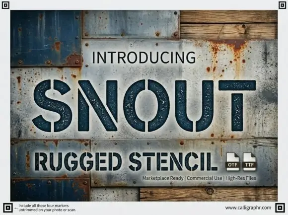
Wide rugged stencil capitals with narrow vertical gaps and speckled fill
Snout is a wide industrial stencil in which heavy capitals are interrupted by narrow vertical gaps, the S and O stay round against straight-sided N, U and T shapes and a speckled fill roughens the surface, so a word reads as a sprayed crate marking.
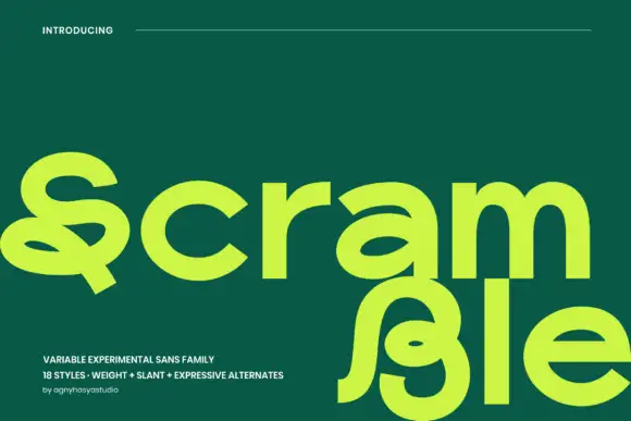
Broad experimental sans with looping forms
Scramble is a broad experimental display shown in lime on a deep green field: lowercase with a looping S that carries a long tail beneath the baseline, a b whose bowl folds into the stem, and a two-level composition in which the final letters drop below the line, with small tracked notes in the lower left and a plain header.
Ideas for this font
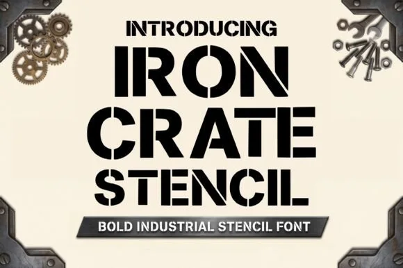
Heavy industrial crate stencil
Iron Crate Stencil builds ultra-bold industrial shipping-crate capitals, where thick vertical bars and generous bridges keep every letter and numeral centre open instead of dropping out as an island.
Ideas for this font
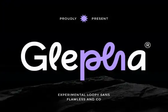
Looped rounded mixed case with interwoven central strokes and a deep p stem
Glepha shows white and purple lettering on black, where a broad open G introduces rounded lowercase forms, the l rises into a narrow loop and the central letters intertwine through a crossing horizontal stroke, while the p drops far below the main bodies and the final a keeps a simple broad bowl.
Ideas for this font
Same independent foundry
Allow optional Google Analytics to measure visits and catalogue actions. Your search words and notes are not included. Privacy & storage