Neutral Sans Workhorse

Ransom Square + Limited Coffee
Lets Ransom Square own the focal silhouette while handling secondary copy, sizing and subheads cleanly.
Inspect Limited Coffee specimenDisclosure: MakerFileHub may earn a commission from qualifying purchases via paid links on this page. How our links work.
Sticker-block hand-drawn caps
Ransom Square is a hand-drawn display in which every capital sits on its own dark rounded square: white letters of uneven width, slight rotations, and soft corners, so a word reads as a row of cut stickers rather than as a line of type.
Paid link
Get this fontProject & layout blueprintsAt-a-glance maker compatibility
Sturdy stroke walls and open counters weed cleanly on adhesive vinyl, HTV apparel film, and cut cardstock.
Visual anatomy & craft review
The two words are set as rows of individual dark tiles, each with a white letter inside, and the tiles vary slightly in size, corner radius and angle, which is what produces the ransom-note effect without any actual cutting. Inside each tile the letters are drawn with rounded strokes and a wobble that follows the hand, so the A and the R have different shoulder heights and the S is visibly wider than the Q, and the baseline of the word is therefore the bottom edge of the tiles rather than the letters themselves. Negative space does the rest of the work: the beige gaps between tiles are as wide as a thin stroke, which is what makes the construction read at a glance. The ground is a plain beige with a dried flower photograph at the edge, and the two caption lines above and below use the same tile device, which shows the face includes the tile as part of its design.
Cute, blocky, playful, hand-drawn
Two-font hierarchy recipes
Tested contrast partners — pairing Ransom Square with grounded secondary typography.
Ransom Square + Limited Coffee
Lets Ransom Square own the focal silhouette while handling secondary copy, sizing and subheads cleanly.
Inspect Limited Coffee specimen
Ransom Square + Bulgary
Grounds bold display lettering with classic typographic authority on posters, badges and apparel.
Inspect Bulgary specimenPractical applications
Concrete hierarchy, scale and production guidance tailored to Ransom Square’s stroke geometry.
A sticker-block face reads as playful before a child decodes the words, and the individual tiles keep every letter legible even when the colour of the ground changes.
Hierarchy & layout recipe
A6 card: the word at 34 pt, the details in a 9 pt rounded sans below, and the tiles set with 3 mm gaps so the background shows through. Keep the tile colour dark and the letters white, and leave 12 mm margins so the last tile never reaches the trim.
Pre-production check
Check the gaps at 34 pt, where a 2 mm gap closes up on a home printer; keep them at 3 mm minimum. Confirm the 9 pt details keep a 4.5:1 contrast on the beige and that no tile is clipped by the card's rounded corner.
Sticker-block letters are easy for young children to distinguish, and the tile construction means a label can be cut out by hand without losing the letters.
Hierarchy & layout recipe
Print A4 on adhesive paper: each name at 28 pt on its own row of tiles, the subject in a 12 pt rounded sans beneath, and a 5 mm gap between the name and the subject line. Keep 8 mm of clear adhesive around each tile so the hand cut follows the design.
Pre-production check
Check the print at 28 pt on the school's inkjet, where white letters inside dark tiles can show a halo; reduce the tile size rather than the letter. Confirm the tiles cut cleanly with scissors and that the 12 pt subject line still reads from a metre away.
A tile-based display makes a coherent sticker pack from one face, and each tile can carry a different word without any additional artwork.
Hierarchy & layout recipe
Die-cut 40 mm square stickers: one word per tile at 18 pt, with a 1.5 mm white border beyond the dark tile and a 2 mm gap to the die line. Keep the same tile colour across the pack so the stickers read as a set on a paper bag.
Pre-production check
Check the die line at 40 mm, where the white border must stay at least 1.5 mm wide after cutting. Confirm the 18 pt letters still read on a bag that is creased and angled, and that the sticker adhesive holds on kraft paper.
Technical & licence verification
Confirm included OTF/TTF/WOFF formats, full glyph tables and licence coverage on the live store page before batch production.
Closest visual alternatives
Matched across letterform anatomy, stroke behaviour and craft applications.
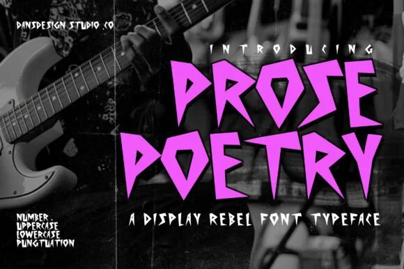
Angular punk display
Prose Poetry is an angular display in bright magenta over a black-and-white photograph: letters built from straight cuts and sharp points, with no curves at all, so the word reads as torn paper rather than as type.
Ideas for this font
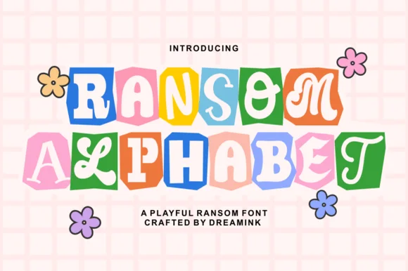
Cute pastel scrapbook & groovy ransom-tile font
Ransom Alphabet is a cheerful, kid-friendly ransom-cutout font pairing groovy 70s, serif, and bubble letters inside colorful rounded paper tiles.
Ideas for this font
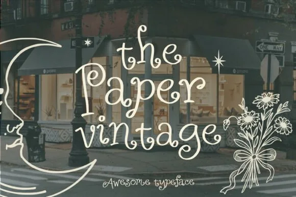
Whimsical outline hand-drawn script
The Paper Vintage is a whimsical outline script in cream over a photograph of a shopfront: a thin monoline drawn as an outline, exaggerated loops, mixed letter heights and curling swashes, framed by a line-art moon and a bouquet, so the plate reads as hand-drawn window lettering.
Ideas for this font
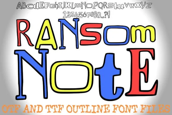
Colorable hand-drawn outline mixed-style ransom alphabet
Ransom Note (by squeebcreative) is an installable hand-drawn outline ransom font mixing mismatched serif, slab, and block letters ready to color.
Ideas for this font
Same independent foundry
Allow optional Google Analytics to measure visits and catalogue actions. Your search words and notes are not included. Privacy & storage