Neutral Sans Workhorse

Prose Poetry + Miniplate
Lets Prose Poetry own the focal silhouette while handling secondary copy, sizing and subheads cleanly.
Inspect Miniplate specimenDisclosure: MakerFileHub may earn a commission from qualifying purchases via paid links on this page. How our links work.
Angular punk display
Prose Poetry is an angular display in bright magenta over a black-and-white photograph: letters built from straight cuts and sharp points, with no curves at all, so the word reads as torn paper rather than as type.
Paid link
Get this fontProject & layout blueprintsAt-a-glance maker compatibility
Sturdy stroke walls and open counters weed cleanly on adhesive vinyl, HTV apparel film, and cut cardstock.
Visual anatomy & craft review
The two lines are set large and every letter is constructed from straight segments: the O is a hexagon, the R has a triangular leg, the E ends in points, and the diagonal cuts repeat across the alphabet, which gives the pair a consistent aggression. The stroke weight is heavy and even, so the word stays legible despite the sharp geometry, and the spacing is tight enough that neighbouring points almost meet. The magenta is the only colour in the frame and sits over a monochrome photograph of hands and instruments, so the type behaves as a printed overlay on a documentary image. Two small credit blocks in a condensed sans sit at the left edge, and a caption beneath the display names the style, which keeps the page reading as a specimen rather than a poster.
Punk, angular, rebel, loud
Two-font hierarchy recipes
Tested contrast partners — pairing Prose Poetry with grounded secondary typography.
Prose Poetry + Miniplate
Lets Prose Poetry own the focal silhouette while handling secondary copy, sizing and subheads cleanly.
Inspect Miniplate specimen
Prose Poetry + Cervelique
Grounds bold display lettering with classic typographic authority on posters, badges and apparel.
Inspect Cervelique specimenPractical applications
Concrete hierarchy, scale and production guidance tailored to Prose Poetry’s stroke geometry.
An angular display reads as torn paper, which suits a punk bill better than a horror face, and the single bright ink stands out on a dark ground.
Hierarchy & layout recipe
A2 portrait: the band name at 160 mm wide, the line-up in a 12 mm condensed sans, and the date at 30 mm. Keep the display on flat black with one bright spot colour and leave 30 mm margins around the points.
Pre-production check
Check the points at full size, where a sharp tip under 0.8 mm breaks in print; thicken the tips. Confirm the 12 mm line-up reads at two metres and that no point crosses the safe area.
An angular display gives a zine cover the look of a paste-up, and the single ink keeps a short photocopied run affordable.
Hierarchy & layout recipe
Set the title at 110 mm wide on an A5 cover, the issue number in a 9 pt condensed sans, and a 3 mm border. Print one ink on a bright stock so the cuts read as the only form on the page.
Pre-production check
Check the title after photocopying, where the sharp points can drop out; print from a laser original. Confirm the 9 pt issue number survives the copy and that the border stays inside the trim.
An angular word suits a label that wants to look confrontational, and one screen keeps the print cost low for a small run.
Hierarchy & layout recipe
Print a 280 mm chest graphic: the word at 80 mm cap height in one ink, the label name in a 5 mm condensed sans, and a 2 mm keyline. Keep the thinnest points at least 1.2 mm so the screen does not break them.
Pre-production check
Check the screen at actual mesh, where points under 1 mm fill in; thicken them for the print. Wash-test one shirt and confirm the word still reads as cut rather than as worn.
Technical & licence verification
Confirm included OTF/TTF/WOFF formats, full glyph tables and licence coverage on the live store page before batch production.
Closest visual alternatives
Matched across letterform anatomy, stroke behaviour and craft applications.
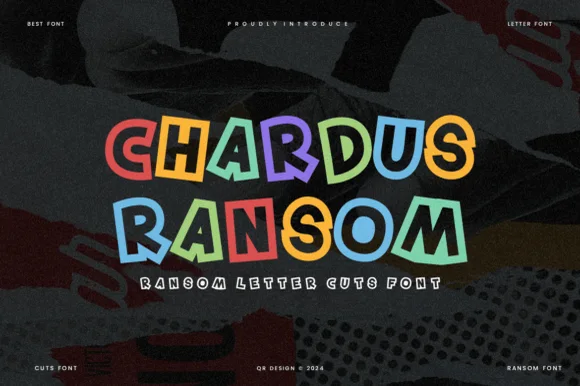
Clean geometric cut-tile ransom display (OTF & TTF)
Chardus Ransom is a crisp, graphic ransom-cut display font alternating solid and outlined letters with tilted geometric rectangle tiles.
Ideas for this font
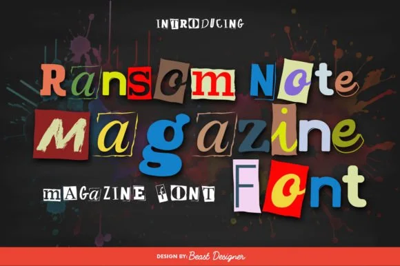
Full-color cut-paper magazine collage ransom font
Ransom Note Magazine is a colorful cut-out collage font placing mismatched serif, sans, and slab letters onto colorful torn magazine paper scraps.
Ideas for this font
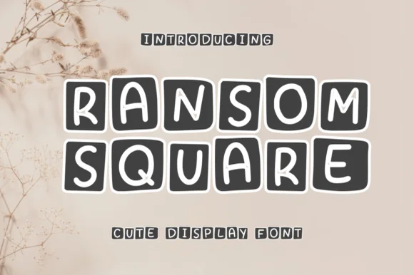
Sticker-block hand-drawn caps
Ransom Square is a hand-drawn display in which every capital sits on its own dark rounded square: white letters of uneven width, slight rotations, and soft corners, so a word reads as a row of cut stickers rather than as a line of type.
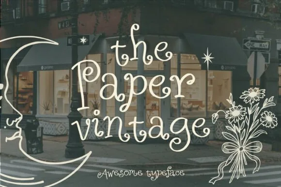
Whimsical outline hand-drawn script
The Paper Vintage is a whimsical outline script in cream over a photograph of a shopfront: a thin monoline drawn as an outline, exaggerated loops, mixed letter heights and curling swashes, framed by a line-art moon and a bouquet, so the plate reads as hand-drawn window lettering.
Ideas for this font
Same independent foundry
Allow optional Google Analytics to measure visits and catalogue actions. Your search words and notes are not included. Privacy & storage