Neutral Sans Workhorse

Prairie Belle + One More
Lets Prairie Belle own the focal silhouette while handling secondary copy, sizing and subheads cleanly.
Inspect One More specimenDisclosure: MakerFileHub may earn a commission from qualifying purchases via paid links on this page. How our links work.
Condensed western display with frame
Prairie Belle is a condensed western display in black on aged tan: tall narrow letters with tiny spurred serifs, a high waist and closed counters, set inside an ornamental border with corner scrolls, a sunburst above and a row of badges beneath, so the plate reads as a general-store sign.
Paid link
Get this fontProject & layout blueprintsAt-a-glance maker compatibility
Sturdy stroke walls and open counters weed cleanly on adhesive vinyl, HTV apparel film, and cut cardstock.
Visual anatomy & craft review
The word is set once, wide, and the drawing is a condensed western face: the stems are heavy, the serifs are small spurs, and the waist pinches, which keeps the letters narrow enough to fit a long name across a plate. Because the counters are closed and the width is tight, the face reads at a distance and in a single colour, and the specimen proves that by keeping the whole plate to one ink on tan. The frame does the period work: corner scrolls, a sunburst, star dividers, a horseshoe badge and two bracketed cartouches. Those elements belong to the product rather than the letterforms, and the plate uses them to show a whole sign rather than a specimen line, which is how a buyer would actually see the face used.
Western, condensed, display, nostalgic
Two-font hierarchy recipes
Tested contrast partners — pairing Prairie Belle with grounded secondary typography.
Prairie Belle + One More
Lets Prairie Belle own the focal silhouette while handling secondary copy, sizing and subheads cleanly.
Inspect One More specimen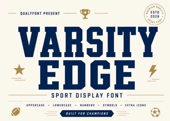
Prairie Belle + Varsity Edge
Grounds bold display lettering with classic typographic authority on posters, badges and apparel.
Inspect Varsity Edge specimenPractical applications
Concrete hierarchy, scale and production guidance tailored to Prairie Belle’s stroke geometry.
A condensed western face fits a long shop name on a narrow fascia, and the small spurs keep the silhouette readable at twenty metres where a fine western face would soften.
Hierarchy & layout recipe
Paint a 1,600 by 400 mm fascia: the name at 140 mm cap height, the goods in a 26 mm condensed slab, and a 6 mm rule. Keep 35 mm margins and paint one ink on a light board.
Pre-production check
Check the fascia at 140 mm, where closed counters can fill with paint; keep them above 8 mm and reduce the weight if necessary. Confirm the 26 mm goods read at four metres and that the rule clears the fixing points.
A condensed western display frames a rural memoir as a period sign, and the tall letters let a long title fit a cover width on one line.
Hierarchy & layout recipe
Set the title at 90 mm cap height across 210 mm, the subtitle in a 12 pt slab, and the author at 9 pt caps. Print one ink on a kraft stock and keep the scroll border as the only ornament.
Pre-production check
Check the title at thumbnail size, where the condensed forms can clot; keep the letter spacing even. Confirm the 9 pt author survives lamination and that the border clears the trim by 10 mm.
A western display suits a rural venue better than a formal script, and the condensed width lets the couple's names and the venue share one board.
Hierarchy & layout recipe
A1 board: the greeting at 80 mm cap height, the names in a 40 mm slab, and the date at 22 mm. Keep 40 mm margins, paint one ink on a light board, and keep the sunburst away from the names.
Pre-production check
Check the board at four metres, where narrow letters can look crowded; open the spacing slightly. Confirm the 22 mm date reads from the door and that the frame sits square on the board.
Technical & licence verification
Confirm included OTF/TTF/WOFF formats, full glyph tables and licence coverage on the live store page before batch production.
Closest visual alternatives
Matched across letterform anatomy, stroke behaviour and craft applications.
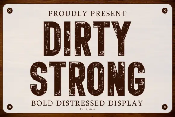
Condensed capitals with coarse scattered erosion and straight stems
Dirty Strong is a condensed industrial display in which the stems run straight and narrow, the bowls stay compact and coarse patches of wear break the fill at several scales, so a heading reads as paint on a warehouse sign.
Ideas for this font
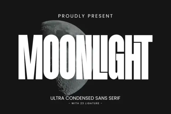
Ultra condensed display sans
Moonlight is an ultra condensed sans in white over a photograph of the moon: very tall narrow caps with square terminals, flat shoulders and tight spacing, with twenty-three ligatures that let letters lock together, so the word reads as a masthead stretched across the frame.
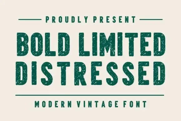
Condensed plain blocks with fine worn texture
Bold Limited Distressed shows tall heavy capitals with softly squared corners and tight inner spaces, where small pale speckles interrupt the green stems without greatly changing the outer silhouettes.
Ideas for this font
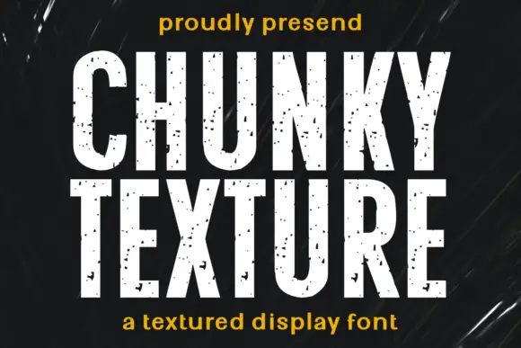
Condensed heavy capitals with sparse chips across pale faces
Chunky Texture is a condensed heavy display in which the stems run straight, the bowls stay compact and fine specks plus occasional larger chips interrupt the faces, so a heading reads as painted stencil with light wear.
Ideas for this font
Same independent foundry
Allow optional Google Analytics to measure visits and catalogue actions. Your search words and notes are not included. Privacy & storage



