Modern Grotesque Body

Davenia + Limited Coffee
Creates crisp high-hierarchy contrast beneath Davenia headlines across menus, websites and labels.
Inspect Limited Coffee specimenDisclosure: MakerFileHub may earn a commission from qualifying purchases via paid links on this page. How our links work.
Heavy soft serif lettering with a broad D tail and hooked n ending
Davenia Retro sets a bold serif with high-waisted bowls, a round shoulder and a D that opens into a swash, so a two-word title looks like a printed poster from the early seventies.
Paid link
Get this fontProject & layout blueprintsAt-a-glance maker compatibility
Weld or Unite overlapping script joins into one continuous vector path before sending to the blade.
Visual anatomy & craft review
Davenia over Retro fills a split cover, cream on dark above and cream over a warm portrait below, the bowls riding high and the joins heavy. The R keeps a small head and a wide leg, the e a circular eye and the t a flat bar, and the D begins with a curved entry that sets the tone for the whole line. Corner notes name the studio, the classification and a glyph count. The face has one weight and no ornament, so its character comes from the proportions, and those proportions need size: at caption sizes the high bowls and tight spacing make the line look squashed.
Heavy soft serif lettering with a broad D tail and hooked n ending
Two-font hierarchy recipes
Tested contrast partners — pairing Davenia with grounded secondary typography.
Davenia + Limited Coffee
Creates crisp high-hierarchy contrast beneath Davenia headlines across menus, websites and labels.
Inspect Limited Coffee specimen
Davenia + Abigail
Adds a warm human signature touch for 1-to-3-word callouts without competing against structured serif capitals.
Inspect Abigail specimenPractical applications
Concrete hierarchy, scale and production guidance tailored to Davenia’s stroke geometry.
The high bowls and the swash capital give a cover the look of a printed sleeve, and the bold weight holds over a full-bleed portrait.
Hierarchy & layout recipe
Print a 210 by 280 mm cover: set the cover line at 90 pt across one row, keep 22 mm of clear ground beneath before the standfirst at 11 pt, and keep 18 mm of margin from the trim edge.
Pre-production check
Bold serifs over a photograph need contrast; check the proof before the cover is signed off.
The retro serif signals the stock on sale before a visitor reads a word, and two lines fill a poster with no illustration behind them.
Hierarchy & layout recipe
Print an A2 poster: set the title at 104 pt across two rows, keep 28 mm of clear ground beneath before the date at 18 pt, and keep 28 mm of border so the swash stays inside the sheet.
Pre-production check
The swash capital overhangs its side bearing; check the layout at final size before printing.
The period letterforms give a bottle a shelf character, and the bold weight holds on a narrow wrap where a light serif would thin out.
Hierarchy & layout recipe
Print a 50 by 110 mm wrap label: set the brand at 18 pt on one row, keep 9 mm of clear ground beneath before the flavour at 6 pt, and keep 6 mm of clear area at each side of the curve.
Pre-production check
Curved labels squeeze wide letters; check a wrapped mock-up before the print run. Verify the result on the printed piece, then approve.
Technical & licence verification
Confirm included OTF/TTF/WOFF formats, full glyph tables and licence coverage on the live store page before batch production.
Closest visual alternatives
Matched across letterform anatomy, stroke behaviour and craft applications.
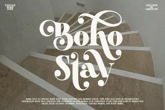
Heavy soft serifs with large ball-ended looping swashes
Boho Stay is a heavy soft serif in which the letters carry strong thick-thin contrast, the counters stay tight and large curled swashes with ball ends frame the capital, rise over the first row and sweep between the two title lines.
Ideas for this font
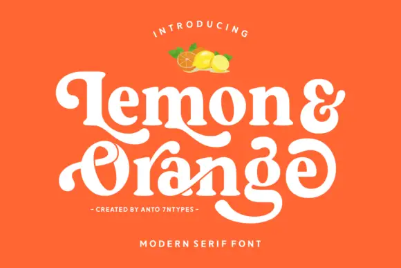
Rounded retro serif with loops
Lemon and Orange is a heavy rounded serif in cream on orange: fat stems with curled terminals, a looping O whose stroke escapes the bowl, a drawn ampersand and a swash that runs under the second word, with a small illustration of fruit above and two tracked lines beneath.
Ideas for this font
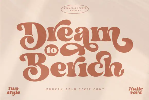
Heavy soft retro lettering with large interwoven loops
Dream to Berich shows orange mixed-case letters with thick rounded strokes and tight curved counters, where the large D and B capitals curl inward and a long loop fills the gap between the two title rows on a pale cover that advertises a two-style and an italic version in the corners.
Ideas for this font
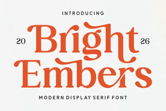
Substantial serif with wavy upper bars and curled lower terminals
Bright Embers is a substantial serif in which the bowls stay broad, the stems hold firm, selected upper bars wave and the t and final s turn into low outward curves, so a two-row heading reads as warm editorial lettering.
Ideas for this font
Same independent foundry
Allow optional Google Analytics to measure visits and catalogue actions. Your search words and notes are not included. Privacy & storage