Neutral Sans Workhorse

Shinier + Modern Limited
Lets Shinier own the focal silhouette while handling secondary copy, sizing and subheads cleanly.
Inspect Modern Limited specimenDisclosure: MakerFileHub may earn a commission from qualifying purchases via paid links on this page. How our links work.
Experimental looped display
Shinier is an experimental display in cream and orange on a walnut cabinet: rounded mixed case in which tall loops are threaded through the letters, an interlocked final n and r, and a registered mark at the shoulder, with a plain sans caption at the foot.
Paid link
Get this fontProject & layout blueprintsAt-a-glance maker compatibility
Sturdy stroke walls and open counters weed cleanly on adhesive vinyl, HTV apparel film, and cut cardstock.
Visual anatomy & craft review
The two words are stacked at different scales and the drawing is a rounded display with additions: loops are threaded through the h and the n, the final letters interlock, and the strokes swell and narrow, so the word reads as a drawn logo rather than as typesetting. That construction sets a large size floor and makes the face unsuitable for anything but a short word, which the plate implicitly admits by setting two short words. The cabinet behind it is staging that gives the cream a warm ground, and the oval badge naming the experiment is product copy. The plain caption at the foot is set in a neutral sans, which is the right counterweight to a display face with this much personality, and it shows the buyer what to pair it with.
Display, experimental, rounded, loopy
Two-font hierarchy recipes
Tested contrast partners — pairing Shinier with grounded secondary typography.
Shinier + Modern Limited
Lets Shinier own the focal silhouette while handling secondary copy, sizing and subheads cleanly.
Inspect Modern Limited specimen
Shinier + The Simple Editorial
Grounds bold display lettering with classic typographic authority on posters, badges and apparel.
Inspect The Simple Editorial specimenPractical applications
Concrete hierarchy, scale and production guidance tailored to Shinier’s stroke geometry.
An experimental display gives a shop a mark that reads as drawn, and the loops keep the word distinctive on a small sticker.
Hierarchy & layout recipe
Set the mark at 20 pt on a sticker, 90 mm on a window and 14 pt on a card, keeping the loops only above 24 pt. Keep one colour and clear space equal to half the mark height.
Pre-production check
Check the 14 pt card mark, where a loop can close; drop the loops at that size. Confirm the window mark reads at six metres and that the interlock stays open in vinyl.
A loopy display sets a release apart on a shelf, and the heavy rounded strokes hold against a photograph. It reads as a logo rather than as typesetting.
Hierarchy & layout recipe
Set the title at 80 mm cap height across 180 mm, the artist in a 10 pt sans, and the label at 8 pt. Print two colours on a matte stock and keep the loops clear of the artist line.
Pre-production check
Check the title at 80 mm, where a thin loop can break in print; keep it above 0.4 mm. Confirm the 8 pt label reads and that the loops clear the trim by 10 mm.
An experimental face makes a launch card feel designed, and the orange accent can carry the date without a second face. It holds at party scale.
Hierarchy & layout recipe
A6 card: the greeting at 22 pt, the details in a 9 pt sans, and the date at 8 pt. Keep 15 mm margins and print two colours on a cream card. Leave 20 mm at the foot for the label line.
Pre-production check
Check the 22 pt greeting, where a loop can crowd the line above; keep 6 mm leading. Confirm the 9 pt details keep a 4.5:1 contrast and that the card folds flat.
Technical & licence verification
Confirm included OTF/TTF/WOFF formats, full glyph tables and licence coverage on the live store page before batch production.
Closest visual alternatives
Matched across letterform anatomy, stroke behaviour and craft applications.
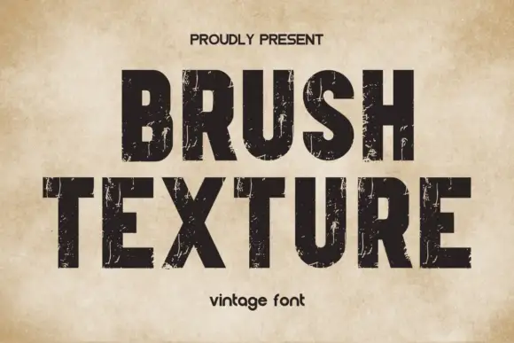
Heavy compact capitals crossed by fine vertical scratches
Brush Texture shows solid black blunt capitals with tall compact bowls on an aged cream field, where thin pale streaks scrape vertically through the ink rather than reading as a brush script, and the fine marks vary in density from letter to letter.
Ideas for this font
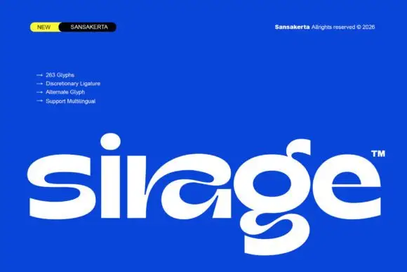
Wide display lowercase with flowing joints
Sirage is a wide display in white on a saturated blue: lowercase with a flowing a construction that sweeps through the bowl, an extended double-bowl g, thick even strokes and round terminals, set as one large word with a small badge at the top left and a list of features beside it.
Ideas for this font
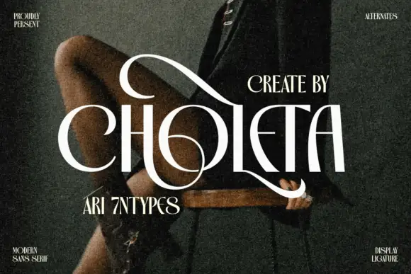
Contrasting capitals woven through a large upper loop and low circular sweep
Choleta builds tall white capitals and then lets thin strokes cross through them, so the counters open into slashes and the whole line reads as one sculpted ligature rather than six separate letters.
Ideas for this font
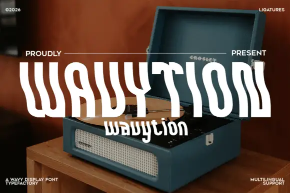
Waved condensed display
Wavytion is a waved display in white over a photograph of a portable record player: very tall narrow forms whose stems bend into broad alternating waves, so the word reads as a ribbon, with a second line in a softer wave beneath and small notes in the corners.
Ideas for this font
Same independent foundry
Allow optional Google Analytics to measure visits and catalogue actions. Your search words and notes are not included. Privacy & storage