Editorial Serif Anchor

Patriotic + Gorga
Anchors Patriotic's fluid strokes with crisp Roman proportions on wedding suites, headers and packaging.
Inspect Gorga specimenDisclosure: MakerFileHub may earn a commission from qualifying purchases via paid links on this page. How our links work.
Condensed hand-brushed display
Patriotic 4 is a condensed hand-brushed display in black on a pale photographic ground: tall narrow capitals of irregular width, a slight forward lean, and edges that are cut by the brush rather than squared, so the word reads as sign painting.
Paid link
Get this fontProject & layout blueprintsAt-a-glance maker compatibility
Weld or Unite overlapping script joins into one continuous vector path before sending to the blade.
Visual anatomy & craft review
The word is set across the middle of a photograph of a stone eagle, and the drawing is a brush letter rather than a type design: the stems are tall and heavy, the widths shift from letter to letter, and the terminals are cut at the angle the brush left them, which is why the letters look individual. Because every letter is condensed, the word fits the frame at a large size while keeping the cap height, and the spacing is tight enough to read as one painted line. The counters are narrow but open, so the word stays legible at a distance, and the baseline is level despite the irregular edges. The ground is a pale, low-contrast photograph, and the two captions are set in a plain grotesque, which keeps the brush face as the only textured element.
Condensed, brushed, uneven, bold
Two-font hierarchy recipes
Tested contrast partners — pairing Patriotic with grounded secondary typography.
Patriotic + Gorga
Anchors Patriotic's fluid strokes with crisp Roman proportions on wedding suites, headers and packaging.
Inspect Gorga specimen
Patriotic + Lemon Milk Pro FTR
Keeps small-scale dates, URLs, nutrition facts and care instructions crisp and legible below script titles.
Inspect Lemon Milk Pro FTR specimenPractical applications
Concrete hierarchy, scale and production guidance tailored to Patriotic’s stroke geometry.
A brushed condensed face reads as hand-painted glass, which suits a barbershop, and the narrow letters let a long shop name fit a fascia board.
Hierarchy & layout recipe
Paint a 1,200 by 400 mm fascia: the name at 220 mm cap height, the services in a 40 mm grotesque, and a 5 mm hand-drawn rule beneath. Keep 40 mm between the display and the rule so the descenders stay clear.
Pre-production check
Check the painted board at five metres, where brush edges can read as a shaky hand; keep the stroke consistent in width. Confirm the 40 mm services line reads from three metres and that the rule clears the lowest descender.
A condensed brush face gives a sports feature the look of a painted stadium sign, and the tall letters hold a long headline on a portrait cover.
Hierarchy & layout recipe
Set the title at 120 pt in two lines on a 234 mm cover, the standfirst in a 10 pt sans beneath, and the folio in 8 pt. Keep the title on a clear area of the photograph so the brush edges read against a simple value.
Pre-production check
Check the title at 120 pt over the image, where brush edges can be mistaken for a mask problem; keep the contrast above 4.5:1. Confirm the 10 pt standfirst reads at arm's length and that the two lines do not collide.
A brushed condensed face reads as a fairground banner, and the tall letters stay legible from a distance where a rounded display would blur.
Hierarchy & layout recipe
A2 portrait: the fair name at 150 mm cap height, the dates in a 16 mm grotesque, and a 6 mm rule at 25 mm from the trim. Keep 30 mm margins and print one ink on a pale board so the brush edges show.
Pre-production check
Check the poster at four metres, where the uneven widths can look like careless spacing; keep the tracking even. Confirm the 16 mm dates read at three metres and that the rule does not cross the display's descenders.
Technical & licence verification
Confirm included OTF/TTF/WOFF formats, full glyph tables and licence coverage on the live store page before batch production.
Closest visual alternatives
Matched across letterform anatomy, stroke behaviour and craft applications.
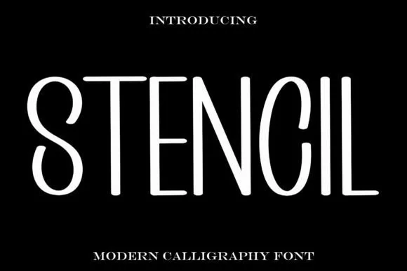
Tall thin modern stencil
Stencil is a tall thin display in white on black: elongated letters with hairline strokes, wide open counters, a high waist and a generally stencil-like separation at the joins, so the word reads as contemporary signage rather than as a military stencil.
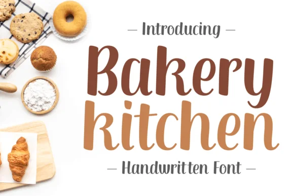
Tall bouncy disconnected brush-pen kitchen display
Bakery Kitchen is a tall, warm disconnected brush-pen display font (zero cursive joins!) pairing thick downstrokes with curled 'n/y' hooks.
Ideas for this font
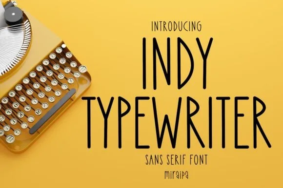
Tall condensed handwritten monoline sans serif (NOT a serif typewriter!)
Indy Typewriter is actually a tall, friendly monoline handwritten sans serif—zero serifs or mechanical slabs despite the 'Typewriter' name!
Ideas for this font
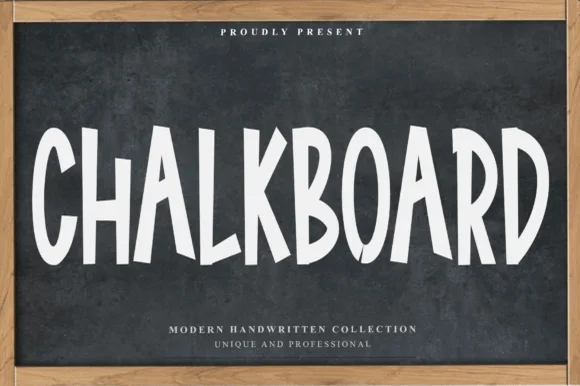
Tall condensed solid marker font for chalkboards & Cricut vinyl
Chalkboard (by Preketek texs) is a tall, condensed SOLID handwritten marker font—giving you chalkboard proportions that actually cut cleanly on Cricut vinyl!
Ideas for this font
Same independent foundry
Allow optional Google Analytics to measure visits and catalogue actions. Your search words and notes are not included. Privacy & storage