Editorial Serif Anchor

Brittany Writing + The Avenue Editorial
Anchors Brittany Writing's fluid strokes with crisp Roman proportions on wedding suites, headers and packaging.
Inspect The Avenue Editorial specimenDisclosure: MakerFileHub may earn a commission from qualifying purchases via paid links on this page. How our links work.
Very tall contrast handwriting with long horizontal swashes and fine joins
Brittany Writing is a very tall handwriting script in which the ascenders run far above the x-height, the joins stay fine and both capital letters carry long horizontal swashes that lift the word off the line.
Paid link
Get this fontProject & layout blueprintsAt-a-glance maker compatibility
Weld or Unite overlapping script joins into one continuous vector path before sending to the blade.
Visual anatomy & craft review
The capital B opens with a tall looped stem and the first word runs in a narrow band, with the double l rising into high loops above the smaller letters and the i keeping a light dot placed well clear. The capital W of the second word repeats the gesture on a wider span, and its swash extends past the letter body as a fine horizontal stroke. Weight is heavy on the downstrokes and hairline on the joins, so the tall letters read as drawn with a pointed pen rather than with a marker. That contrast is the fragile part: it needs a coated stock and a size of 20 pt or more. The white plate, the fountain pen, the sparkles and the small banded caption are presentation; the script is the two words.
Tall · Contrasted · Swashed
Two-font hierarchy recipes
Tested contrast partners — pairing Brittany Writing with grounded secondary typography.
Brittany Writing + The Avenue Editorial
Anchors Brittany Writing's fluid strokes with crisp Roman proportions on wedding suites, headers and packaging.
Inspect The Avenue Editorial specimen
Brittany Writing + Clyne Sans
Keeps small-scale dates, URLs, nutrition facts and care instructions crisp and legible below script titles.
Inspect Clyne Sans specimenPractical applications
Concrete hierarchy, scale and production guidance tailored to Brittany Writing’s stroke geometry.
The tall reach gives a small card presence without ornament, and the fine joins keep both names readable at 22 pt across a landscape format.
Hierarchy & layout recipe
Print a 148 by 105 mm card: set both names at 22 pt on one line, set the date in a 7 pt caps serif beneath, and leave 17 mm of margin at each side so the capital swash finishes inside the trim rather than running off the edge.
Pre-production check
A hairline join under 0.12 mm breaks on uncoated stock; ask the printer for the minimum line and thicken the joins rather than the downstrokes.
The pointed-pen contrast carries the craft the teacher sells, and the tall letters still read at 15 pt on a card where a flatter script would look generic.
Hierarchy & layout recipe
Print a 90 by 55 mm card: set the name at 15 pt across the upper third, set the classes in a 6 pt caps sans below, and keep 10 mm of clearance under the descender so the swash does not collide with the contact block.
Pre-production check
At 15 pt the hairline joins can disappear on a laser printer; check one printed card and move the name onto the coated stock if the joins break.
The tall script gives a menu a ceremonial head while the dish list stays quiet, and the contrast survives at 26 pt on a coated card.
Hierarchy & layout recipe
Print an A5 menu: set the header at 26 pt, set the courses in a 9 pt serif at 13.5 pt leading, and hold 13 mm below the swash before the first course line so the fine stroke does not sit on the dish names.
Pre-production check
A long swash over a printed list reads as a rule rather than a letter; check the menu at final size and shorten the swash on the second capital.
Technical & licence verification
Confirm included OTF/TTF/WOFF formats, full glyph tables and licence coverage on the live store page before batch production.
Closest visual alternatives
Matched across letterform anatomy, stroke behaviour and craft applications.
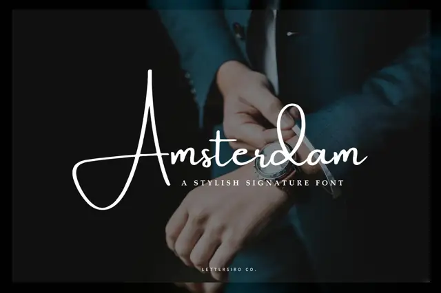
Very thin signature script with a large open capital
Amsterdam is a very thin signature script whose capital opens into a wide oval before the rest of the word runs, and the whole name is set so lightly that it reads as a pen mark on the photograph behind it.
Ideas for this font
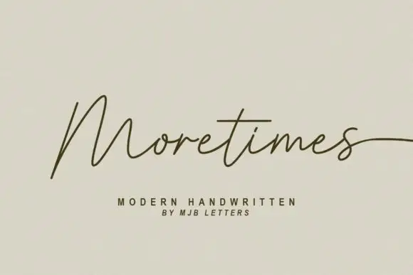
Light modern handwriting with long exits
Moretimes is a light modern handwriting script in olive brown on cream: hairline monoline strokes, an M built from open peaks, and a final s that runs out to the edge of the frame.
Ideas for this font
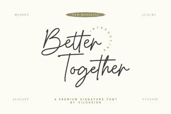
Fine crossed signature script
Better Together is a fine connected signature script with an open looped B, an even monoline weight and long horizontal strokes that cross beneath both words.
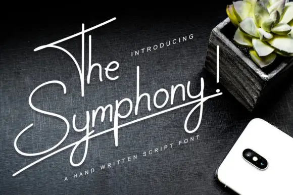
Very thin rising monoline script
The Symphony! is a very thin monoline script in white on a dark wood surface: tall narrow letters, a baseline that rises to the right, and a long horizontal stroke that underlines the whole phrase.
Ideas for this font
Same independent foundry
Allow optional Google Analytics to measure visits and catalogue actions. Your search words and notes are not included. Privacy & storage