Neutral Sans Workhorse

Eloy + Mansory
Lets Eloy own the focal silhouette while handling secondary copy, sizing and subheads cleanly.
Inspect Mansory specimenDisclosure: MakerFileHub may earn a commission from qualifying purchases via paid links on this page. How our links work.
Three-dimensional interlocking toy-brick display with studded tops
Eloy is a three-dimensional display alphabet in which each letter is built from interlocking bricks with studded tops, shaded sides and a lit front face, so a word reads as something assembled rather than printed.
Paid link
Get this fontProject & layout blueprintsAt-a-glance maker compatibility
Sturdy stroke walls and open counters weed cleanly on adhesive vinyl, HTV apparel film, and cut cardstock.
Visual anatomy & craft review
The E stacks three brick courses with studs on each top edge, the L turns a corner with a visible side face and the Y splits into two shaded arms, all at a heavy weight with bevelled edges, a light top plane and a darker side plane. That construction is what makes the face work at poster scale: the shading reads as a light source at 60 pt, and the studs read as texture rather than detail. Because each letter is an assembly, the fit is generous and a four-letter name spans a panel. Below 30 pt the studs become noise. The midnight sky, the scattered bricks, the small badges are presentation; the display face is the word shown.
Toy-brick · Dimensional · Playful
Two-font hierarchy recipes
Tested contrast partners — pairing Eloy with grounded secondary typography.
Eloy + Mansory
Lets Eloy own the focal silhouette while handling secondary copy, sizing and subheads cleanly.
Inspect Mansory specimen
Eloy + Cervelique
Grounds bold display lettering with classic typographic authority on posters, badges and apparel.
Inspect Cervelique specimenPractical applications
Concrete hierarchy, scale and production guidance tailored to Eloy’s stroke geometry.
The three-dimensional blocks give a party poster the theme at 90 pt, and the shaded faces read as depth without an illustration of a toy.
Hierarchy & layout recipe
Print an A2 poster: set the name at 90 pt across the middle, set the details in a 16 pt rounded sans beneath, and keep 25 mm of margin so the studded tops stay inside the trim on every edge.
Pre-production check
Stud detail under 2 mm reads as noise below 40 pt; check the proof at final size and drop the studs on the smaller lines.
The shaded letters read on a printed cake board at 35 mm, and the brick construction ties a birthday print to the theme without a licensed character.
Hierarchy & layout recipe
Print a 250 mm round board: set the name at 35 mm across the upper half, set the age in a 12 pt rounded sans below, and keep 25 mm of clear board around the edge so the studs are not cropped by the rim.
Pre-production check
A board printed to the edge is trimmed after printing; check the trim line against the artwork and keep the name inside 85 percent of the diameter.
The dimension reads on a small sticker at 25 mm, and the studded tops give a favour a toy-like character that a flat face would miss.
Hierarchy & layout recipe
Print a 50 mm round sticker: set the name at 25 mm, keep 5 mm inside the die so the shaded side face survives the cut, and check that the studs still read at that size.
Pre-production check
A shaded side face under 2 mm looks like a shadow error; check the printed sticker and use the flat cut below 25 mm.
Technical & licence verification
Confirm included OTF/TTF/WOFF formats, full glyph tables and licence coverage on the live store page before batch production.
Closest visual alternatives
Matched across letterform anatomy, stroke behaviour and craft applications.
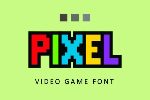
Clean uniform square-grid 8-bit block
Pixel constructs 8-bit arcade capitals from uniform square blocks, with no diagonal curves and no tiny notches, so every edge follows a crisp orthogonal pixel grid on a fixed unit.
Ideas for this font
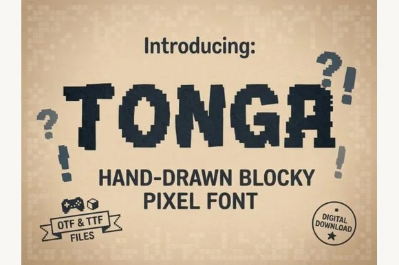
Hand-drawn blocky pixel display
Tonga is a hand-drawn pixel display in navy on a dotted tan ground: chunky capitals built from irregular square blocks, stepped edges that wobble by a pixel or two, and matching question and exclamation marks drawn in the same blocks.
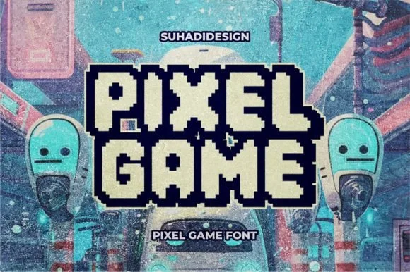
Double-outlined retro pixel arcade alphabet with a filled inner core
Pixel Game is an arcade alphabet in which every letter carries two outlines and a filled core, so a word reads as an eight-bit game logo rendered as a sticker.
Ideas for this font
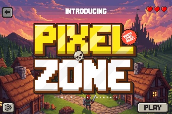
Chunky sixteen-bit pixel lettering with bevelled corners
Pixel Zone is a chunky sixteen-bit display in which every stem is built from square blocks, the corners bevel slightly and the strokes carry mass, so a title reads as an arcade logo rather than as a modern squarish sans.
Ideas for this font
Same independent foundry
Allow optional Google Analytics to measure visits and catalogue actions. Your search words and notes are not included. Privacy & storage