Neutral Sans Workhorse

Cali + Headline
Lets Cali own the focal silhouette while handling secondary copy, sizing and subheads cleanly.
Inspect Headline specimenDisclosure: MakerFileHub may earn a commission from qualifying purchases via paid links on this page. How our links work.
Heavy streaky hog-bristle wall-paint brush font (OTF & TTF)
Cali is a bold, wide-bristle rough brush display font streaked with authentic paint-roller and dry-brush fibers (OTF & TTF).
Paid link
Get this fontProject & layout blueprintsAt-a-glance maker compatibility
Fine grain and micro-texture excel in 300 DPI print, sublimation, and screen print rather than small vinyl weeding.
Visual anatomy & craft review
Cali is a casual brush-lettered display with thick marker strokes, tapered entry and exit strokes and a relaxed baseline that rises and falls across a word, so it reads as a hand-painted sign on a beach shack. The taper is what gives it movement, and the uneven ends mean it looks right in one flat colour with no outline. It needs roughly 26 mm for the taper to read as a stroke, and it is best in a warm ink on pale timber or in white on a bright ground.
Wall-bristle · Heavy-stroke · Textured
Two-font hierarchy recipes
Tested contrast partners — pairing Cali with grounded secondary typography.
Cali + Headline
Lets Cali own the focal silhouette while handling secondary copy, sizing and subheads cleanly.
Inspect Headline specimen
Cali + Majestic Letters
Grounds bold display lettering with classic typographic authority on posters, badges and apparel.
Inspect Majestic Letters specimenPractical applications
Concrete hierarchy, scale and production guidance tailored to Cali’s stroke geometry.
Loose brush lettering reads as a cart that painted its own sign, which is what a small coffee operator wants. The taper holds in one ink on a chalkboard or a cup, and the relaxed baseline lets a short name fill a 90 mm cup band without a second line.
Hierarchy & layout recipe
Cart sign 900 x 600 mm, word 170 mm, 60 mm margins and 25 mm frame clearance. Cup print 200 x 90 mm, word 25 mm, 12 mm from the rim. Tote print 300 x 300 mm, word 70 mm, 60 mm margins.
Pre-production check
A cup print wraps a cylinder and a baseline that rises on a flat file tilts visibly on the cup. Use the printer's wrap template and keep the word inside a 120 mm band, and check one printed cup before the batch.
Brush-painted lettering reads as a travel journal rather than a magazine masthead, which is what a city guide uses on an opener. The taper gives the headline movement over a photograph, and one ink keeps a small print run affordable.
Hierarchy & layout recipe
Opener 420 x 297 mm, headline 110 mm, standfirst 12/16 pt, 15 mm margins. Cover 148 x 210 mm, title 54 mm, cover lines 8/11 pt, 15 mm margins. Caption header 60 x 30 mm, word 14 mm, 6 mm margins.
Pre-production check
A headline set over a photograph needs a clear area, and a tapered stroke crossing a busy detail disappears. Place the word over a 40 percent black scrim or in an empty sky area, and check one spread printed before the run.
Relaxed brush lettering reads as a seasonal beach business rather than a resort chain, which is what a surf school sells. The taper holds at 160 mm on a sign in one bright ink, and the loose baseline matches the casual tone of a rental counter.
Hierarchy & layout recipe
Menu 210 x 297 mm, sections 20 mm, items 9/12 pt, 15 mm margins. Sign 900 x 400 mm, word 160 mm, 60 mm margins and 25 mm frame clearance. Board decal 200 x 60 mm, word 20 mm, 4 mm die margin.
Pre-production check
A surfboard decal flexes with the board and a tapered stroke cracks along the stringer line. Split the decal either side of the stringer, and check one applied board after a session in the water.
Technical & licence verification
Confirm included OTF/TTF/WOFF formats, full glyph tables and licence coverage on the live store page before batch production.
Closest visual alternatives
Matched across letterform anatomy, stroke behaviour and craft applications.
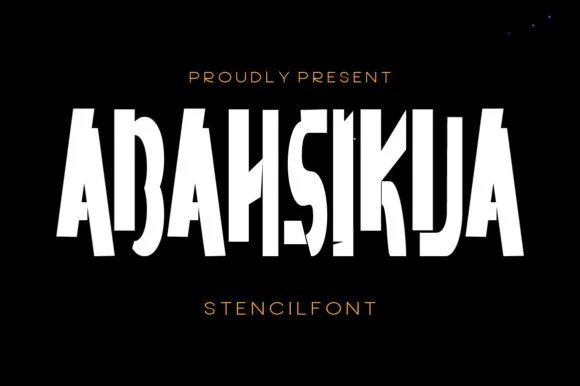
Tall condensed diagonal-sliced architectural stencil display
Abahsikua is a tall, condensed modern stencil display font sliced by bold diagonal negative-space cuts across geometric block pillars.
Ideas for this font
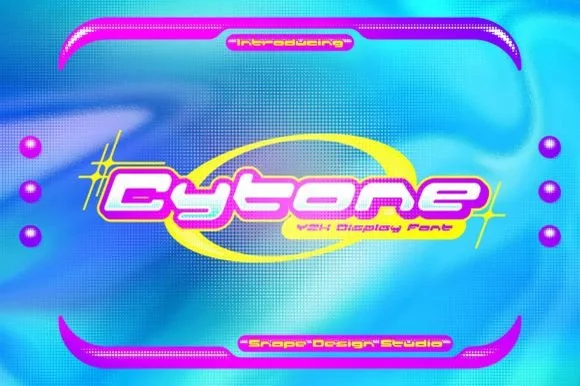
Extended geometric Y2K techno-pop capsule display
Cytone is a wide, upbeat Y2K display font sculpting low-slung geometric capsule letters built for orbital rings and glossy pop graphics.
Ideas for this font
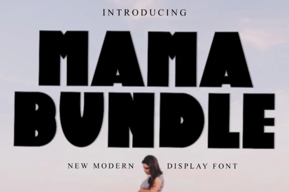
Fat condensed display with notched counters
Mama Bundle is a fat condensed display in black on a pale sky: extremely heavy strokes, counters reduced to narrow slots, letters set almost touching, and small notches cut into the tops of the M and the A that keep the mass from reading as a solid block.
Ideas for this font
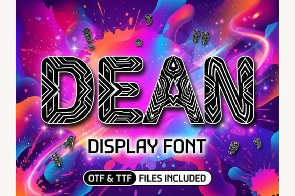
Cybernetic circuit-maze & tribal-line block display
Dean is a bold geometric block display typeface filled inside every thick stem with intricate parallel maze and circuit-board pathways.
Ideas for this font
Same independent foundry
Allow optional Google Analytics to measure visits and catalogue actions. Your search words and notes are not included. Privacy & storage