Neutral Sans Workhorse

Negative Space Army Stencil + Olline
Lets Negative Space Army Stencil own the focal silhouette while handling secondary copy, sizing and subheads cleanly.
Inspect Olline specimenDisclosure: MakerFileHub may earn a commission from qualifying purchases via paid links on this page. How our links work.
Distressed army stencil caps
Negative Space Army Stencil is a distressed stencil in white on black bands: heavy condensed caps with bridges cut through the stems, chipped edges, worn interiors and a full alphabet and digit set laid out below the main word, so the sheet reads as a stencil kit.
Paid link
Get this fontProject & layout blueprintsAt-a-glance maker compatibility
Open counter bridges hold interior islands intact on laser-cut wood, acrylic, and mylar stencils.
Visual anatomy & craft review
The main word is set huge on a black band over a pink gradient, and the drawing is a military stencil with the wear built in: the bridges cross every closed letter, the edges are chipped at random, and the strokes carry small internal gaps that suggest a sprayed surface. Because the letters are condensed and heavy, the stencil bridges stay wide enough to hold, which is what separates a usable stencil from a decorated sans. Below the main word the specimen sets the full A–Z and the digits at a legible size, which tells a buyer what the kit contains without a written claim, and the letterspacing in that block is wide so the bridges read. The pink gradient is a modern ground for a military face, and the contrast is what makes the sheet memorable.
Stencil, military, distressed, bold
Two-font hierarchy recipes
Tested contrast partners — pairing Negative Space Army Stencil with grounded secondary typography.
Negative Space Army Stencil + Olline
Lets Negative Space Army Stencil own the focal silhouette while handling secondary copy, sizing and subheads cleanly.
Inspect Olline specimen
Negative Space Army Stencil + Augler
Grounds bold display lettering with classic typographic authority on posters, badges and apparel.
Inspect Augler specimenPractical applications
Concrete hierarchy, scale and production guidance tailored to Negative Space Army Stencil’s stroke geometry.
A military stencil sets a survival or combat theme immediately, and the cut bridges mean the letters can actually be sprayed through a mask rather than only printed.
Hierarchy & layout recipe
A2 poster: the headline at 150 mm cap height on a black band, the details in a 14 mm condensed sans, and a 6 mm border. Keep 25 mm between the band and the details so the chips do not crowd the small type.
Pre-production check
Check the stencil bridges at full size, where a bridge under 3 mm tears in a paper mask; widen it for cutting. Confirm the 14 mm details read at two metres and that the distressed gaps do not break the word at half size.
A stencil face signals utility equipment, and the distressed edge sells a rugged product where a clean sans would look theoretical.
Hierarchy & layout recipe
Print a 60 by 90 mm label: the range name at 16 pt, the specification in a 6 pt sans, and a 3 mm border. Keep the stencil to the name only so the small specification stays readable, and print white on a dark stock.
Pre-production check
Check the 16 pt name, where the chips can close a counter; use the least distressed cut at that size. Confirm the 6 pt specification reads on the shelf and that the bridges do not merge the name into a single shape.
A stencil face reads as an outdoor exercise, and the heavy condensed letters fit a long event name on a noticeboard sheet where a wide sans would wrap.
Hierarchy & layout recipe
A4 print: the headline at 58 mm cap height, the schedule in a 10 mm sans, and a 4 mm rule. Keep to two colours so a school copier holds the distressed edges as texture rather than as noise.
Pre-production check
Check the A4 on a copier, where the distressed gaps can fill and the letters turn into blobs; print at the highest setting. Confirm the 10 mm schedule reads at two metres and that the headline still parses on a phone screen at half size.
Technical & licence verification
Confirm included OTF/TTF/WOFF formats, full glyph tables and licence coverage on the live store page before batch production.
Closest visual alternatives
Matched across letterform anatomy, stroke behaviour and craft applications.
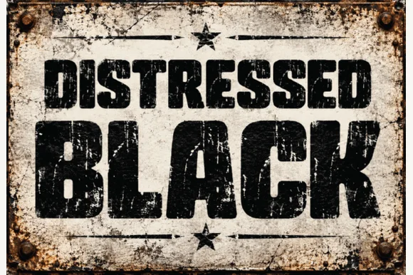
Heavy asphalt-cracked industrial grunge block sans
Distressed Black is an ultra-heavy industrial block sans (NOT delicate handwriting!) blasted with authentic scratched-paint & rusted-sign distressing!
Ideas for this font
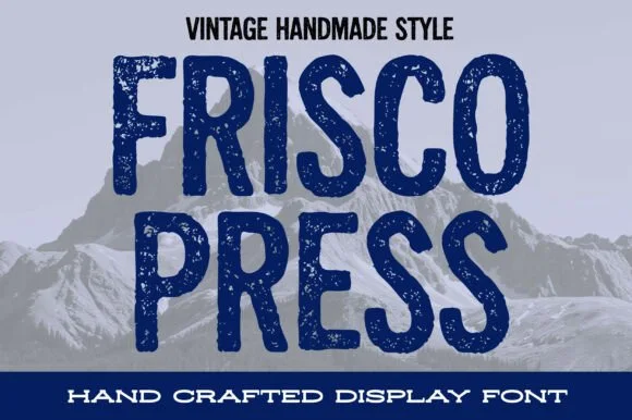
Distressed woodblock-stamp condensed vintage sans display
Frisco Press is a tall, heavy rounded sans-display font (not a slab serif) textured with authentic letterpress speckles and hand-carved warmth.
Ideas for this font
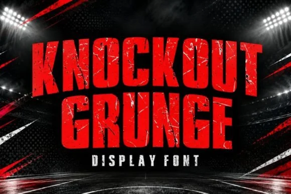
Heavy weathered stadium & boxing-poster athletic slab
Knockout Grunge is a towering, heavy-impact athletic slab-display font textured with gritty stadium-concrete and fight-poster wear.
Ideas for this font
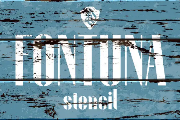
Tall high-contrast capitals shown through broad horizontal breaks and distressed wood texture
Fontuna Stencil places pale narrow capitals over heavily weathered blue boards, where fine arms meet thick vertical strokes, dark horizontal bands cross the title at several heights and a narrower mixed-case contrast repeats beneath the main row.
Ideas for this font
Same independent foundry
Allow optional Google Analytics to measure visits and catalogue actions. Your search words and notes are not included. Privacy & storage