Modern Grotesque Body

Wild West Wanted + Taught
Creates crisp high-hierarchy contrast beneath Wild West Wanted headlines across menus, websites and labels.
Inspect Taught specimenDisclosure: MakerFileHub may earn a commission from qualifying purchases via paid links on this page. How our links work.
Heavy western wanted slab
Wild West Wanted is a heavy western slab in black on a warm yellow vignette: wide caps with spurred serifs, a swollen waist, heavy strokes and closed counters, shown with a full alphabet and numeral line above and a tracked note beneath announcing the formats.
Paid link
Get this fontProject & layout blueprintsAt-a-glance maker compatibility
Sturdy stroke walls and open counters weed cleanly on adhesive vinyl, HTV apparel film, and cut cardstock.
Visual anatomy & craft review
The plate leads with the character set rather than a single word, which is the honest choice for a face sold on its swash-like spurs and its numerals: the buyer can scan every letter and digit before looking at the display sample. The drawing is a wanted-poster slab — the serifs sprout points, the waist swells, and the counters are narrow — which keeps the letters legible at a distance while carrying a period flavour. The display sample is set on two lines at a size where the spurs are visible, and the note beneath is a light serif in tracked caps. The palette is one ink on a warm vignette, which reads as an aged poster without a texture overlay.
Western, heavy, slab, nostalgic
Two-font hierarchy recipes
Tested contrast partners — pairing Wild West Wanted with grounded secondary typography.
Wild West Wanted + Taught
Creates crisp high-hierarchy contrast beneath Wild West Wanted headlines across menus, websites and labels.
Inspect Taught specimen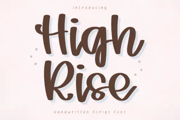
Wild West Wanted + High Rise
Adds a warm human signature touch for 1-to-3-word callouts without competing against structured serif capitals.
Inspect High Rise specimenPractical applications
Concrete hierarchy, scale and production guidance tailored to Wild West Wanted’s stroke geometry.
A wanted-poster slab reads as period signage at a glance, and the heavy spurs hold in paint on a fascia where a lighter face would soften.
Hierarchy & layout recipe
Paint a 1,200 by 400 mm fascia: the name at 130 mm cap height, the hours in a 26 mm slab, and a 6 mm rule. Keep 30 mm margins and paint one ink on a light board.
Pre-production check
Check the fascia at 130 mm, where a spur can close a counter; keep the counters above 6 mm. Confirm the 26 mm hours read at four metres and that the rule clears the fixings.
A period slab sets a costumed theme instantly, and the numerals in the family let a date and a year be set in the same voice.
Hierarchy & layout recipe
A2 portrait: the event at 110 mm cap height, the date at 40 mm, and the address at 14 mm. Keep 30 mm margins and print one ink on a warm ground so the vignette reads as aged paper.
Pre-production check
Check the poster at five metres, where the narrow counters can close; keep them above 5 mm. Confirm the 40 mm date reads at three metres and that the address clears the display block.
A wanted-poster slab gives a frontier novel the tone of a printed notice, and the family's numerals let a series number sit in the same voice.
Hierarchy & layout recipe
Set the title at 90 mm cap height across 200 mm, the author in a 12 pt slab, and the series number at 10 mm. Print one ink on a kraft stock and keep an ornamental rule as the only decoration.
Pre-production check
Check the title at thumbnail size, where the spurs can blur; keep the contrast high. Confirm the 10 mm series number reads on the spine and that the title clears the trim by 12 mm.
Technical & licence verification
Confirm included OTF/TTF/WOFF formats, full glyph tables and licence coverage on the live store page before batch production.
Closest visual alternatives
Matched across letterform anatomy, stroke behaviour and craft applications.
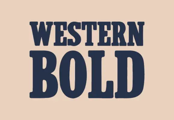
Heavy western slab
Western Bold is a heavy slab shown in navy on a warm sand ground: two lines of capitals with broad rounded brackets, narrow vertical counters in the O, blunt serifs and a heavy even stroke, with no ornament on the sheet at all.
Ideas for this font
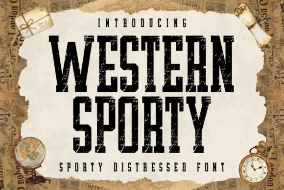
Very condensed distressed slab
Western Sporty is a very condensed square slab in black on a torn paper sheet: tall caps with heavy square slabs, scratched irregular fill and rough edges, set on two lines with a tracked line above and a caption beneath, over a ground of aged newspaper and travel props.
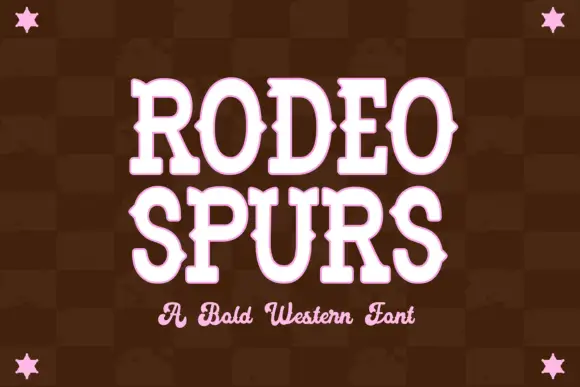
Western slab with mid-stroke spurs
Rodeo Spurs is a tall rounded western slab in pale pink on a dark brown check: heavy caps with pointed spurs standing out from the mid-stroke, round bowls and a strong vertical stress, with a script line beneath in the same tone and four stars set in the corners.
Ideas for this font
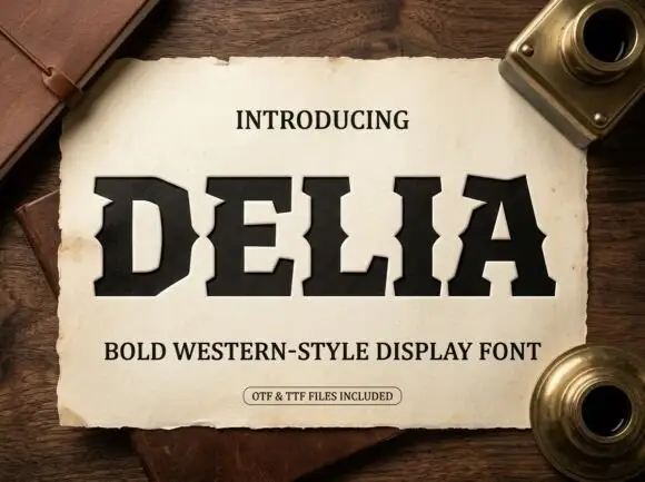
Heavy western-style capitals with clipped corners and inward mid-stem notches
Delia shows thick dark capitals with broad square feet and sharply clipped corners, where small inward notches cut into the sides of the D, E and L around mid-height and the A keeps a narrow opening, while the parchment, notebook and inkwells around it are presentation scenery.
Same independent foundry
Allow optional Google Analytics to measure visits and catalogue actions. Your search words and notes are not included. Privacy & storage