Modern Grotesque Body

Nedogta + Furion
Creates crisp high-hierarchy contrast beneath Nedogta headlines across menus, websites and labels.
Inspect Furion specimenDisclosure: MakerFileHub may earn a commission from qualifying purchases via paid links on this page. How our links work.
High-contrast luxury didone caps
Nedogta is a modern luxury didone in white over a portrait: very high contrast caps with hairline serifs, a narrow waist on the stems, and tight tracking, so the name reads as a fashion masthead laid across a photograph.
Paid link
Get this fontProject & layout blueprintsAt-a-glance maker compatibility
Crisp hairline serifs shine on stationery, foil stamping, and packaging; add slight offset for small decals.
Visual anatomy & craft review
The word is set across the full width of the frame and the drawing is a didone at display scale: the stems are thick, the hairlines that join the serifs approach a single line, and the serifs are flat and unbracketed, which gives the face its engraved look. The O is a near-perfect circle drawn with the same contrast, the counters are wide and open, and the tracking is tight enough that the word reads as one plate rather than as separate letters. Because hairlines are the defining feature, the face needs a large size and a smooth ground, and the specimen places it over the shoulder and chest of a portrait where the print is soft enough not to compete. Three small credits are set beneath in a light serif and spaced across the width, which is the fashion-editorial convention and keeps the lockup balanced.
Luxury, didone, elegant, high contrast
Two-font hierarchy recipes
Tested contrast partners — pairing Nedogta with grounded secondary typography.
Nedogta + Furion
Creates crisp high-hierarchy contrast beneath Nedogta headlines across menus, websites and labels.
Inspect Furion specimen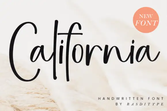
Nedogta + California
Adds a warm human signature touch for 1-to-3-word callouts without competing against structured serif capitals.
Inspect California specimenPractical applications
Concrete hierarchy, scale and production guidance tailored to Nedogta’s stroke geometry.
A didone masthead reads as luxury without an ornament, and the wide open counters keep a long brand name readable at label size where a condensed serif would clot.
Hierarchy & layout recipe
Set the masthead at 24 pt on a 60 mm label and 120 mm wide for a box; add a 7 pt light serif descriptor at 200 units tracking. Keep the masthead one colour on a matte stock so the hairlines do not fill.
Pre-production check
Check the 24 pt version, where the hairlines can vanish on uncoated paper; keep the label above 18 pt or switch to a smooth stock. Confirm the 7 pt descriptor reads on the shelf and that the masthead holds at 30 percent in a marketplace thumbnail.
A didone masthead is the expected language of a fashion cover, and the tight tracking lets a long title span the trim without crowding the photograph.
Hierarchy & layout recipe
Set the masthead at 110 mm cap height across 230 mm, the cover lines in an 8 pt serif, and the issue details at 7 pt. Keep the masthead clear of the model's face and put the cover lines in the lower third.
Pre-production check
Check the masthead at 110 mm, where tight tracking can merge two letters into a ligature; open it by 10 units. Confirm the cover lines read at newsstand distance and that the masthead holds at thumbnail size in a digital edition.
A high-contrast didone gives formal stationery an engraved feel, and the open counters let two long surnames share one line without shrinking the type.
Hierarchy & layout recipe
A5 invitation: the names at 26 pt in caps, the request in a 10 pt serif, and the date in 9 pt caps at 150 units tracking. Keep 22 mm margins and letterpress one ink on a heavy cotton card.
Pre-production check
Check the 26 pt caps on the cotton stock, where the hairlines can sink; proof the actual board. Confirm the 10 pt request reads at arm's length and that the tight tracking does not close the space between the two surnames.
Technical & licence verification
Confirm included OTF/TTF/WOFF formats, full glyph tables and licence coverage on the live store page before batch production.
Closest visual alternatives
Matched across letterform anatomy, stroke behaviour and craft applications.
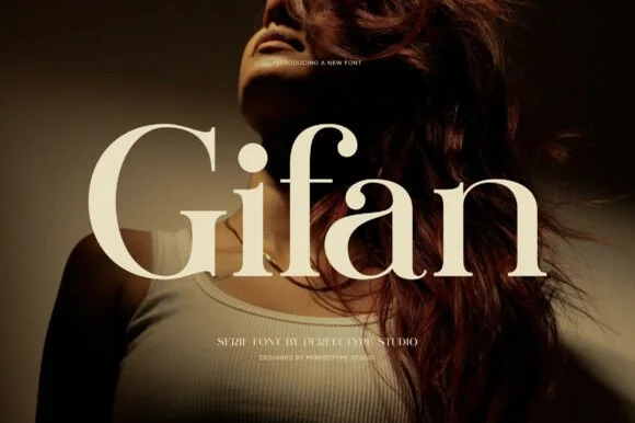
Bold high-contrast modern serif with teardrop ball terminals
Gifan is a bold, voluptuous modern luxury serif distinguished by lush teardrop ball terminals on 'f' and 'a' and notched architectural spurs!
Ideas for this font
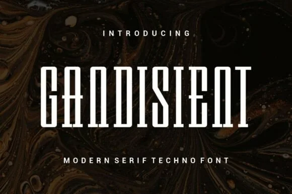
Tall condensed architectural & techno-editorial slab-serif
Gandisient is a towering, ultra-condensed techno-serif blending monolithic industrial vertical pillars with crisp flat bracketed serifs.
Ideas for this font

Flamboyant coiled-swash couture editorial serif
Alerigue is a high-contrast luxury editorial serif distinguished by dramatic coiled spiral terminals and sweeping calligraphic ascender loops.
Ideas for this font

Art-Nouveau ligature & celestial-sparkle editorial serif
Resquel is an expressive high-contrast editorial serif featuring sweeping ribbon under-tails, interlocked ligatures, and star-sparkle counters.
Ideas for this font
Same independent foundry
Allow optional Google Analytics to measure visits and catalogue actions. Your search words and notes are not included. Privacy & storage