Neutral Sans Workhorse

Mansur + Cenura
Lets Mansur own the focal silhouette while handling secondary copy, sizing and subheads cleanly.
Inspect Cenura specimenDisclosure: MakerFileHub may earn a commission from qualifying purchases via paid links on this page. How our links work.
Chiselled crystal-faceted display
Mansur is a chiselled display in black with white keylines on a gem-lit purple scene: each letter is built from flat crystal facets, with sharp points at the terminals and a highlight line that divides every face, so the word reads as carved stone rather than as drawn type.
Paid link
Get this fontProject & layout blueprintsAt-a-glance maker compatibility
Sturdy stroke walls and open counters weed cleanly on adhesive vinyl, HTV apparel film, and cut cardstock.
Visual anatomy & craft review
The word spans the frame and the construction is geometric: the letters are assembled from triangular and quadrilateral facets, the stems are wide and the counters are angular, and the terminals end in points rather than serif or stem. A thin white keyline follows every facet boundary, which separates the faces and gives the lettering its carved look, and the highlights sit on the upper-left faces so the light appears to come from one direction. Because the shapes are wide and the facets are large, the word stays legible at poster scale and would fail below about 40 pt, which the sample respects by setting it once. The ground is a dark purple scene packed with faceted crystals and sparks, and the two corner labels and a badge are set in clean sans caps so the display face is the only complex form.
Chiselled, faceted, dramatic, fantasy
Two-font hierarchy recipes
Tested contrast partners — pairing Mansur with grounded secondary typography.
Mansur + Cenura
Lets Mansur own the focal silhouette while handling secondary copy, sizing and subheads cleanly.
Inspect Cenura specimen
Mansur + Bulgary
Grounds bold display lettering with classic typographic authority on posters, badges and apparel.
Inspect Bulgary specimenPractical applications
Concrete hierarchy, scale and production guidance tailored to Mansur’s stroke geometry.
A faceted display signals fantasy or magic without a blackletter, and the large facets read at a distance where a fine gothic would turn into texture.
Hierarchy & layout recipe
A2 portrait: the event name at 150 mm cap height, the details in a 16 mm sans, and the keyline at 2 mm. Keep the display on a dark ground with a jewel-toned illustration and leave 30 mm margins so the points stay inside the sheet.
Pre-production check
Check the points at full size, where a sharp tip under 0.8 mm breaks in print; blunt the tips slightly for the poster. Confirm the 16 mm details read at three metres and that the keylines stay even across every facet.
A faceted mark gives a dark ale a carved-stone identity, and the single-colour keyline construction reproduces well on a foil label where gradients would fail.
Hierarchy & layout recipe
Print a 65 by 100 mm label: the name at 20 pt, the style in a 7 pt sans, and the keyline at 0.4 mm. Keep the facets large enough to read at label size and print the outline in one ink on a dark stock.
Pre-production check
Check the 20 pt name on the label, where the small facets fill in; simplify to the largest facets for that size. Confirm the 7 pt style reads on the bottle and that the keyline survives the label's varnish.
A chiselled display gives a fantasy cover a title that looks carved into the artwork, and the facet highlights read at thumbnail size where a book cover is usually first seen.
Hierarchy & layout recipe
Set the title at 110 pt across 180 mm, the subtitle in a 9 pt serif, and the editor credit in 7 pt caps. Keep the title over the darkest area of the illustration and print the keyline in white so the facets separate.
Pre-production check
Check the title at 120 px wide in an online listing, where the facets can merge into a grey mass; keep the keyline at full contrast. Confirm the 7 pt credit survives the matte lamination and that the title clears the trim.
Technical & licence verification
Confirm included OTF/TTF/WOFF formats, full glyph tables and licence coverage on the live store page before batch production.
Closest visual alternatives
Matched across letterform anatomy, stroke behaviour and craft applications.
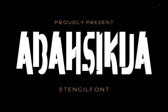
Tall condensed diagonal-sliced architectural stencil display
Abahsikua is a tall, condensed modern stencil display font sliced by bold diagonal negative-space cuts across geometric block pillars.
Ideas for this font
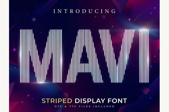
Tall condensed vertical-pinstripe optical display
Mavi is a towering condensed display font built entirely from crisp vertical parallel pinstripes sliced into bold geometric silhouettes.
Ideas for this font
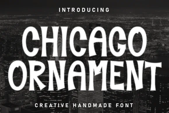
Handcrafted vintage-ornamental condensed poster serif-display
Chicago Ornament is a tall, hand-inked condensed display typeface with softly flared terminals, high-waisted bars, and subtle sign-painter grit.
Ideas for this font
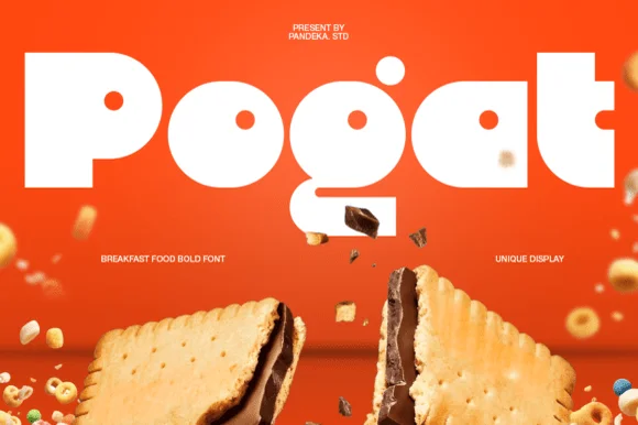
Ultra-fat heavy-packaging & cereal-box geometric display
Pogat is an ultra-heavy, slab-thick retro packaging font with massive ink mass and tiny circular pinhole counters built for snack and food branding!
Ideas for this font
Same independent foundry
Allow optional Google Analytics to measure visits and catalogue actions. Your search words and notes are not included. Privacy & storage