Neutral Sans Workhorse

Fern + Nyxar
Lets Fern own the focal silhouette while handling secondary copy, sizing and subheads cleanly.
Inspect Nyxar specimenDisclosure: MakerFileHub may earn a commission from qualifying purchases via paid links on this page. How our links work.
Ornate outlined capitals with patterned stems and curled terminals
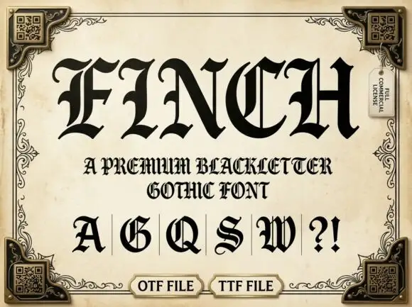
Fern is an ornate blackletter display face in white with a fine inner line traced along every stroke, small patterns filling the wider areas, and spurs that end in curled leaves.
Paid link
Get this fontProject & layout blueprintsAt-a-glance maker compatibility
Sturdy stroke walls and open counters weed cleanly on adhesive vinyl, HTV apparel film, and cut cardstock.
Visual anatomy & craft review
FERN fills the middle of the card in white on a dark ground of velvet drapes and fern leaves, and the letters are the decorative end of the blackletter range: each stem carries an inner contour, the counters are filled with tiny patterns, and the terminals curl into leaf shapes. The capitals are wide with heavy shoulders, and the word is set in a size where the drawn detail is the subject. Under the title two lines in a light serif name the style and list the formats, and two round stamps sit at the lower corners. The gold and green in the frame come from the photograph rather than the type, so the lettering is entirely monochrome and can be printed in any single colour, which is what makes an ornate face like this practical.
Ornate outlined capitals with patterned stems and curled terminals
Two-font hierarchy recipes
Tested contrast partners — pairing Fern with grounded secondary typography.
Fern + Nyxar
Lets Fern own the focal silhouette while handling secondary copy, sizing and subheads cleanly.
Inspect Nyxar specimen
Fern + Kernova
Grounds bold display lettering with classic typographic authority on posters, badges and apparel.
Inspect Kernova specimenPractical applications
Concrete hierarchy, scale and production guidance tailored to Fern’s stroke geometry.
The leaf terminals and the inner line give a plain title page the look of an engraved plate, and the white lettering holds over a dark illustration.
Hierarchy & layout recipe
Print a 152 by 229 mm title page: set the title at 44 pt across one row, keep 30 mm of clear ground beneath before the imprint at 9 pt, and hold 20 mm of margin left and right of the block.
Pre-production check
The inner line fills in on uncoated stock; print one page on the real paper and check the contour before the signatures.
The fern detail matches what is in the bottle, and the single-colour construction prints cleanly on a small label where a full-colour drawing would not.
Hierarchy & layout recipe
Print a 55 by 100 mm label: set the house name at 20 pt on one row, keep 8 mm of clear ground beneath before the volume at 4.5 pt, and hold 5 mm from the curled terminals to the die line.
Pre-production check
Thin inner lines break at small sizes; print one label on the actual bottle stock and check the bowl of the letters.
The leaf terminals give a formal invitation a botanical note without a drawn wreath, and the ornate letters carry the decoration on their own.
Hierarchy & layout recipe
Print a 130 by 180 mm invitation: set the names at 28 pt on one row, keep 20 mm of clear ground beneath before the venue at 9 pt, and hold 16 mm of margin from the widest terminal to the card edge.
Pre-production check
Fine patterns fill on textured card; print one invitation on the intended board and check the openings before the suite.
Technical & licence verification
Confirm included OTF/TTF/WOFF formats, full glyph tables and licence coverage on the live store page before batch production.
Closest visual alternatives
Matched across letterform anatomy, stroke behaviour and craft applications.
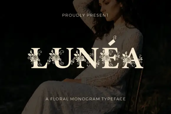
Floral monogram display
Lunéa is a floral monogram display in cream over a dark portrait: broad serif capitals with a fine accent, and fine roses, leaves and curled tendrils drawn over every letter, with a small sprig above the A and a tracked line beneath naming the style.
Ideas for this font
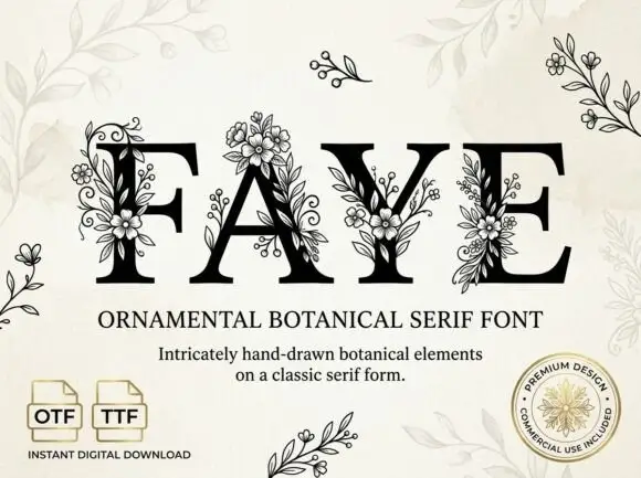
Large contrast serif capitals crossed by fine outlined flower and leaf clusters
Faye places black capitals on pale cream, where large fine-lined flowers overlap the F stem and the A apex, leafy sprigs and small buds cross the Y and E, and narrow curled tendrils climb between the letters while standalone sprigs sit around the page.
Ideas for this font
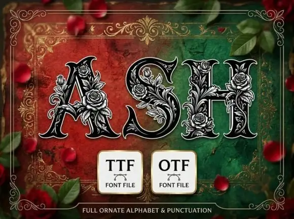
Heavy pointed serif capitals wrapped in dense fine rose and leaf outlines
Ash presents three dark capitals on a red-green field. Broad contrast strokes taper into sharp curled serifs, while pale outlined roses, leaves and tendrils climb around the A, fill parts of the S and bridge the H crossbar, with thin outer contours separating ornament from letter body.
Ideas for this font
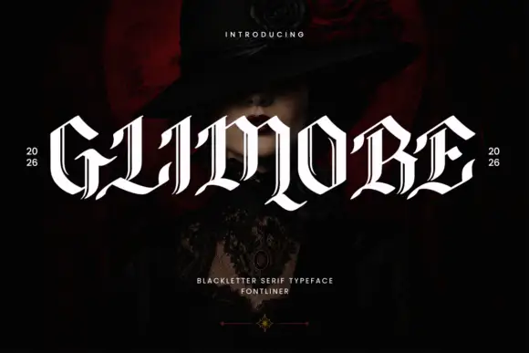
Broad capitals with thin inset strokes and blade-like lower curls
Glimore is a blackletter display face drawn with sharp diagonal joins, tall narrow capitals and a fine inner line, set tight enough that a word reads as a row of blades.
Ideas for this font
Same independent foundry
Allow optional Google Analytics to measure visits and catalogue actions. Your search words and notes are not included. Privacy & storage