Neutral Sans Workhorse

Finch + Inkora
Lets Finch own the focal silhouette while handling secondary copy, sizing and subheads cleanly.
Inspect Inkora specimenDisclosure: MakerFileHub may earn a commission from qualifying purchases via paid links on this page. How our links work.
Ornate Gothic capitals with split interiors and curled upper tips
Finch sets a heavy blackletter in black on aged parchment, its stems broad, its finials drawn to diamonds and a few letters carrying fine parallel stripes inside the stroke.
Paid link
Get this fontProject & layout blueprintsAt-a-glance maker compatibility
Sturdy stroke walls and open counters weed cleanly on adhesive vinyl, HTV apparel film, and cut cardstock.
Visual anatomy & craft review
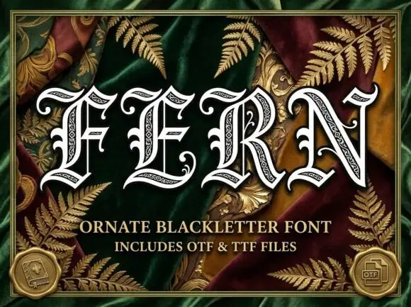
FINCH fills the top of the card, the F and the H hooked and the C closing in a tight bowl, with the striped detail reading as engraved shading rather than decoration. Under it two lines of smaller blackletter name the style, and a row of separate glyphs separated by fine rules shows the face without words in the way. A parchment ground, an ornate frame and small file badges complete the presentation. The stripes are the detail that makes the face distinctive and also the thing that disappears first: printed small or on textured paper, the interiors fill and the letters turn into solid shapes.
Ornate Gothic capitals with split interiors and curled upper tips
Two-font hierarchy recipes
Tested contrast partners — pairing Finch with grounded secondary typography.
Finch + Inkora
Lets Finch own the focal silhouette while handling secondary copy, sizing and subheads cleanly.
Inspect Inkora specimen
Finch + Majestic Letters
Grounds bold display lettering with classic typographic authority on posters, badges and apparel.
Inspect Majestic Letters specimenPractical applications
Concrete hierarchy, scale and production guidance tailored to Finch’s stroke geometry.
The engraved weight gives a seasonal fair the look of a printed bill, and the heavy stems hold across a dark hall at the far end of the room.
Hierarchy & layout recipe
Print an A2 poster: set the fair name at 110 pt on one row, keep 30 mm of clear ground beneath before the dates at 18 pt, and keep 28 mm of border so the finials stay inside.
Pre-production check
Inner stripes fill under 40 pt; check the printed proof before the poster run. Test it on the real material before the run is booked.
The blackletter gives a title page its period, and the tracked subline in a smaller cut keeps a long title readable on the same page.
Hierarchy & layout recipe
Print a 129 by 198 mm page: set the title at 48 pt across two lines, keep 18 mm of clear ground beneath before the author name at 10 pt, and keep 16 mm of margin from the text block.
Pre-production check
Fine stripes fill in offset; check a proof on the chosen paper before the book run. Verify the result on the printed piece, then approve.
The heavy letterforms hold on a narrow neck label, and the diamond finials give a dark beer a printed character of its own.
Hierarchy & layout recipe
Print a 35 by 90 mm neck label: set the beer name at 13 pt on one row, keep 6 mm of clear ground beneath before the strength at 5 pt, and keep 4 mm to the die edge so the points are not cut.
Pre-production check
Small counters close on a cheap label; check the printed proof before the brew run. Print a sample and re-check it at final size.
Technical & licence verification
Confirm included OTF/TTF/WOFF formats, full glyph tables and licence coverage on the live store page before batch production.
Closest visual alternatives
Matched across letterform anatomy, stroke behaviour and craft applications.
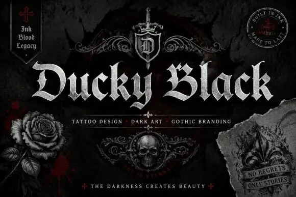
Wide blackletter with sweeping D and a densely split B
Ducky Black is a tattoo and dark-art blackletter with wide stems, sharp spurs and a distressed silver fill, framed by drawn roses, a skull and a fleur.
Ideas for this font
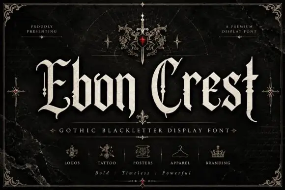
Split Gothic capitals beside narrow angular lowercase
Ebon Crest sets a tall gothic blackletter in bone white on a dark ground and frames it with a crest, a sword and fleur ornaments, then lists the uses along the foot of the cover.
Ideas for this font
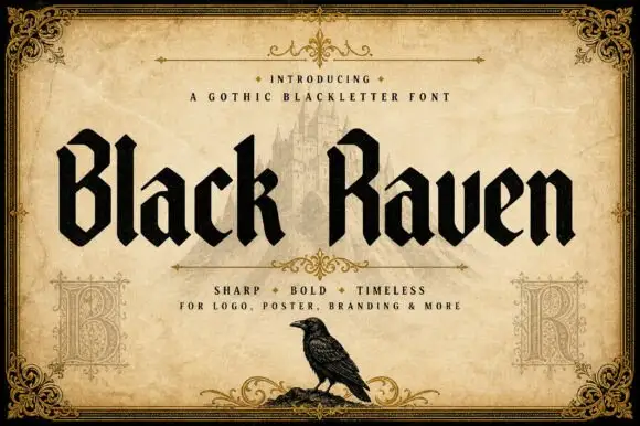
Solid blackletter with angular B and R bowls and pointed feet
Black Raven is a bold blackletter display face with wide stems, tight spacing and a flat black contour, drawn to print solid at large sizes on a light ground.
Ideas for this font
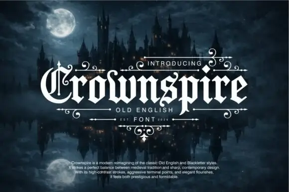
Pointed blackletter with a split ornate C and descending p
Crownspire is an old English display face with long entry and exit flourishes, sharp spurs and a heavy lower stem weight, framed here by a symmetrical ornament of curls and diamonds.
Ideas for this font
Same independent foundry
Allow optional Google Analytics to measure visits and catalogue actions. Your search words and notes are not included. Privacy & storage