Neutral Sans Workhorse

Nova + Mansory
Lets Nova own the focal silhouette while handling secondary copy, sizing and subheads cleanly.
Inspect Mansory specimenDisclosure: MakerFileHub may earn a commission from qualifying purchases via paid links on this page. How our links work.
Inflated bubbly display with layered depth
Nova is an inflated display in glossy white on a psychedelic gradient: rounded, blown-up letters with a thick outline and two offset layers behind them in orange and violet, so the word looks like a balloon sign lit from above.
Paid link
Get this fontProject & layout blueprintsAt-a-glance maker compatibility
Cut solid base, outline, and shadow layers in separate vinyl colors and align on registration marks.
Visual anatomy & craft review
The word fills the middle of the frame and every letter is exaggerated into a balloon: wide bowls, no straight strokes, and highlights drawn along the top-left of each shape as if the surface were wet. A cream keyline wraps the whole word, and behind it two solid offset layers step down and to the right in warm and cool colours, which produces the depth without a soft shadow. The counters are generous and round, so the word stays legible at the weight it is set at, and the spacing is tight enough that the inflated forms nearly touch and read as a single drifting shape. The ground is a full-colour gradient of bubbles, stars and blobs, and the two caption lines are set in a rounded sans with a small offset edge, so the page is entirely of one visual language.
Bubbly, glossy, playful, dimensional
Two-font hierarchy recipes
Tested contrast partners — pairing Nova with grounded secondary typography.
Nova + Mansory
Lets Nova own the focal silhouette while handling secondary copy, sizing and subheads cleanly.
Inspect Mansory specimen
Nova + Alerigue
Grounds bold display lettering with classic typographic authority on posters, badges and apparel.
Inspect Alerigue specimenPractical applications
Concrete hierarchy, scale and production guidance tailored to Nova’s stroke geometry.
An inflated display reads as celebration before a single word is parsed, and the layered offsets give a home-printed card the look of a designed piece.
Hierarchy & layout recipe
A6 card: the word at 40 pt, the details in a 9 pt rounded sans beneath, and two offset layers behind the letters at 1 mm steps. Keep the palette to three tints on a mid ground so the layers stay distinguishable.
Pre-production check
Check the offsets at 40 pt, where a 0.5 mm step disappears on a home printer; keep them at 1 mm minimum. Confirm the 9 pt details keep a 4.5:1 contrast on the gradient and that the outlines do not merge where two letters touch.
A glossy inflated word reads as a product with fizz, and the solid offset layers can be reduced to two flat inks for a cheap sticker run.
Hierarchy & layout recipe
Die-cut a 55 mm sticker: the word at 16 pt, two flat offset layers at 1.5 mm, and a 2 mm white border to the die line. Keep the outline at least 0.8 mm wide so the cut does not clip the letters.
Pre-production check
Check the die at 55 mm, where a 0.8 mm outline can be cut through; increase the border. Confirm the two flat layers read as depth at arm's length and that the sticker survives being peeled from a cold can.
An inflated display gives a summer poster the look of water toys and inflatables, which is a faster read than an illustration of a pool.
Hierarchy & layout recipe
A2 portrait: the word at 180 mm cap height, the date in a 20 mm rounded sans, and three offset layers at 4 mm. Keep the type on the upper half so the lower half can carry the venue and a simple graphic, and use four tints maximum.
Pre-production check
Check the offsets at 180 mm, where a light layer can read as a printing error; separate the tints enough to see the step. Confirm the 20 mm date reads at four metres and that the outlines hold at the printer's resolution.
Technical & licence verification
Confirm included OTF/TTF/WOFF formats, full glyph tables and licence coverage on the live store page before batch production.
Closest visual alternatives
Matched across letterform anatomy, stroke behaviour and craft applications.
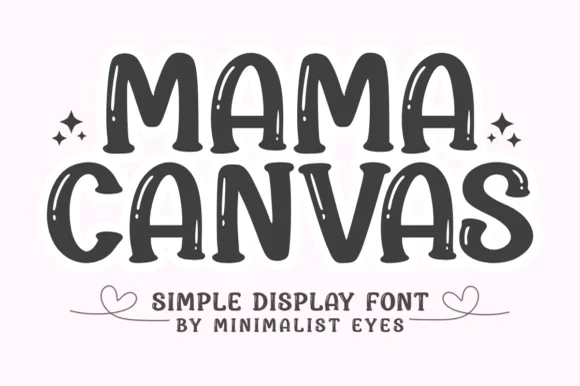
Bold brush display with inline highlights
Mama Canvas is a bold brush display in charcoal on cream: fat rounded capitals with a slight lean, thin highlight streaks left inside each stroke, and small sparkles beside the words, so the pair reads as brush lettering on a card rather than as constructed type.
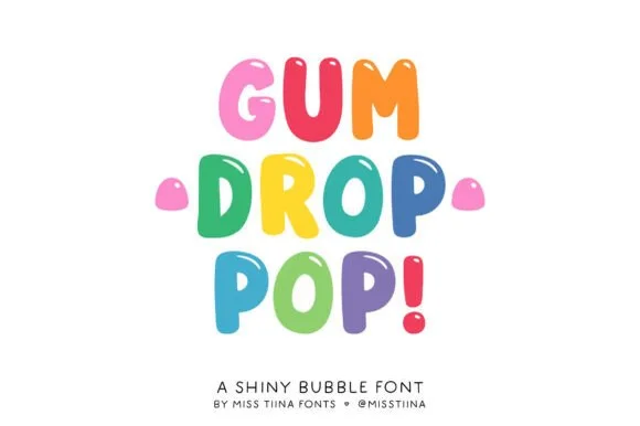
Glossy jellybean & candy-drop upright bubble display
Gum Drop Pop is a tall, bouncy candy-drop bubble font accented with tiny white shine highlights on every colorful character.
Ideas for this font
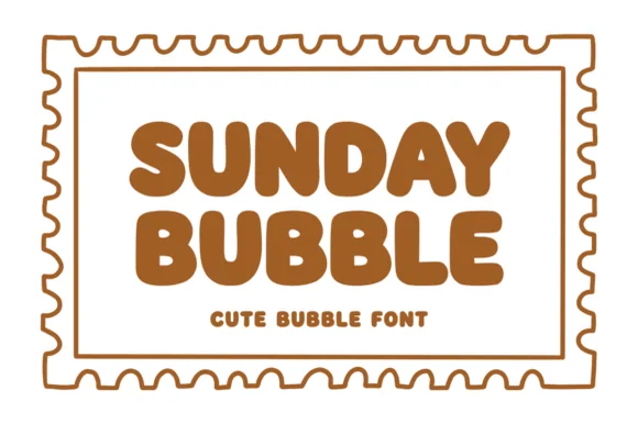
Warm chubby zero-counter-clutter retro bubble sans
Sunday Bubble is a warm, ultra-plump rounded bubble display font with soft cozy strokes and super-fast Cricut weeding.
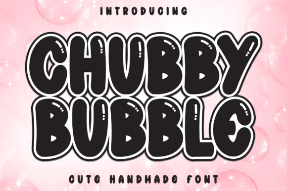
Sticker-outlined marshmallow bubble display with shine slits
Chubby Bubble is a fat, rounded handmade bubble display font wrapped in a parallel outline ring and accented with interior shine marks.
Ideas for this font
Same independent foundry
Allow optional Google Analytics to measure visits and catalogue actions. Your search words and notes are not included. Privacy & storage