Editorial Serif Anchor

Madness Scratch + Brenco
Anchors Madness Scratch's fluid strokes with crisp Roman proportions on wedding suites, headers and packaging.
Inspect Brenco specimenDisclosure: MakerFileHub may earn a commission from qualifying purchases via paid links on this page. How our links work.
Roughed brush display with a horror edge
Madness Scratch is a horror display in red on a foggy night scene: bold brushed letters with torn, jagged edges, an italic slant and a dark outline, stacked as two lines with a small capital line beneath.
Paid link
Get this fontProject & layout blueprintsAt-a-glance maker compatibility
Fine grain and micro-texture excel in 300 DPI print, sublimation, and screen print rather than small vinyl weeding.
Visual anatomy & craft review
Two words are stacked and tilted and the face is a brush display built for a scare: the strokes are thick and uneven, the ends break into ragged ticks where the brush ran dry, the corners are cut at angles, the letters lean right as one block, and a dark outline holds them against the fog behind. The damage is heavier at the ends of strokes than in the middles, which keeps the words readable at a distance while looking torn up close, and the slant gives the block its momentum. Two small capital lines, one above and one below, are set in the same face at a smaller size, so the buyer can see it holds below display scale. The ground is a drawn haunted house in teal fog with bare branches, kept low in contrast so the red reads. Madness Scratch is a display face for horror posters, event graphics, apparel and packaging, and it needs a short phrase at a large size on a dark ground.
Rough, brushed, frightening
Two-font hierarchy recipes
Tested contrast partners — pairing Madness Scratch with grounded secondary typography.
Madness Scratch + Brenco
Anchors Madness Scratch's fluid strokes with crisp Roman proportions on wedding suites, headers and packaging.
Inspect Brenco specimen
Madness Scratch + Miniplate
Keeps small-scale dates, URLs, nutrition facts and care instructions crisp and legible below script titles.
Inspect Miniplate specimenPractical applications
Concrete hierarchy, scale and production guidance tailored to Madness Scratch’s stroke geometry.
A rough brushed face does the scaring before a word is read, and the red on a dark fog holds at the distance of a street poster.
Hierarchy & layout recipe
Print a 420 by 594 mm poster: set the title at 130 pt over two lines, keep 36 mm of clear ground beneath before the date at 22 pt, and hold 24 mm of margin on all four sides.
Pre-production check
Ragged edges can turn to mush in cheap print; proof one sheet at the final size before the run.
A torn brush face sets the genre on a cover at once, and the dark outline keeps the title readable over a busy illustrated scene.
Hierarchy & layout recipe
Print a 152 by 229 mm cover: set the title at 52 pt over two lines, keep 20 mm of clear ground beneath before the editor at 10 pt, and hold 14 mm of margin on all four sides.
Pre-production check
A distressed face over a busy illustration can disappear; proof the cover and check the outline contrast.
A horror face gives a seasonal bottle a character, and the heavy strokes read at shelf distance where a fine script would not.
Hierarchy & layout recipe
Print a 55 by 90 mm label: set the brand at 15 pt over two lines, keep 6 mm of clear ground beneath before the strength at 4.5 pt, and hold 4 mm of margin on all four sides.
Pre-production check
Fine ticks at fifteen points can print as dirt; print one on the real stock and judge the edges.
Technical & licence verification
Confirm included OTF/TTF/WOFF formats, full glyph tables and licence coverage on the live store page before batch production.
Closest visual alternatives
Matched across letterform anatomy, stroke behaviour and craft applications.
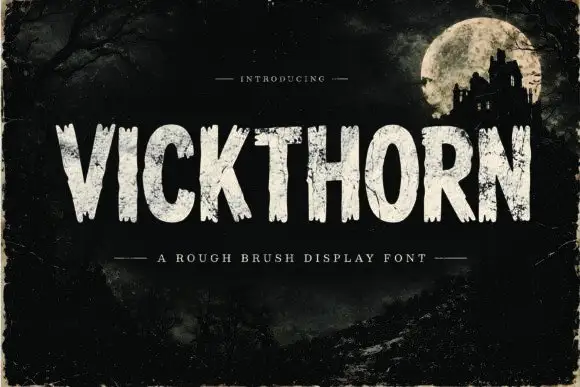
Rough brush display
Vickthorn is a rough brush display in cream on a dark, worn ground: condensed capitals with ragged edges, strokes that vary in width, and a dry-brush texture that leaves gaps in the fill, so the word reads as painted on a weathered board by moonlight.
Ideas for this font
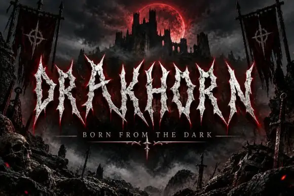
Spiked narrow capitals with rough pale interiors
Drakhorn spreads pale uppercase lettering across a dark fortress scene, where long spear-like ends project above and below a narrow central body, the A carries a high triangular counter and the K diagonal cuts across its stem.
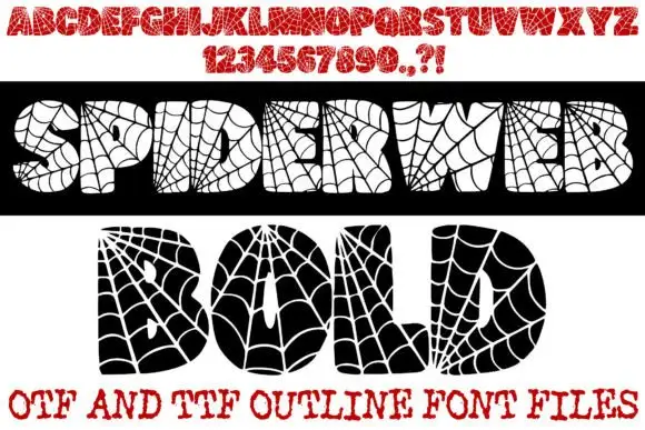
Spiderweb-filled display
Spiderweb Bold is a novelty display shown in two opposite treatments on white: a black bar carrying cream letters and a white panel carrying black letters, both filled with radial spiderweb lines and small spiders, with a red alphabet row and numeral row above and a format line at the foot.
Ideas for this font
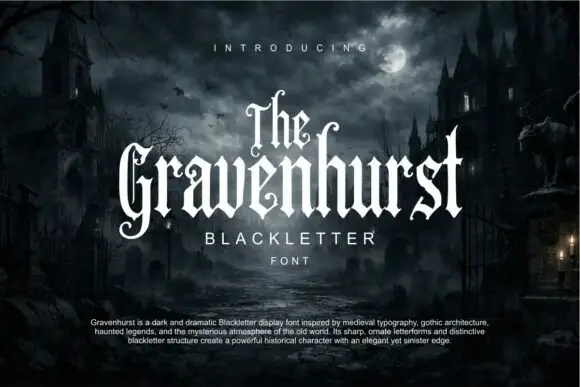
Slim blackletter with curled capital terminals and tall ascenders
Gravenhurst sets a condensed blackletter in white against a moonlit churchyard, its capitals hooked, its ascenders drawn to fine points and its counters kept narrow enough to feel carved.
Ideas for this font
Same independent foundry
Allow optional Google Analytics to measure visits and catalogue actions. Your search words and notes are not included. Privacy & storage