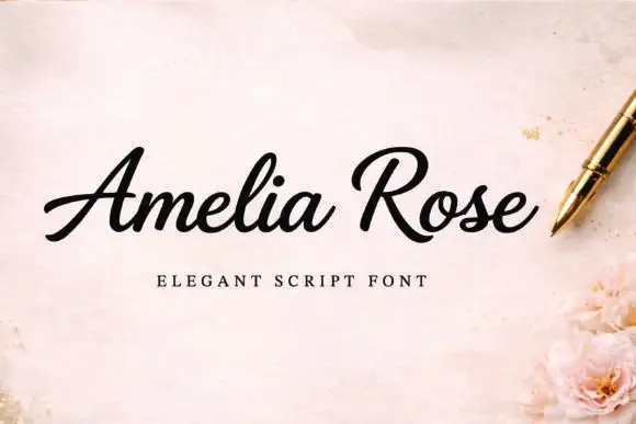
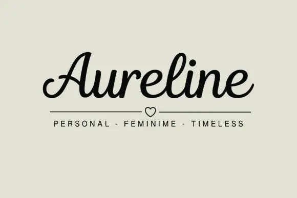
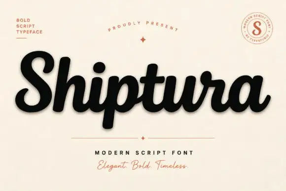
Editorial Serif Anchor

Vickthorn + Auretha
Anchors Vickthorn's fluid strokes with crisp Roman proportions on wedding suites, headers and packaging.
Inspect Auretha specimenDisclosure: MakerFileHub may earn a commission from qualifying purchases via paid links on this page. How our links work.
Rough brush display
Vickthorn is a rough brush display in cream on a dark, worn ground: condensed capitals with ragged edges, strokes that vary in width, and a dry-brush texture that leaves gaps in the fill, so the word reads as painted on a weathered board by moonlight.
Paid link
Get this fontProject & layout blueprintsAt-a-glance maker compatibility
Fine grain and micro-texture excel in 300 DPI print, sublimation, and screen print rather than small vinyl weeding.
Visual anatomy & craft review
The word spans the frame and the drawing is a brush letter with heavy wear: the stems are thick and slightly irregular, the terminals break into dry streaks, and the interiors carry small unpainted gaps, which is what makes the surface look like a board that has been repainted several times. The letterforms are condensed with flat shoulders, so the word fits the width without losing height, and the spacing is tight enough that the letters read as one painted line. Because the wear is drawn into the strokes, the face holds at large sizes and is unsuited to small text, which the sample respects by setting it once at hero scale. The ground is a dark, grungy texture with a moon and a castle silhouette, and the two caption lines are set in a tracked sans with rules on either side.
Rough, brushed, worn, autumn
Two-font hierarchy recipes
Tested contrast partners — pairing Vickthorn with grounded secondary typography.
Vickthorn + Auretha
Anchors Vickthorn's fluid strokes with crisp Roman proportions on wedding suites, headers and packaging.
Inspect Auretha specimen
Vickthorn + Modern Limited
Keeps small-scale dates, URLs, nutrition facts and care instructions crisp and legible below script titles.
Inspect Modern Limited specimenPractical applications
Concrete hierarchy, scale and production guidance tailored to Vickthorn’s stroke geometry.
A rough brush face reads as painted signage that has been outdoors, which suits an outdoor trail better than a clean novelty face, and the wear gives it age.
Hierarchy & layout recipe
A2 portrait: the event name at 140 mm cap height, the times in a 20 mm sans, and the trail details at 10 mm. Keep the display on the darkest part of the ground and print cream on a near-black board.
Pre-production check
Check the dry gaps at full size, where a gap over 3 mm can look like a printing error; keep them small. Confirm the 20 mm times read at three metres and that the display clears the poster's trim.
A rough brush display gives a farm sign the look of a painted board, and the condensed letters fit a long farm name across a gate sign.
Hierarchy & layout recipe
Paint an 800 by 400 mm board: the name at 120 mm cap height, the opening hours in a 24 mm sans, and a 4 mm hand-drawn rule beneath. Keep 30 mm between the display and the rule so the rough terminals stay clear.
Pre-production check
Check the board at four metres in daylight, where a cream on dark scheme holds up but the rough edges can look like damage; keep the wear moderate. Confirm the 24 mm hours read at two metres and that the rule sits level.
A rough brush label suggests a pressed-by-hand product, and the single ink keeps the worn texture readable on a kraft label.
Hierarchy & layout recipe
Print a 65 by 100 mm label: the name at 20 pt, the variety in a 7 pt sans, and the strength in 6.5 pt. Keep 5 mm of clear space inside the die and print one dark ink on a pale kraft so the dry gaps show as paper.
Pre-production check
Check the 20 pt name on kraft, where the dry gaps can read as print faults; reduce the wear for the small label. Confirm the 6.5 pt strength reads on the bottle and that the name clears the die line.
Technical & licence verification
Confirm included OTF/TTF/WOFF formats, full glyph tables and licence coverage on the live store page before batch production.
Closest visual alternatives
Matched across letterform anatomy, stroke behaviour and craft applications.
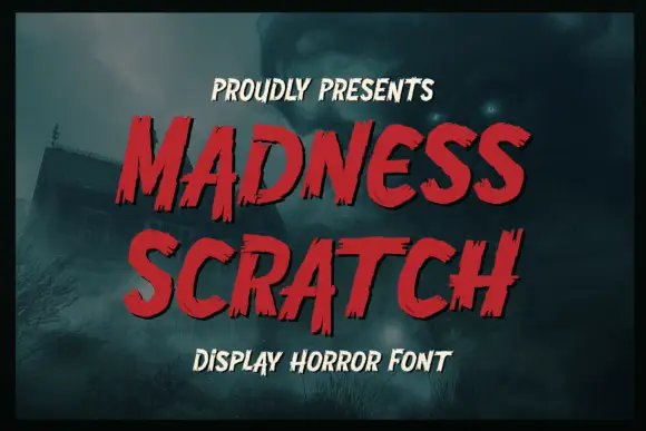
Roughed brush display with a horror edge
Madness Scratch is a horror display in red on a foggy night scene: bold brushed letters with torn, jagged edges, an italic slant and a dark outline, stacked as two lines with a small capital line beneath.
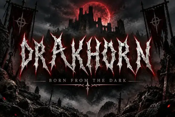
Spiked narrow capitals with rough pale interiors
Drakhorn spreads pale uppercase lettering across a dark fortress scene, where long spear-like ends project above and below a narrow central body, the A carries a high triangular counter and the K diagonal cuts across its stem.
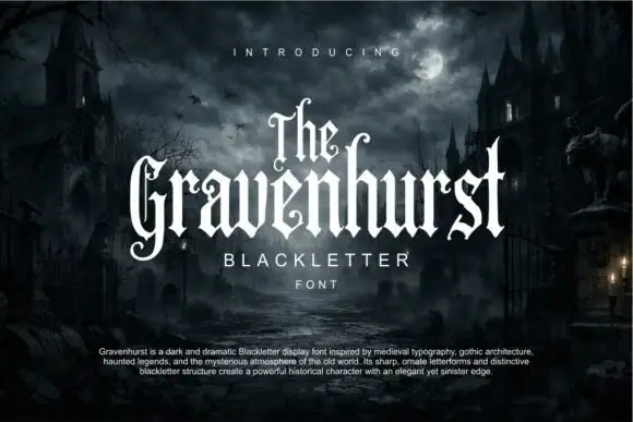
Slim blackletter with curled capital terminals and tall ascenders
Gravenhurst sets a condensed blackletter in white against a moonlit churchyard, its capitals hooked, its ascenders drawn to fine points and its counters kept narrow enough to feel carved.
Ideas for this font
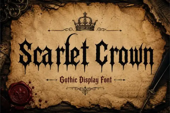
Sharp gothic display
Scarlet Crown is a sharp blackletter in black on aged parchment: narrow mixed case with spear-like feet, a high curling l and pointed terminals, framed by a drawn crown above, rules with flourishes and a wax seal at the lower left, with a plain line beneath naming the style.
Ideas for this font
Same independent foundry
Allow optional Google Analytics to measure visits and catalogue actions. Your search words and notes are not included. Privacy & storage