Editorial Serif Anchor

Ryzora Brush + Stanza
Anchors Ryzora Brush's fluid strokes with crisp Roman proportions on wedding suites, headers and packaging.
Inspect Stanza specimenDisclosure: MakerFileHub may earn a commission from qualifying purchases via paid links on this page. How our links work.
Torn brush display
Ryzora Brush is a brush display in bone and red on a dark street scene: forward-slanted capitals with torn edges, pointed tails and dry-brush gaps, set in two lines above a brush-stroke band, with a hooded figure at the left, a feature list at the right and a row of small mockups along the foot.
Paid link
Get this fontProject & layout blueprintsAt-a-glance maker compatibility
Fine grain and micro-texture excel in 300 DPI print, sublimation, and screen print rather than small vinyl weeding.
Visual anatomy & craft review
The plate is a product sheet for a streetwear face, and the mockups along the foot are the honest part: they show the type on a shirt, a poster, a mug and a bottle, so a buyer can judge the register before opening the file. The drawing is a forward-slanted brush capital with torn edges and dry gaps, so the letters read as painted with a wide brush rather than as a digital effect, and the torn edges set a size floor because they close when the letters shrink. The feature list on the right is genuine product copy that names the case coverage and the formats. It suits a shirt, a poster and a logo lockup.
Brush, raw, loud, streetwear
Two-font hierarchy recipes
Tested contrast partners — pairing Ryzora Brush with grounded secondary typography.
Ryzora Brush + Stanza
Anchors Ryzora Brush's fluid strokes with crisp Roman proportions on wedding suites, headers and packaging.
Inspect Stanza specimen
Ryzora Brush + Nyxar
Keeps small-scale dates, URLs, nutrition facts and care instructions crisp and legible below script titles.
Inspect Nyxar specimenPractical applications
Concrete hierarchy, scale and production guidance tailored to Ryzora Brush’s stroke geometry.
A torn brush face reads as painted merch, and the dry gaps keep the lettering from looking like a printed block. The dry gaps read as hand work.
Hierarchy & layout recipe
Print a 260 mm chest graphic: the brand at 60 mm cap height, the year at 26 mm, and two inks on a dark shirt. Keep the narrowest brush stroke at 4 mm and place the graphic 80 mm below the collar.
Pre-production check
Check the screen at actual mesh, where a 4 mm tail can fill; widen it. Wash-test one shirt and confirm the torn edges stay open after five cycles.
A brush face gives a night a hand-painted bill, and the slant reads at distance where a straight face would look static.
Hierarchy & layout recipe
A2 poster: the night at 110 mm cap height, the acts in a 22 mm brush, and the venue at 11 mm. Keep 28 mm margins and print two colours on a dark stock.
Pre-production check
Check the A2 at five metres, where a dry gap can vanish; keep it above 2 mm. Confirm the 11 mm venue reads at two metres and that the slant clears the right margin.
A brush lockup reads as hand-painted signage, and the torn edges hold on a window in vinyl at night. It reads as painted signage.
Hierarchy & layout recipe
Cut 800 by 300 mm vinyl: the shop at 110 mm cap height, the line in a 22 mm sans, and a 4 mm contour. Keep 22 mm margins and apply to a clean pane at dusk.
Pre-production check
Check the cut at 110 mm, where a 4 mm tail can tear on weeding; widen it to 6 mm. Confirm the 22 mm line reads at two metres and that the slash clears the door frame.
Technical & licence verification
Confirm included OTF/TTF/WOFF formats, full glyph tables and licence coverage on the live store page before batch production.
Closest visual alternatives
Matched across letterform anatomy, stroke behaviour and craft applications.
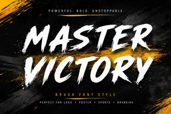
Frayed brush caps
Master Victory is a brush uppercase on a dark textured ground: slanted strokes with frayed tails, open counters and uneven edges, set in two stacked words in white over dry gold brush strokes, with a tracked line above and a plain list of uses beneath.
Ideas for this font
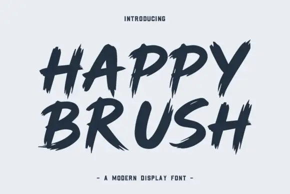
Heavy brush capitals with split pointed ends
Happy Brush is a heavy brush capital face in which the strokes slant, the ends taper into long points and some terminals split in two, so a short headline reads as a loaded brush dragged across the surface.
Ideas for this font

Slanted brush script
Lover is a slanted brush script in black on nude packaging: thick downstrokes with rough white breaks, blunt tapered ends and a fast rightward lean, shown on a bottle, a bag, a tag, a card and a jar across a single mockup sheet.
Ideas for this font
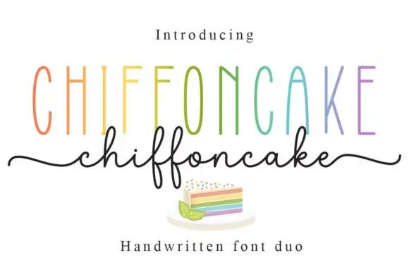
Tall narrow sans and fine looping script duo
Chiffoncake Duo pairs very tall narrow capitals, each in a different pastel tone, with a low connected script whose deep f loops drop below the baseline, and long tails extend from both sides of the lower word above a small cake illustration.
Ideas for this font
Same independent foundry
Allow optional Google Analytics to measure visits and catalogue actions. Your search words and notes are not included. Privacy & storage