Editorial Serif Anchor

Happy Brush + Mewah
Anchors Happy Brush's fluid strokes with crisp Roman proportions on wedding suites, headers and packaging.
Inspect Mewah specimenDisclosure: MakerFileHub may earn a commission from qualifying purchases via paid links on this page. How our links work.
Heavy brush capitals with split pointed ends
Happy Brush is a heavy brush capital face in which the strokes slant, the ends taper into long points and some terminals split in two, so a short headline reads as a loaded brush dragged across the surface.
Paid link
Get this fontProject & layout blueprintsAt-a-glance maker compatibility
Sturdy stroke walls and open counters weed cleanly on adhesive vinyl, HTV apparel film, and cut cardstock.
Visual anatomy & craft review
The strokes lean to the right, the lower terminals stretch into long tapers, selected ends split into two prongs and the bowls stay broad enough to keep the word open. The split point is the character: it shows the brush lifting rather than a clean cut, which is why the sample sets one short headline over craft artwork. Because the tapers are thin, the face wants 32 pt before the points stay visible, and cutting vinyl under three quarters of an inch of cap height leaves fragile tips. The craft artwork in the sample is presentation; the brush capitals are the face.
Brush · Slanted · Pointed
Two-font hierarchy recipes
Tested contrast partners — pairing Happy Brush with grounded secondary typography.
Happy Brush + Mewah
Anchors Happy Brush's fluid strokes with crisp Roman proportions on wedding suites, headers and packaging.
Inspect Mewah specimen
Happy Brush + One More
Keeps small-scale dates, URLs, nutrition facts and care instructions crisp and legible below script titles.
Inspect One More specimenPractical applications
Concrete hierarchy, scale and production guidance tailored to Happy Brush’s stroke geometry.
The brush taper gives a birthday banner energy, and the broad bowls keep a short name readable at 44 pt across an A4 sheet in one ink. The slant also leans into the party direction.
Hierarchy & layout recipe
Print an A4 banner: set the name at 44 pt, keep 20 mm of clear sheet beneath for the long tapers, and set the age at 16 pt in a rounded sans above with 12 mm of clear ground. Trim inside the sheet edge by 5 mm.
Pre-production check
A taper printed under 1 mm disappears on matte card; check the proof and keep the name at 38 pt or above. Gloss stock holds the point better than matte.
The loaded brush suits a handmade label, and the slanted capitals stay clear at 20 pt on a 55 mm panel in one flat ink. The slant keeps a small label from sitting still.
Hierarchy & layout recipe
Print a 55 by 40 mm label: set the maker name at 20 pt, keep 5 mm of border so the points are not trimmed, and set the scent in a 6 pt caps beneath with 5 mm of clear ground. Keep the word centred on the panel.
Pre-production check
A split point printed at 16 pt fills in; check the plate proof and keep the name at 18 pt or above. Print one sheet before the batch runs.
The brush stroke reads from a path, and the heavy mass holds a two-word sign at 55 mm on a painted board in two colours. A dark ground makes the tapers read at a distance.
Hierarchy & layout recipe
Paint a 500 by 250 mm board: set the words at 55 mm, keep 20 mm of margin so the tapers stay inside the frame, and set the prices in a 20 mm condensed caps on a separate band.
Pre-production check
Points painted at an angle lose their taper; check the mask and keep the taper aligned with the brush direction.
Technical & licence verification
Confirm included OTF/TTF/WOFF formats, full glyph tables and licence coverage on the live store page before batch production.
Closest visual alternatives
Matched across letterform anatomy, stroke behaviour and craft applications.
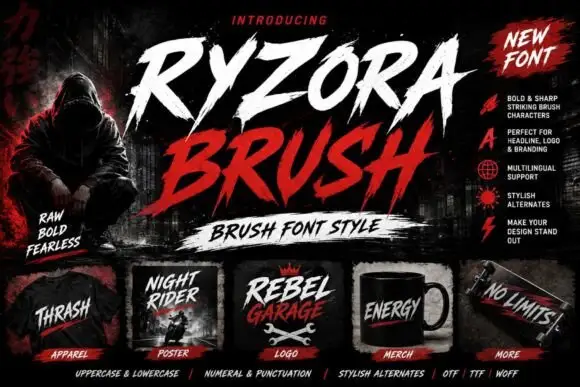
Torn brush display
Ryzora Brush is a brush display in bone and red on a dark street scene: forward-slanted capitals with torn edges, pointed tails and dry-brush gaps, set in two lines above a brush-stroke band, with a hooded figure at the left, a feature list at the right and a row of small mockups along the foot.
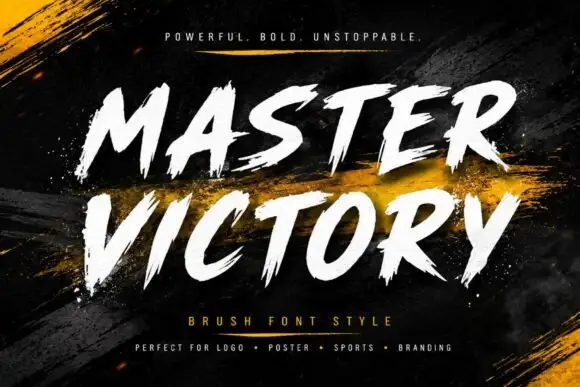
Frayed brush caps
Master Victory is a brush uppercase on a dark textured ground: slanted strokes with frayed tails, open counters and uneven edges, set in two stacked words in white over dry gold brush strokes, with a tracked line above and a plain list of uses beneath.
Ideas for this font

Slanted brush script
Lover is a slanted brush script in black on nude packaging: thick downstrokes with rough white breaks, blunt tapered ends and a fast rightward lean, shown on a bottle, a bag, a tag, a card and a jar across a single mockup sheet.
Ideas for this font
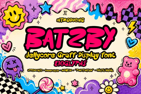
Slanted heavy graffiti-like capitals with blunt hooked strokes and an irregular baseline
Batzby places a hot-pink uppercase word inside a heavy black outline, where wide curved B bowls contrast with a sharp A apex and a long rising Y arm, several stroke ends curl into blunt hooks and the Z sweeps low across the baseline.
Ideas for this font
Same independent foundry
Allow optional Google Analytics to measure visits and catalogue actions. Your search words and notes are not included. Privacy & storage