Editorial Serif Anchor

Master Victory + Auretha
Anchors Master Victory's fluid strokes with crisp Roman proportions on wedding suites, headers and packaging.
Inspect Auretha specimenDisclosure: MakerFileHub may earn a commission from qualifying purchases via paid links on this page. How our links work.
Frayed brush caps
Master Victory is a brush uppercase on a dark textured ground: slanted strokes with frayed tails, open counters and uneven edges, set in two stacked words in white over dry gold brush strokes, with a tracked line above and a plain list of uses beneath.
Paid link
Get this fontProject & layout blueprintsAt-a-glance maker compatibility
Weld or Unite overlapping script joins into one continuous vector path before sending to the blade.
Visual anatomy & craft review
The plate is a sports poster mock-up, and the brush work is the product: the strokes are slanted, the tails fray into the ground and the counters stay open, so the words read as painted at speed rather than as a font with a texture. The dry gold strokes behind are staging that explains the colour, and the tracked line above and the use list beneath are product copy. Because the edges are rough and the strokes are heavy, the face sets a moderate size floor, since the fray closes first. It suits a poster, a shirt and a social graphic for a sports, a gym or a fitness subject, and its best setting is two stacked words at a large size.
Brush, energetic, sport, poster
Two-font hierarchy recipes
Tested contrast partners — pairing Master Victory with grounded secondary typography.
Master Victory + Auretha
Anchors Master Victory's fluid strokes with crisp Roman proportions on wedding suites, headers and packaging.
Inspect Auretha specimen
Master Victory + Helina
Keeps small-scale dates, URLs, nutrition facts and care instructions crisp and legible below script titles.
Inspect Helina specimenPractical applications
Concrete hierarchy, scale and production guidance tailored to Master Victory’s stroke geometry.
A brush display carries a final, and the frayed strokes read at distance where a clean sans would look like a form. It reads as a sports bill.
Hierarchy & layout recipe
A2 poster: the final at 110 mm cap height, the details in a 20 mm sans, and the venue at 11 mm. Keep 28 mm margins, print two colours on a dark stock and keep the fray above 2.5 mm.
Pre-production check
Check the A2 at five metres, where a tail vanishes; keep it above 2.5 mm. Confirm the 11 mm venue reads at two metres and that the gold strokes clear the type.
A brush display reads as a gym, and the heavy strokes hold on a shirt where a thin script would look weak. It reads as a gym brand.
Hierarchy & layout recipe
Print a 250 mm chest graphic: the gym at 55 mm cap height, the year at 24 mm, and two inks on a dark shirt. Keep the smallest tail at 4 mm and place the graphic 80 mm below the collar.
Pre-production check
Check the screen at actual mesh, where a 4 mm tail can fill; enlarge it. Wash-test one shirt and confirm the edges stay rough after five cycles.
A brush mark reads as movement, and the open counters keep a short name legible at the size of a social avatar. It stays legible at avatar size.
Hierarchy & layout recipe
Render the mark at 1024 px square, and set it at 16 pt on a card and 90 mm on a wall. Keep two colours and clear space equal to half the mark height on all sides.
Pre-production check
Check the 16 pt card mark, where a tail can vanish; keep the size above 18 pt. Confirm the 1024 px avatar crops cleanly to a circle and that the wall mark reads at ten metres.
Technical & licence verification
Confirm included OTF/TTF/WOFF formats, full glyph tables and licence coverage on the live store page before batch production.
Closest visual alternatives
Matched across letterform anatomy, stroke behaviour and craft applications.
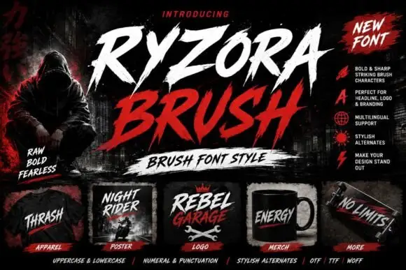
Torn brush display
Ryzora Brush is a brush display in bone and red on a dark street scene: forward-slanted capitals with torn edges, pointed tails and dry-brush gaps, set in two lines above a brush-stroke band, with a hooded figure at the left, a feature list at the right and a row of small mockups along the foot.
Heavy brush capitals with split pointed ends
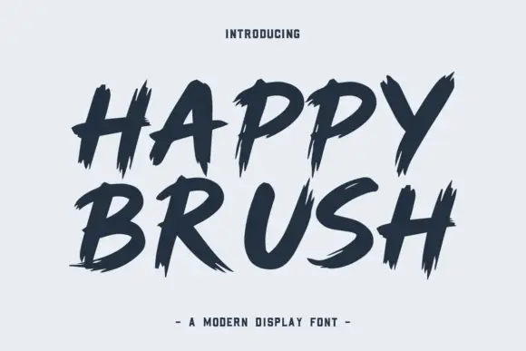
Happy Brush is a heavy brush capital face in which the strokes slant, the ends taper into long points and some terminals split in two, so a short headline reads as a loaded brush dragged across the surface.
Ideas for this font

Slanted brush script
Lover is a slanted brush script in black on nude packaging: thick downstrokes with rough white breaks, blunt tapered ends and a fast rightward lean, shown on a bottle, a bag, a tag, a card and a jar across a single mockup sheet.
Ideas for this font
Display
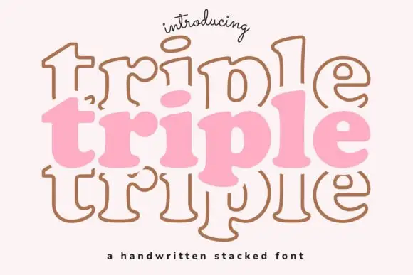
Triple is a handwritten display face built for stacking: the same soft capital is drawn three times, once filled and twice as outline, offset above and below, so a word looks like a hand-drawn sign layered on itself.
Ideas for this font
Same independent foundry
Allow optional Google Analytics to measure visits and catalogue actions. Your search words and notes are not included. Privacy & storage