Modern Grotesque Body

Kryptelle + Limited Coffee
Creates crisp high-hierarchy contrast beneath Kryptelle headlines across menus, websites and labels.
Inspect Limited Coffee specimenDisclosure: MakerFileHub may earn a commission from qualifying purchases via paid links on this page. How our links work.
Heavy Victorian-gothic spurred display serif (OTF)
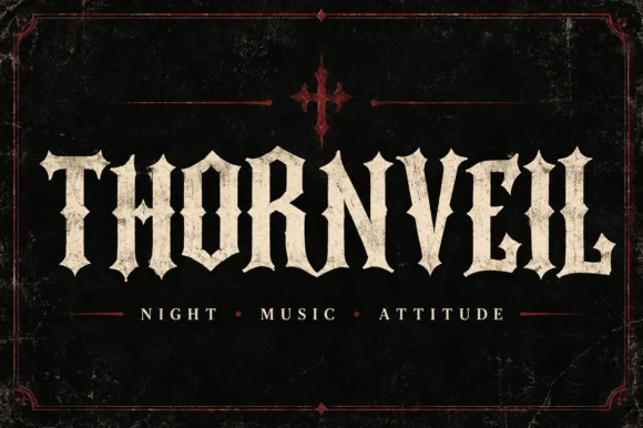
Kryptelle is a muscular, heavy-weight gothic-Victorian display serif armed with median stem spurs and bold curved brackets (OTF).
Paid link
Get this fontProject & layout blueprintsAt-a-glance maker compatibility
Sturdy stroke walls and open counters weed cleanly on adhesive vinyl, HTV apparel film, and cut cardstock.
Visual anatomy & craft review
Kryptelle is a heavy Victorian-gothic spurred display serif: dense bracketed stems, a medial spur on the round letters, split serifs and a small notch cut into the counters that reads as carving. The spur breaks the silhouette and the dense weight closes the counters early. It needs roughly 34 mm for the spur and the notch to read, and it is best in one dense ink on cream and stone, or a single dark red on parchment, and it should never be reversed at small sizes.
Ornate-heavy · Spurred-slab · Heritage
Two-font hierarchy recipes
Tested contrast partners — pairing Kryptelle with grounded secondary typography.
Kryptelle + Limited Coffee
Creates crisp high-hierarchy contrast beneath Kryptelle headlines across menus, websites and labels.
Inspect Limited Coffee specimen
Kryptelle + Handmade Calligraphy
Adds a warm human signature touch for 1-to-3-word callouts without competing against structured serif capitals.
Inspect Handmade Calligraphy specimenPractical applications
Concrete hierarchy, scale and production guidance tailored to Kryptelle’s stroke geometry.
A spurred Victorian serif reads as a gilded mirror rather than a modern bar logo, which is what a themed room wants behind its bar. The spur holds at 40 mm on a decal, and one dark ink on a light ground keeps the counters open.
Hierarchy & layout recipe
Mirror decal 800 x 300 mm, word 100 mm with 12 mm spur clearance, 30 mm margins. Bottle label 90 x 70 mm, word 20 mm, 5 mm margins. Card 85 x 55 mm, word 14 mm, 5 mm margins.
Pre-production check
Reversed white on a dark label at 20 mm the notched counters fill and the name reads as a solid plate. Print the label dark on light or raise the word to 26 mm, and check one label on the bottle.
A Victorian display serif reads as a bar's own signage rather than a printed thank-you, which is what a regulars' night sends. The spur holds at 22 mm on a card, and one ink prints the card, the coaster and the tags in one order.
Hierarchy & layout recipe
Card A6, greeting 22 mm with 6 mm spur clearance, note 8/11 pt, 12 mm margins. Coaster 95 mm square, word 14 mm, 5 mm die margin. Glass tag 40 x 90 mm, word 10 mm with a 4 mm hole and 8 mm clear.
Pre-production check
On a 95 mm coaster the split serif runs into the die edge and the blade clips a curl. Keep the word 6 mm inside the die, and cut one coaster before the batch.
A spurred gothic serif reads as a period bill rather than a cartoon monster, which is what a themed fright night wants at the gate. The dense stems hold at 120 mm, and one ink plus a spot red prints the poster, the ticket and the candles.
Hierarchy & layout recipe
Poster A2, word 120 mm with 14 mm spur clearance, times 40 mm, 20 mm margins. Ticket 100 x 50 mm, word 14 mm, 4 mm perforation. Candle label 60 x 40 mm, word 10 mm, 3 mm margins.
Pre-production check
A 60 x 40 mm candle label at 10 mm closes the notch into a black bar and the name is unreadable by candlelight. Raise the label word to 16 mm, and check one label in the actual light.
Technical & licence verification
Confirm included OTF/TTF/WOFF formats, full glyph tables and licence coverage on the live store page before batch production.
Closest visual alternatives
Matched across letterform anatomy, stroke behaviour and craft applications.
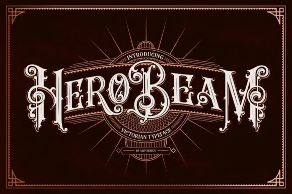
3D-shaded Victorian saloon & tattoo blackletter
Hero Beam is an elaborate Victorian poster typeface dressed with interior inline filigree, curled spurs, and crisp drop-contour framing.
Ideas for this font
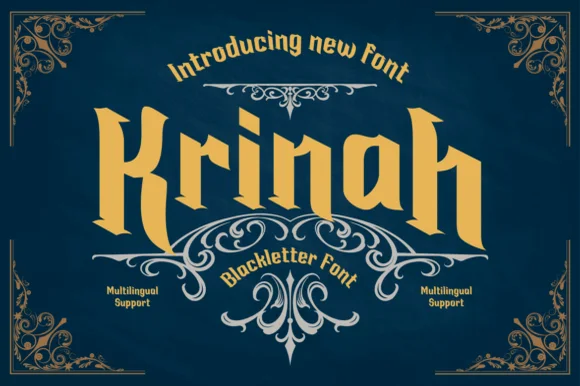
Wide sturdy modern tavern blackletter (Multilingual)
Krinah is a wide, ultra-sturdy modern blackletter typeface with generous open counters and full multilingual support—built to cut cleanly on Cricut!
Ideas for this font
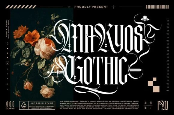
Ornate blackletter with filigree swashes
Makyos Gothic is an ornate blackletter in white on black: heavy spiked stems, hairline filigree woven through the counters, and long swashes that curl out of the first and last letters, shown beside dark blooms and studio marks.
Ideas for this font
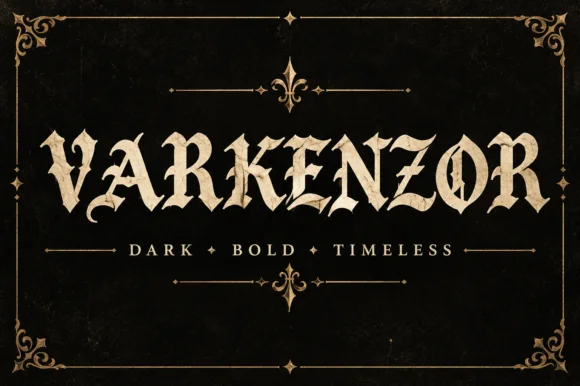
Condensed blackletter with sharp spurs
Varkenzor is a condensed blackletter in ochre on black inside an ornamental frame: tall narrow strokes, sharp spurs on the capitals, tight spacing that fuses the word into a band, and small diamond ornaments separating the motto words.
Ideas for this font
Same independent foundry
Allow optional Google Analytics to measure visits and catalogue actions. Your search words and notes are not included. Privacy & storage