Neutral Sans Workhorse

Krinah + Taught
Lets Krinah own the focal silhouette while handling secondary copy, sizing and subheads cleanly.
Inspect Taught specimenDisclosure: MakerFileHub may earn a commission from qualifying purchases via paid links on this page. How our links work.
Wide sturdy modern tavern blackletter (Multilingual)
Krinah is a wide, ultra-sturdy modern blackletter typeface with generous open counters and full multilingual support—built to cut cleanly on Cricut!
Paid link
Get this fontProject & layout blueprintsAt-a-glance maker compatibility
Sturdy stroke walls and open counters weed cleanly on adhesive vinyl, HTV apparel film, and cut cardstock.
Visual anatomy & craft review
Krinah is a wide sturdy modern blackletter with generous open counters, heavy squared stems and full multilingual support, drawn to cut cleanly rather than to reproduce a fragile manuscript hand. The open counters are what makes it usable at 16 pt, and the wide stance fills a panel with a short word; the heavy weight survives vinyl and HTV. It needs roughly 24 mm for the blackletter texture to read, and it is best in ochre gold on deep blue or in one ink on cream.
Wide-legible-blackletter · Pub-crest · Multilingual
Two-font hierarchy recipes
Tested contrast partners — pairing Krinah with grounded secondary typography.
Krinah + Taught
Lets Krinah own the focal silhouette while handling secondary copy, sizing and subheads cleanly.
Inspect Taught specimen
Krinah + Papillon Serif – Elegant Modern Luxury
Grounds bold display lettering with classic typographic authority on posters, badges and apparel.
Inspect Papillon Serif – Elegant Modern Luxury specimenPractical applications
Concrete hierarchy, scale and production guidance tailored to Krinah’s stroke geometry.
A sturdy wide blackletter reads as a tavern that means business, which is what a small brewery prints on a label and a sign. The open counters hold a long product name at 16 pt, and the heavy stems cut cleanly for vinyl.
Hierarchy & layout recipe
Label 70 x 95 mm, name 16 mm, weight 5 pt, 5 mm top arc and 4 mm die margin. Sign 900 x 400 mm, word 160 mm, 60 mm margins. Merch print 280 x 160 mm, word 60 mm, 40 mm margins.
Pre-production check
A vinyl cut at 160 mm leaves the blackletter's inner counters as loose islands. Keep counters bridged at 1.5 mm on cut artwork, and weed one sign before the run.
A heavy blackletter reads as a mark engraved for a club, which is what a long-service thank-you wants. The wide forms hold a long name at 26 mm, and the heavy weight engraves without the counters closing.
Hierarchy & layout recipe
Plaque 250 x 150 mm, word 30 mm, year 10 mm, 20 mm margins and 8 mm engraved margin. Card 148 x 105 mm, heading 14 mm, message 7/10 pt. Board 900 x 600 mm, word 140 mm, 60 mm margins.
Pre-production check
An engraved plate cuts the 2 mm counter bridges and the letter falls into two islands. Widen the bridges to 3 mm on the engraving file, and inspect one plate before the order.
Modern blackletter reads as a gothic tavern rather than a horror poster, which is what an immersive October night prints. The heavy stems hold at 260 mm in one ink, and the wide stance makes a short venue name fill a panel.
Hierarchy & layout recipe
Poster A2, word 260 mm, times 22/28 pt, 30 mm margins and 20 mm trim. Card 105 x 148 mm, word 26 mm, details 8/11 pt. Prop label 90 x 140 mm, word 20 mm, 12 mm margins.
Pre-production check
Gold on a dark poster under warm lamp light loses contrast and the blackletter reads as a brown smear. Add a pale keyline behind the word, and check one card under the venue's actual lighting.
Technical & licence verification
Confirm included OTF/TTF/WOFF formats, full glyph tables and licence coverage on the live store page before batch production.
Closest visual alternatives
Matched across letterform anatomy, stroke behaviour and craft applications.
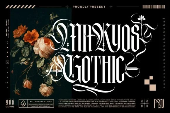
Ornate blackletter with filigree swashes
Makyos Gothic is an ornate blackletter in white on black: heavy spiked stems, hairline filigree woven through the counters, and long swashes that curl out of the first and last letters, shown beside dark blooms and studio marks.
Ideas for this font
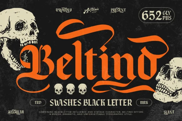
Swashed vintage gothic blackletter (Regular & Slant, 652 glyphs)
Beltino is a muscular 652-glyph swashed blackletter family (Regular & Slant) crowned with sweeping flame-like banner ribbons.
Ideas for this font
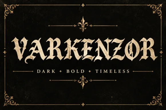
Condensed blackletter with sharp spurs
Varkenzor is a condensed blackletter in ochre on black inside an ornamental frame: tall narrow strokes, sharp spurs on the capitals, tight spacing that fuses the word into a band, and small diamond ornaments separating the motto words.
Ideas for this font
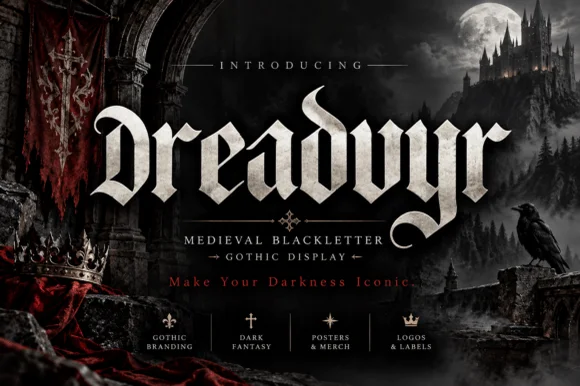
Aggressive thorn-spurred medieval dark-gothic blackletter
Dreadvyr is a fierce medieval blackletter armed with razor-sharp diamond spurs, horned ascenders, and scythe-curved 'y/r' terminals.
Ideas for this font
Allow optional Google Analytics to measure visits and catalogue actions. Your search words and notes are not included. Privacy & storage