Neutral Sans Workhorse

Noise Youth + Swaraga
Lets Noise Youth own the focal silhouette while handling secondary copy, sizing and subheads cleanly.
Inspect Swaraga specimenDisclosure: MakerFileHub may earn a commission from qualifying purchases via paid links on this page. How our links work.
Punk zine display in three distressed styles
Noise Youth is a punk zine typeface family in white and black on magenta: tall condensed capitals shown in distressed, stencil and grunge styles, with ink bands and a caption line about DIY zines.
Paid link
Get this fontProject & layout blueprintsAt-a-glance maker compatibility
Open counter bridges hold interior islands intact on laser-cut wood, acrylic, and mylar stencils.
Visual anatomy & craft review
The sheet is laid out like a zine page and the family is built for that: three styles of one condensed capital face, one with a rough distressed edge, one cut as a stencil with gaps through the stems, and one heavier and more eaten away, so a page can mix them without a change of voice. The letters are narrow with flat terminals and tight fitting, which is what lets a long word fill the width of a page, and the ink bands behind them are drawn with torn edges to match the printing the styles imitate. Because the faces are condensed, a whole phrase can be set large, which is how a zine headline works. The palette is a magenta field with black bands and white type, and small capital lines sit above and below the block to name the family and its sources. Noise Youth is a display family for posters, zines, album artwork and apparel, and it needs capitals at a large size on a high-contrast ground.
Punk, stencil, distressed
Two-font hierarchy recipes
Tested contrast partners — pairing Noise Youth with grounded secondary typography.
Noise Youth + Swaraga
Lets Noise Youth own the focal silhouette while handling secondary copy, sizing and subheads cleanly.
Inspect Swaraga specimen
Noise Youth + Things
Grounds bold display lettering with classic typographic authority on posters, badges and apparel.
Inspect Things specimenPractical applications
Concrete hierarchy, scale and production guidance tailored to Noise Youth’s stroke geometry.
A zine cover needs a face that looks printed by hand, and the three styles let a designer build a hierarchy without leaving the family.
Hierarchy & layout recipe
Print a 210 by 297 mm cover: set the title at 100 pt on one line, keep 24 mm of clear ground beneath before the coverlines at 10 pt, and hold 14 mm of margin on all four sides.
Pre-production check
A torn ink band can clip a letter at the trim; keep the block inside the safe area and proof the cover.
A stencil style within the family prints cleanly on a shirt, and the distressed styles give a worn look without a second product.
Hierarchy & layout recipe
Print a 260 mm chest width: set the band name at 70 mm cap height, keep 22 mm of clear ground beneath before the tour line, and hold 55 mm from each sleeve seam.
Pre-production check
A stencil gap can close in a screen print; print one garment and check the gaps before the run.
A condensed punk face reads from a doorway and looks right printed on cheap paper, which is where this kind of poster lives.
Hierarchy & layout recipe
Print an A3 poster at 297 by 420 mm: set the lineup at 90 pt over three lines, keep 26 mm of clear ground beneath before the date at 20 pt, and hold 20 mm of margin on all four sides.
Pre-production check
Cheap paper and heavy ink can set off; print one sheet and check the dry time before running a stack.
Technical & licence verification
Confirm included OTF/TTF/WOFF formats, full glyph tables and licence coverage on the live store page before batch production.
Closest visual alternatives
Matched across letterform anatomy, stroke behaviour and craft applications.
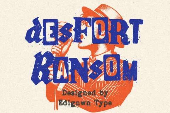
Gritty stamp-distressed mixed-typeface ransom-note font
Desfort Ransom is a rugged, ink-stamped ransom-note typeface mixing serif, sans, and reverse-tile characters with weathered woodblock grit!
Ideas for this font
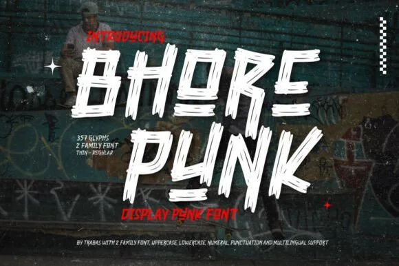
Slashed stencil-cut punk & streetwear display
Bhore Punk is a fierce, slanted punk-rock display typeface sliced through with diagonal razor-cut stencil splits and jagged dry-brush spurs.
Ideas for this font
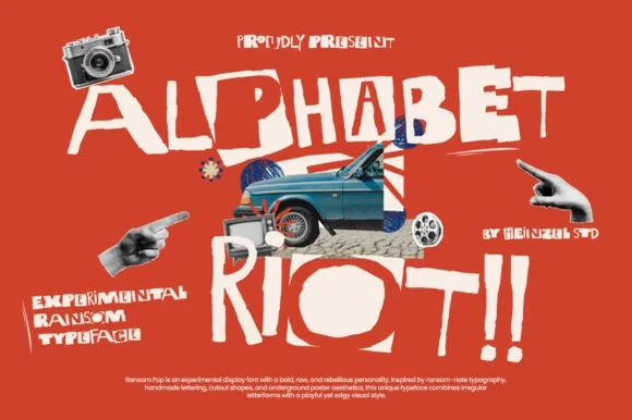
Rebellious mixed-case collage & street-poster ransom font
Alphabet Riot is a bold, gritty street-collage ransom font mixing solid hand-cut block letters with tilted cutout boxes and exclamation energy.
Ideas for this font
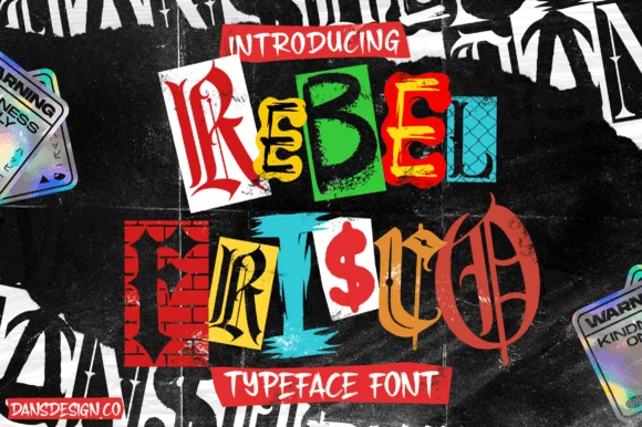
Cut-and-paste punk zine & brick-wall ransom-note alphabet
Rebel Frisco Graffiti Urban Y2k is a wild cut-out ransom-note decorative font mixing brick-wall blocks, dollar signs, blackletter, and newspaper clippings!
Ideas for this font
Allow optional Google Analytics to measure visits and catalogue actions. Your search words and notes are not included. Privacy & storage