Neutral Sans Workhorse

Brashvane + Mango Dream
Lets Brashvane own the focal silhouette while handling secondary copy, sizing and subheads cleanly.
Inspect Mango Dream specimenDisclosure: MakerFileHub may earn a commission from qualifying purchases via paid links on this page. How our links work.
Raw jagged street-brush uppercase display (OTF)
Brashvane is an edgy, fast-painted uppercase street-brush font with sharp dry-bristle kicks and punk-poster attitude (OTF).
Paid link
Get this fontProject & layout blueprintsAt-a-glance maker compatibility
Fine grain and micro-texture excel in 300 DPI print, sublimation, and screen print rather than small vinyl weeding.
Visual anatomy & craft review
Brashvane is a raw uppercase street-brush display with fast dry-bristle kicks, jagged terminals and uneven stroke pressure, so a word reads as paint dragged across concrete rather than a designed tag. The dry edge is baked in, which means the face holds at large sizes and turns to noise below about 24 mm, and the kicks extend past the letter body. It needs roughly 28 mm for the bristle edge to read, and it is best in jet black on scuffed white or one bright ink on a dark ground.
Raw-brush · Rebellious · Punk-tag
Two-font hierarchy recipes
Tested contrast partners — pairing Brashvane with grounded secondary typography.
Brashvane + Mango Dream
Lets Brashvane own the focal silhouette while handling secondary copy, sizing and subheads cleanly.
Inspect Mango Dream specimen
Brashvane + Mewah
Grounds bold display lettering with classic typographic authority on posters, badges and apparel.
Inspect Mewah specimenPractical applications
Concrete hierarchy, scale and production guidance tailored to Brashvane’s stroke geometry.
Dry-brush street lettering reads as a print made in a garage, which is what a small skate label sells. The heavy strokes hold at 60 mm on a garment, and the jagged edge gives the mark attitude without a distressed texture pass.
Hierarchy & layout recipe
Tee print 280 x 160 mm, word 60 mm, 40 mm margins. Sticker 90 x 60 mm, word 18 mm, 3 mm die margin. Window vinyl 900 x 300 mm, word 150 mm, 60 mm margins.
Pre-production check
A vinyl cut at 150 mm drops bristle kicks under 0.5 mm and the word arrives with flat ends. Keep the kicks at 1.5 mm on cut artwork, and weed one window word before the run.
Raw brush caps read as a zine assembled by hand, which is what a punk publication is. The uneven edge gives the cover texture in one pass, and the kick terminals hold at 90 pt on cheap stock.
Hierarchy & layout recipe
Cover 148 x 210 mm, title 60 mm, cover lines 8/11 pt, 12 mm margins. Opener 420 x 297 mm, headline 110 mm, body 9/13 pt. Poster A2, word 260 mm, details 22/28 pt, 30 mm margins.
Pre-production check
A photocopied zine at 80 percent reduction erodes the dry-brush edge into scattered dots and the title looks faded. Print at 100 percent, and check one reduced spread before the run.
Jagged black brush lettering reads as a street night with a hard edge, which is what a late-October warehouse event prints. The dry strokes hold in white on black under coloured light, and the jagged terminals carry across a dark room.
Hierarchy & layout recipe
Poster A2, word 260 mm, times 22/28 pt, 30 mm margins and 20 mm trim. Entry band 250 x 25 mm, word 8 mm, 4 mm margins. Merch print 280 x 160 mm, word 60 mm, 40 mm margins.
Pre-production check
A wristband at 8 mm reduces dry-brush kicks to dots and the event name smears on the wrist. Use the solid weight for small formats, and check one printed band before the gate.
Technical & licence verification
Confirm included OTF/TTF/WOFF formats, full glyph tables and licence coverage on the live store page before batch production.
Closest visual alternatives
Matched across letterform anatomy, stroke behaviour and craft applications.
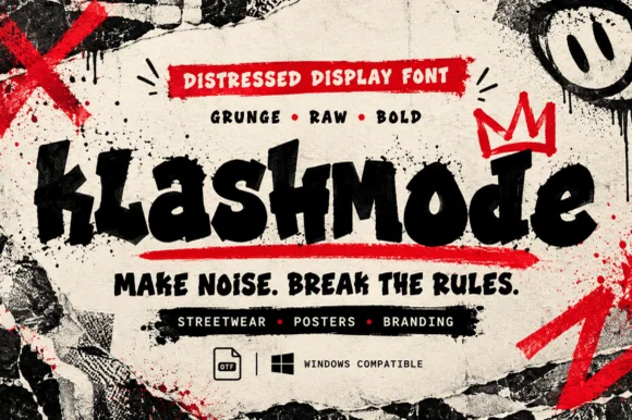
Chaotic punk-street & ransom-tilted grunge display (OTF)
Klashmode is a raw, rebellious street-grunge display font mixing chunky tilted uppercase and lowercase blocks with rough ink-stamp edges.
Ideas for this font
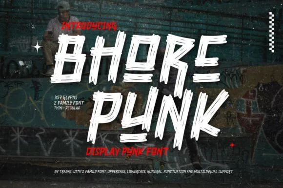
Slashed stencil-cut punk & streetwear display
Bhore Punk is a fierce, slanted punk-rock display typeface sliced through with diagonal razor-cut stencil splits and jagged dry-brush spurs.
Ideas for this font
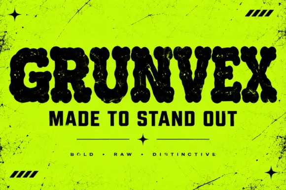
Rounded puffy street-grunge block display (OTF)
Grunvex is an ultra-heavy, puffy street-block display font combining rounded graffiti-slab silhouettes with subtle worn-ink texture.
Ideas for this font
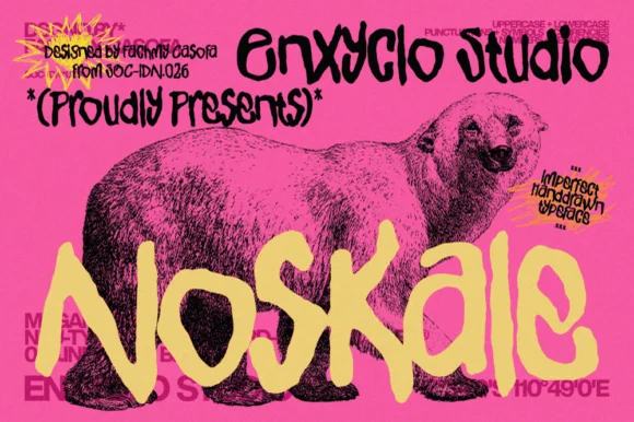
Imperfect hand-drawn marker display
Noskale is an imperfect hand-drawn display in yellow on hot pink: wobbly thick marker letters with uneven widths and heights, drawn over a vintage engraving of a polar bear, with printed corner notes in a scrawled hand.
Ideas for this font
Same independent foundry
Allow optional Google Analytics to measure visits and catalogue actions. Your search words and notes are not included. Privacy & storage