Editorial Serif Anchor

Ez Fwipple + The Bilstein Editorial
Anchors Ez Fwipple's fluid strokes with crisp Roman proportions on wedding suites, headers and packaging.
Inspect The Bilstein Editorial specimenDisclosure: MakerFileHub may earn a commission from qualifying purchases via paid links on this page. How our links work.
Bouncy separate mixed-case print
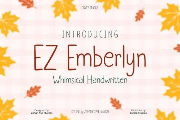
Ez Fwipple shows uneven separate letters with a tall F, long p descenders and lowercase proportions that change from letter to letter rather than holding one geometric width.
Paid link
Get this fontProject & layout blueprintsAt-a-glance maker compatibility
Weld or Unite overlapping script joins into one continuous vector path before sending to the blade.
Visual anatomy & craft review
The F rises above the line, the p letters drop long descenders, the bowls vary in width and the baseline shifts so the row bounces without joining. The changing proportions are the character: the word reads as quick handwriting rather than a uniform sans, which is why the sample sets a short phrase. Because the descenders travel, keep 18 mm beneath from 26 pt, and check a longer word for the width jumps that a short sample hides. The face stays separate throughout, so it needs clear word spacing rather than connectors.
Bouncy · Separate · Uneven
Two-font hierarchy recipes
Tested contrast partners — pairing Ez Fwipple with grounded secondary typography.
Ez Fwipple + The Bilstein Editorial
Anchors Ez Fwipple's fluid strokes with crisp Roman proportions on wedding suites, headers and packaging.
Inspect The Bilstein Editorial specimen
Ez Fwipple + Taught
Keeps small-scale dates, URLs, nutrition facts and care instructions crisp and legible below script titles.
Inspect Taught specimenPractical applications
Concrete hierarchy, scale and production guidance tailored to Ez Fwipple’s stroke geometry.
The bouncy print suits a friendly note, and the separate letters stay clear at 24 pt across an A6 sheet in one ink. The uneven widths also keep a printed card from feeling typeset.
Hierarchy & layout recipe
Print an A6 card: set the line at 24 pt across the upper third, keep 14 mm of clear ground beneath for the p descenders, and leave the lower half blank for a written message. Keep the card flat under the type.
Pre-production check
Long descenders printed into the writing area are smudged; check the card and keep 12 mm of white beneath them.
The uneven print suits a child's folder, and the tall F keeps a first name readable at 20 pt on a 70 mm sticker. The tall F also gives a plain name a single accent.
Hierarchy & layout recipe
Print a 70 by 25 mm folder label: set the name at 20 pt, keep 6 mm of clear vinyl at each end, and keep 3 mm inside the die so the descender is not trimmed. Centre the name on the strip.
Pre-production check
A descender cut by the die edge looks like a fault; check the artwork and keep the name on the flat centre. Round the die corners on the strip.
The bouncing letters suit a small tag, and the even weight keeps a short name clear at 18 pt on a 45 mm card. The changing widths also keep a short name lively on a tag.
Hierarchy & layout recipe
Print a 45 by 70 mm tag: set the name at 18 pt, punch a 4 mm hole 9 mm from the top edge, and keep 6 mm between that hole and the tallest letter. Keep the row on one line so the bounce stays even.
Pre-production check
A hole punched under a tall letter leaves a thin bridge; check the die and move the hole 4 mm lower. A 350 gsm tag holds the punch better.
Technical & licence verification
Confirm included OTF/TTF/WOFF formats, full glyph tables and licence coverage on the live store page before batch production.
Closest visual alternatives
Matched across letterform anatomy, stroke behaviour and craft applications.
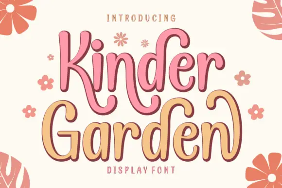
Tall soft letters with curled extensions and an offset outline
Kinder Garden is a tall soft face in which the letters rise above the line, the extensions curl away and an offset outline sits behind each stroke, so a word reads as a hand-painted shop sign with depth.
Ideas for this font
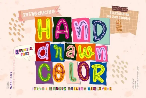
Loose multicolour scribble outlines on contrasting rectangular tiles
Hand Drawn Color builds each word out of separate squares of coloured paper, every tile carrying one letter drawn in loose multicolour scribble outlines, so a headline reads as a pile of marker sketches rather than one even typeface.
Ideas for this font
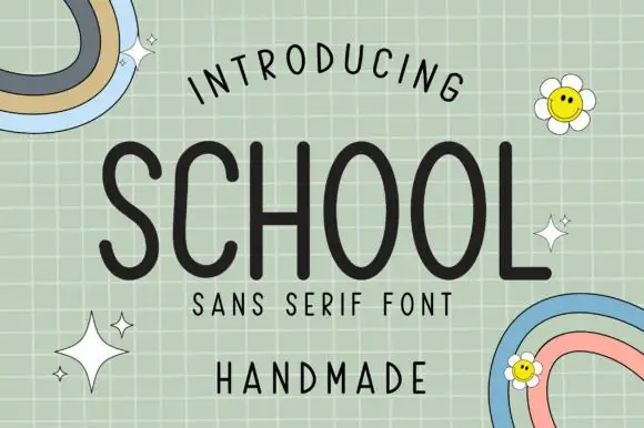
Tall rounded monoline hand
School is a tall rounded monoline face in charcoal on a pale green grid: capitals with long oval O bowls, a curved L foot and an even stroke, with a curved line above, a tracked line and a plain word beneath, plus two small rainbow doodles and daisies in the corners.
Ideas for this font
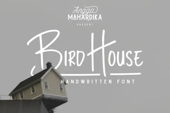
Thin informal marker mixed case with towering capitals and long cross-strokes
Bird House is a thin informal marker hand in which the first capital towers over a narrow lowercase body, the H rises especially high and a long cross-stroke travels across the second word, so a name reads as a quick marker sketch.
Ideas for this font
Same independent foundry
Allow optional Google Analytics to measure visits and catalogue actions. Your search words and notes are not included. Privacy & storage