Editorial Serif Anchor

Chalky Kids + Auretha
Anchors Chalky Kids's fluid strokes with crisp Roman proportions on wedding suites, headers and packaging.
Inspect Auretha specimenDisclosure: MakerFileHub may earn a commission from qualifying purchases via paid links on this page. How our links work.
Textured chalk capitals with rounded frames and a broken inner fill
Chalky Kids is a rounded capital alphabet with a chalk texture inside the strokes, drawn so a word looks written on a blackboard rather than printed on paper.
Paid link
Get this fontProject & layout blueprintsAt-a-glance maker compatibility
Fine grain and micro-texture excel in 300 DPI print, sublimation, and screen print rather than small vinyl weeding.
Visual anatomy & craft review
The C closes a wide crescent, the H keeps two even stems and a low bar, the K splays from one junction and the Y forks high, all at a heavy even weight with fully rounded corners. The texture is the point: the fill carries a granular chalk grain with a lighter edge, so each letter reads as something drawn with a chunky stick and then dusted off. Because the shapes are simple and equal in weight, the letters can take different colours without losing the chalk character, which is what the sample does. Counters stay open at 30 pt, so the face works on a classroom board as well as on a printed worksheet. The cream ground, the pastel fills, the sun, the rainbow and the small caption are presentation; the typeface is the two words.
Chalky · Rounded · Textured
Two-font hierarchy recipes
Tested contrast partners — pairing Chalky Kids with grounded secondary typography.
Chalky Kids + Auretha
Anchors Chalky Kids's fluid strokes with crisp Roman proportions on wedding suites, headers and packaging.
Inspect Auretha specimen
Chalky Kids + One More
Keeps small-scale dates, URLs, nutrition facts and care instructions crisp and legible below script titles.
Inspect One More specimenPractical applications
Concrete hierarchy, scale and production guidance tailored to Chalky Kids’s stroke geometry.
The chalk texture reads at 40 mm on a printed sign while keeping the handmade register of a real blackboard, which is what a classroom door wants.
Hierarchy & layout recipe
Print a 300 by 200 mm sign: set the welcome at 40 mm across the upper half, set the class name in a 12 mm rounded sans beneath, and leave 25 mm of margin so the rounded ends stay inside the printed panel.
Pre-production check
A chalk texture printed at small sizes reads as a dirty plate; check the proof and keep the textured cut above 20 mm.
The chunky rounded letters cut cleanly in card and read against a frosted cake, and the texture survives on a printed topper at 45 mm.
Hierarchy & layout recipe
Cut a 150 mm wide topper: set the name at 45 mm tall, keep 6 mm of material around each stroke, and leave a 20 mm stem at the centre so the topper can stand without a support.
Pre-production check
A rounded stroke under 5 mm snaps when the topper is pushed into the cake; check the vector at full size and thicken the thinnest arm before cutting.
The letters stay legible on a photocopied worksheet at 20 pt, and the rounded shapes keep a routine task from feeling institutional.
Hierarchy & layout recipe
Print an A4 worksheet: set the header at 20 pt across the top margin, keep the instructions in an 11 pt sans at 15 pt leading, and leave a 10 mm band under the header so the pupils' writing starts clear of the texture.
Pre-production check
Photocopiers close small counters and thicken textures; check a copy at full size and open the a and e if the grain starts to fill them.
Technical & licence verification
Confirm included OTF/TTF/WOFF formats, full glyph tables and licence coverage on the live store page before batch production.
Closest visual alternatives
Matched across letterform anatomy, stroke behaviour and craft applications.
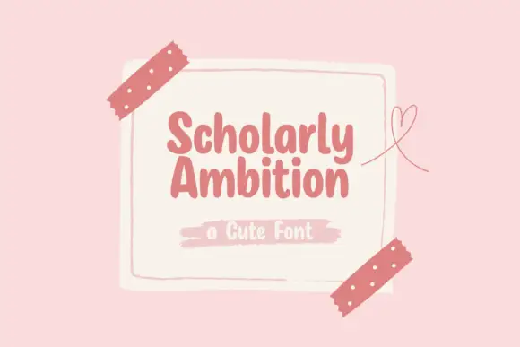
Compact heavy rounded separate letters
Scholarly Ambition is a compact heavy hand-drawn print in dusty rose on a cream card taped to a pink wall: fat rounded letters with blunt ends, a light bounce, and a brush-stroke caption beneath.
Ideas for this font
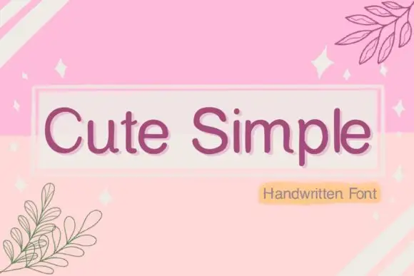
Simple rounded separate letters
Cute Simple sets rounded, separated letters with a mixed outline treatment and a soft pill badge, reading as a friendly printed label rather than a script.
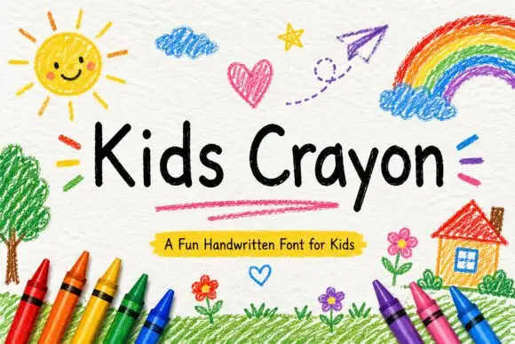
Rounded separate handwriting with uneven letter heights and soft terminals
Kids Crayon is rounded handwriting in which the letters stand separately, the heights drift a little and the strokes end softly, so a phrase reads as something written by a child rather than drawn for one.
Ideas for this font
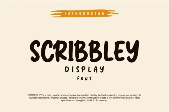
Chunky organic handwriting display
Scribbley is a chunky organic handwriting display in dark brown on cream: thick rounded letters with a wobbling outline, uneven heights, an open e and a looped y, set as one word with two small supporting lines beneath and a paragraph of tracked copy at the foot.
Ideas for this font
Same independent foundry
Allow optional Google Analytics to measure visits and catalogue actions. Your search words and notes are not included. Privacy & storage