Neutral Sans Workhorse

Sumario + Olline
Lets Sumario own the focal silhouette while handling secondary copy, sizing and subheads cleanly.
Inspect Olline specimenDisclosure: MakerFileHub may earn a commission from qualifying purchases via paid links on this page. How our links work.
Polygonal heavy display
Sumario is a heavy angular display on a bright gradient: capitals built from polygonal shapes with counters cut as hexagons and trapezoids, each letter in a different saturated colour with a bold black offset edge, set as one word and nothing else on the sheet.
Paid link
Get this fontProject & layout blueprintsAt-a-glance maker compatibility
Sturdy stroke walls and open counters weed cleanly on adhesive vinyl, HTV apparel film, and cut cardstock.
Visual anatomy & craft review
The plate is a plain specimen on a loud gradient, and the construction is what carries it: every letter is assembled from polygonal facets, so the counters come out as hexagons and trapezoids rather than curves, and the black offset edge gives the word a sticker-like separation from the ground. The colour varies letter by letter, which is what makes the face read as playful rather than brutal. That construction sets a moderate size floor, because the offset edge merges into the letters first. The gradient is staging. It suits a shirt, a poster and a game title, and the angular counters mean it holds a short word at a small size better than a rounded block face.
Display, angular, heavy, colourful
Two-font hierarchy recipes
Tested contrast partners — pairing Sumario with grounded secondary typography.
Sumario + Olline
Lets Sumario own the focal silhouette while handling secondary copy, sizing and subheads cleanly.
Inspect Olline specimen
Sumario + Mewah
Grounds bold display lettering with classic typographic authority on posters, badges and apparel.
Inspect Mewah specimenPractical applications
Concrete hierarchy, scale and production guidance tailored to Sumario’s stroke geometry.
A polygonal display reads as a game title, and the offset edge keeps the word separate from a busy illustration. It reads as a game title.
Hierarchy & layout recipe
Set the title at 90 mm cap height across 190 mm, the studio in a 10 pt sans, and the platform at 8 pt. Print four colours on a coated stock and keep 20 mm margins.
Pre-production check
Check the title at 90 mm, where an offset can merge; keep 1.5 mm of gap. Confirm the 8 pt platform survives lamination and that the counters stay open.
A polygonal display prints as party kit, and the saturated colours hold on a light shirt where a single ink would look flat.
Hierarchy & layout recipe
Print a 250 mm chest graphic: the greeting at 55 mm cap height, the year at 24 mm, and four inks on a light shirt. Keep the offset at 3 mm and place the graphic 80 mm below the collar.
Pre-production check
Check the screen at actual mesh, where a 3 mm offset can merge; keep it at 4 mm. Wash-test one shirt and confirm the colours stay separate after five cycles.
A polygonal display names a games night, and the heavy counters read at a small card size where a fine face would fail. It reads at card size.
Hierarchy & layout recipe
A6 card: the greeting at 30 pt, the details in a 10 pt sans, and the date at 9 pt. Keep 15 mm margins, print four colours on a white card and leave 12 mm at the foot for the address.
Pre-production check
Check the 30 pt greeting at home-print resolution, where an offset merges; keep 1.2 mm of gap. Confirm the details read at arm's length and that the card folds flat.
Technical & licence verification
Confirm included OTF/TTF/WOFF formats, full glyph tables and licence coverage on the live store page before batch production.
Closest visual alternatives
Matched across letterform anatomy, stroke behaviour and craft applications.

Very heavy rounded comic bubbles with tiny circular counters
Comic Pop is a very heavy comic display in which the letters balloon into rounded bubbles, the counters shrink to small circles and the i sits under a detached dot, so a short shout reads as a hand-lettered sound effect.
Ideas for this font
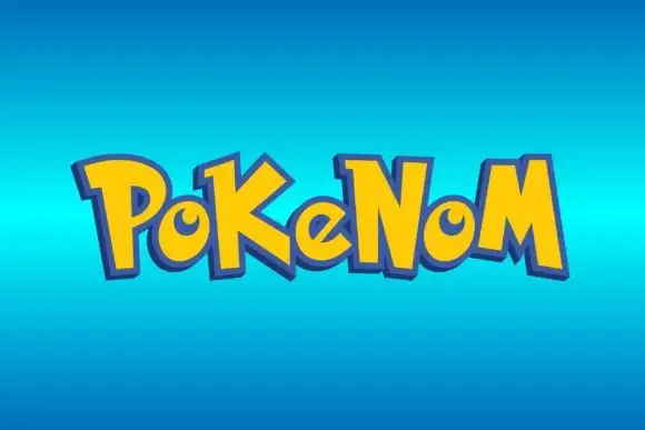
Bouncing pointed display
Pokenom is a bouncing irregular display shown in yellow on a blue gradient: mixed case with pointed capitals, curled small bowls, uneven stroke widths and letters that rise and fall, with a heavy blue outline and a soft shadow around the whole word.
Ideas for this font
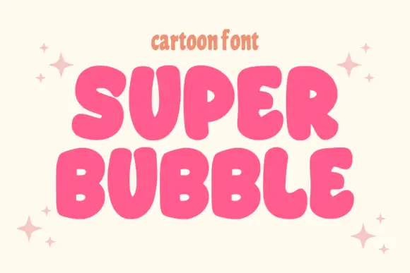
Heavy rounded cartoon capitals with small counters and uneven widths
Super Bubble is a heavy rounded cartoon display in which the capitals inflate, the counters shrink to small openings and the widths vary, so two stacked words read as gently over-full balloons.
Ideas for this font
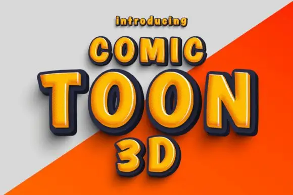
Rounded orange capitals with pale bevel highlights and thick dark depth
Comic Toon 3d gives orange block capitals a chunky bevelled appearance, where yellow and pale highlights run near the upper and left edges and dark navy sides step down to suggest depth, while a diagonal grey-orange divide crosses the background behind the letters.
Ideas for this font
Same independent foundry
Allow optional Google Analytics to measure visits and catalogue actions. Your search words and notes are not included. Privacy & storage