Modern Grotesque Body

Standard Typewriter + Borsen
Creates crisp high-hierarchy contrast beneath Standard Typewriter headlines across menus, websites and labels.
Inspect Borsen specimenDisclosure: MakerFileHub may earn a commission from qualifying purchases via paid links on this page. How our links work.
Typewriter serif with a wide even set
Standard Typewriter is a typewriter serif in black on white: slab-shaped serifs, an even stroke, wide and open letter spacing, shown as a single large line set inside a page of justified running text.
Paid link
Get this fontProject & layout blueprintsAt-a-glance maker compatibility
Fine grain and micro-texture excel in 300 DPI print, sublimation, and screen print rather than small vinyl weeding.
Visual anatomy & craft review
The specimen is unusually honest: the face is shown in one large line inside a page of justified text, which is how it is actually used. The letters carry slab serifs, a nearly even stroke with only a hint of contrast, a tall x-height and open spacing, and the a, the g and the e are drawn with typewriter shapes rather than print ones, with the g keeping a single-storey bowl and the t a full crossbar. Because the stroke is even and the spacing even, a paragraph set in the face reads as a typed sheet rather than as a printed book, which is the effect a typewriter face exists to produce. Nothing decorates the page but the text itself, so the specimen shows the texture of the face at reading size. Standard Typewriter is a serif for manuscripts, correspondence, packaging with a documentary feel and editorial layouts that want a typed voice, and it works at both text and display sizes provided the measure is not too narrow.
Typed, even, practical
Two-font hierarchy recipes
Tested contrast partners — pairing Standard Typewriter with grounded secondary typography.
Standard Typewriter + Borsen
Creates crisp high-hierarchy contrast beneath Standard Typewriter headlines across menus, websites and labels.
Inspect Borsen specimen
Standard Typewriter + Hello Honey
Adds a warm human signature touch for 1-to-3-word callouts without competing against structured serif capitals.
Inspect Hello Honey specimenPractical applications
Concrete hierarchy, scale and production guidance tailored to Standard Typewriter’s stroke geometry.
A typewriter face reads as a document rather than a design, which is exactly what a page reproducing letters or notes needs to convey.
Hierarchy & layout recipe
Print a 210 by 280 mm page: set the extract at 10.5 pt over a 92 mm measure, keep 14 mm of clear ground above the caption, and hold 22 mm of margin on the three outer sides.
Pre-production check
An even stroke at ten points can look grey in print; check one page on the intended paper stock before the run.
A typed label suits a publisher that sells on being small and hand-run, and the even spacing keeps a long imprint name readable on a narrow strip.
Hierarchy & layout recipe
Print a 60 by 25 mm label: set the imprint at 8.5 pt on one line, keep 3 mm of clear ground on all four sides, and hold the label 10 mm from the spine of the book.
Pre-production check
At eight and a half points the typewriter serifs can fill; print one label on the real paper and check before the order.
A typed tag reads as a note written at the kitchen table, and the even letters stay legible at the small size of a hanging tag.
Hierarchy & layout recipe
Print a 35 by 60 mm tag: set the contents at 9 pt over two lines, keep 4 mm of clear ground above the punched hole, and hold 3.5 mm of margin on the other sides.
Pre-production check
A punched hole can clip a long line; set the text inside the safe area and print one tag before the batch.
Technical & licence verification
Confirm included OTF/TTF/WOFF formats, full glyph tables and licence coverage on the live store page before batch production.
Closest visual alternatives
Matched across letterform anatomy, stroke behaviour and craft applications.
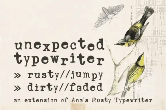
Distressed typewriter slab
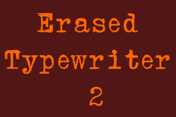
Unexpected Typewriter is a distressed typewriter slab in dark ink on aged paper: light uniform strokes, blunt slab serifs, a fixed advance with ragged breaks, and a worn edge that eats the outlines at random, with a line of tracked notes beneath and a vintage natural-history illustration behind.
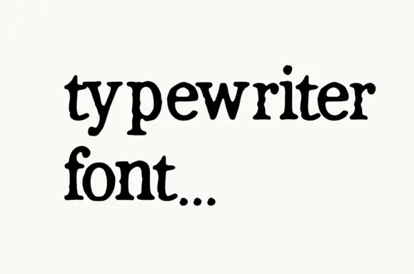
Plain typewriter serif in mixed case
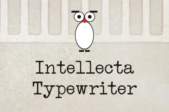
Typewriter Font is a typewriter serif in black on off-white, shown in two short lowercase lines: small slab serifs, an even stroke, a single-storey a and g, and a full stop that reads as a struck key.
Ideas for this font
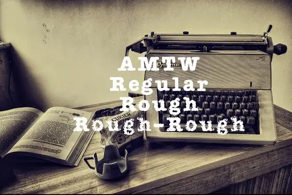
Heavy typed-looking forms shown in clean and increasingly broken treatments
AMTW is a heavy typewriter-style slab in which rounded feet and broad bowls appear in three treatments: a fairly clean regular row, a broken rough row and a much more eroded third row beneath the main initials.
Ideas for this font
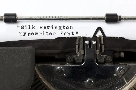
Typewriter slab lettering
Silk Remington is a typewriter face photographed on paper in a machine: uneven letter spacing, dark slab ends, broken ink texture and a few misaligned characters, shown as three short lines in black on a white sheet.
Ideas for this font
Same independent foundry
Allow optional Google Analytics to measure visits and catalogue actions. Your search words and notes are not included. Privacy & storage