High-Contrast Display Serif

Benjamin Franklin + Aureline
Pairs sculptural editorial warmth with Benjamin Franklin's clean modern geometry.
Inspect Aureline specimenDisclosure: MakerFileHub may earn a commission from qualifying purchases via paid links on this page. How our links work.
Uneven bookish text beside dense floral initial blocks
Benjamin Franklin is a duo of roles rather than two matching weights: softly irregular bookish text sets the small lines, while four elaborate square initials hold tightly packed leaves, flowers and speckles inside rectangular frames.
Paid link
Get this fontProject & layout blueprintsAt-a-glance maker compatibility
Sturdy stroke walls and open counters weed cleanly on adhesive vinyl, HTV apparel film, and cut cardstock.
Visual anatomy & craft review
The small lines keep rounded serif forms with uneven edges, and the blocks below set white vegetation against black inside square frames with the letter as the counter-shape. The two scales are the character: the text reads at line length while the initials work as pictures, which is why the sample sets a paragraph above four blocks. Because the white vegetation is fine, the blocks need 30 mm of side before the detail survives, and the open headline letters can run smaller. The four blocks are decorative initials; the small text is the reading face.
Bookish text · Floral initials · Two scales
Two-font hierarchy recipes
Tested contrast partners — pairing Benjamin Franklin with grounded secondary typography.
Benjamin Franklin + Aureline
Pairs sculptural editorial warmth with Benjamin Franklin's clean modern geometry.
Inspect Aureline specimen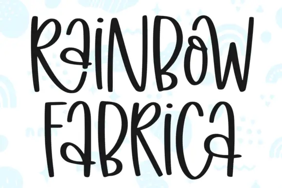
Benjamin Franklin + Rainbow Fabrica
Introduces organic movement on pull-quotes, signatures and gift tags.
Inspect Rainbow Fabrica specimenPractical applications
Concrete hierarchy, scale and production guidance tailored to Benjamin Franklin’s stroke geometry.
The pair sets a chapter opening, and the floral initial gives the first paragraph a picture while the small text carries the reading at 10 pt. The initials should never be set smaller than the text.
Hierarchy & layout recipe
Print a 210 mm spread: set the opening initial at 30 mm square, set the first paragraph at 10 pt on a 62 mm measure with 4 mm of clear ground beside the block, and keep the smaller lines ragged right.
Pre-production check
A floral initial smaller than 22 mm turns into a dark square; check the page proof and keep the block at 26 mm or above.
The two initials suit a monogram card, and the floral frame gives a small block weight at 40 mm on heavy card in one ink. The floral frame gives a small card an engraved feel.
Hierarchy & layout recipe
Print a 105 by 148 mm card: set the two initials as 40 mm blocks side by side, keep 14 mm between them so the frames stay separate, and set the names at 9 pt in a small caps beneath.
Pre-production check
Two floral blocks set closer than 8 mm read as one panel; check the card and open the gap to 12 mm. Keep the frames apart so each initial reads alone.
The bookish text suits a journal cover, and the initial blocks give a class title a printed feel at 18 pt over a 35 mm block. The bookish text carries a title without competing.
Hierarchy & layout recipe
Print an A5 cover: set the title at 18 pt in the text face, set the opening initial as a 35 mm block at the head of the first line, and keep 6 mm of clear ground around the frame.
Pre-production check
Fine white vegetation printed on a matte cover fills in; check the proof and keep the block at 30 mm or above.
Technical & licence verification
Confirm included OTF/TTF/WOFF formats, full glyph tables and licence coverage on the live store page before batch production.
Closest visual alternatives
Matched across letterform anatomy, stroke behaviour and craft applications.
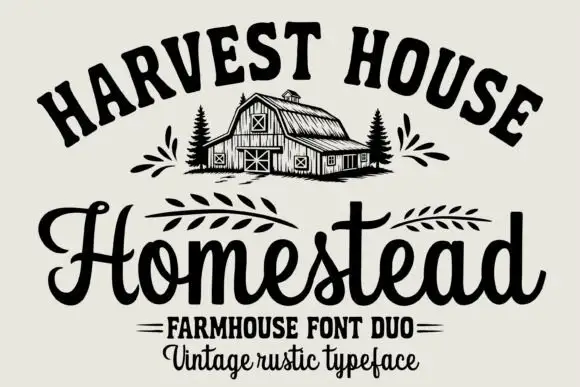
Arched rustic caps paired with a heavy farmhouse script
Homestead is a duo of an arched rustic capital alphabet and a heavy farmhouse script with curled terminals, drawn so a stacked sign reads as a hand-painted barn board.
Ideas for this font
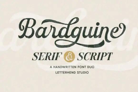
Textured brush script paired with an italic serif in caps
Bardguine pairs a textured brush script in mixed case with an italic serif in caps, so a label can carry a written name and a formal secondary line that share a slightly worn finish.
Ideas for this font
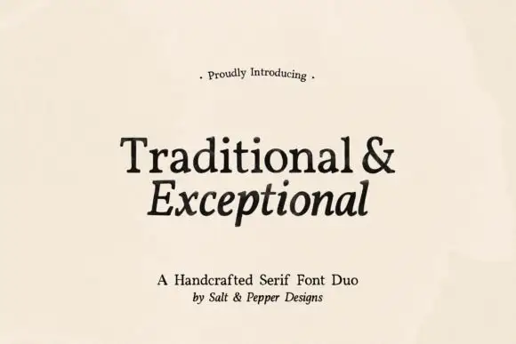
Handcrafted serif duo
Traditional and Exceptional is a handcrafted serif duo in black on cream: a roman with sturdy bracketed serifs and a slightly irregular stem, paired with an italic drawn on the same skeleton, set in two lines with a small tracked introduction and a credit beneath, so the plate reads as a bookish specimen.
Ideas for this font
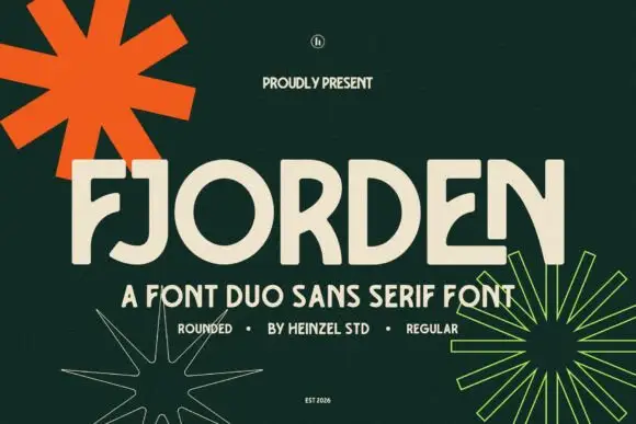
Broad rounded capitals with inward curved arms and a low hooked descender
Fjorden is a duo of broad rounded capitals in which several arms curve inward and the J drops into a low hook, shown with a regular weight that carries the explanatory lines.
Ideas for this font
Same independent foundry
Allow optional Google Analytics to measure visits and catalogue actions. Your search words and notes are not included. Privacy & storage