Modern Grotesque Body

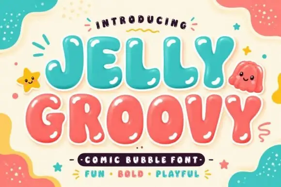
Heritage + Mango Dream
Creates crisp high-hierarchy contrast beneath Heritage headlines across menus, websites and labels.
Inspect Mango Dream specimenDisclosure: MakerFileHub may earn a commission from qualifying purchases via paid links on this page. How our links work.
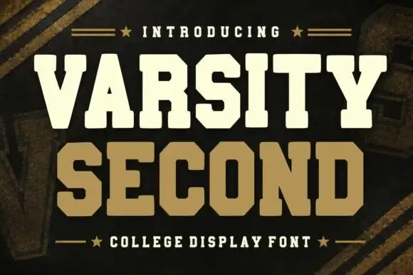
Soft rounded slab capitals with bracketed feet and compact counters
Heritage shows cream capitals on navy, followed by a full A to J alphabet row and a digit row including zero. Rounded serif ends and bracketed joins soften the heavy main strokes, the R leg curls, and the G keeps an open rounded bowl with a short inward bar instead of an angular varsity notch.
Paid link
Get this fontProject & layout blueprintsAt-a-glance maker compatibility
Sturdy stroke walls and open counters weed cleanly on adhesive vinyl, HTV apparel film, and cut cardstock.
Visual anatomy & craft review
The stems stay heavy, the feet round off, the joins bracket into the stem and the counters close tight. That softening is the character: the face reads as a friendly sports block rather than a college slab, which is why the sample can show a whole alphabet and a digit row. No provenance follows from the name and the numbers are only partly visible, so inspect the remaining letters and real figure widths before you build a jersey or a price list.
Soft rounded slab capitals with bracketed feet and compact counters
Two-font hierarchy recipes
Tested contrast partners — pairing Heritage with grounded secondary typography.
Heritage + Mango Dream
Creates crisp high-hierarchy contrast beneath Heritage headlines across menus, websites and labels.
Inspect Mango Dream specimen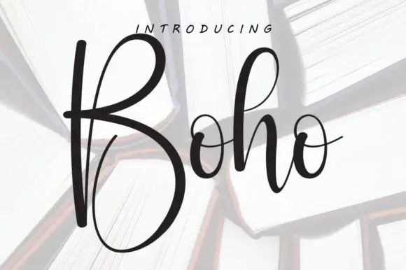
Heritage + Boho
Adds a warm human signature touch for 1-to-3-word callouts without competing against structured serif capitals.
Inspect Boho specimenPractical applications
Concrete hierarchy, scale and production guidance tailored to Heritage’s stroke geometry.
The rounded slabs hold a team name at 70 mm across a jacket back, where the bracketed feet stay readable in dense embroidery.
Hierarchy & layout recipe
Set a 300 mm jacket back: place the team name at 70 mm on one row, keep 10 mm between letters for the stitch path, and keep the mascot clear of the slab feet by 15 mm.
Pre-production check
Bracketed joins under 3 mm disappear in satin stitch; check a sew-out sample and widen the spacing if the feet fill in.
The soft caps read at distance, and the compact counters hold a short club name at 52 mm on a painted panel, where the curled R leg adds a collegiate touch.
Hierarchy & layout recipe
Paint a 600 by 300 mm panel: set the club name at 52 mm on one row, keep 24 mm of clear ground beneath before the hours at 14 pt, and keep the panel a single flat colour behind the letters.
Pre-production check
A curled leg painted freehand loses its curve; check the mask artwork before the board goes up.
The bracketed feet give a bakery warmth, and the heavy strokes hold a two-word name at 26 pt on a 60 by 45 mm label, where the G bowl stays open at small size.
Hierarchy & layout recipe
Print a 60 by 45 mm label: set the name at 26 pt on one row, keep 9 mm of clear ground beneath before the weight at 6 pt, and keep the paper uncoated so the rounded feet feel printed rather than stamped.
Pre-production check
The digit row is only partly shown; check the file before setting a price or a founding year in this face.
Technical & licence verification
Confirm included OTF/TTF/WOFF formats, full glyph tables and licence coverage on the live store page before batch production.
Closest visual alternatives
Matched across letterform anatomy, stroke behaviour and craft applications.
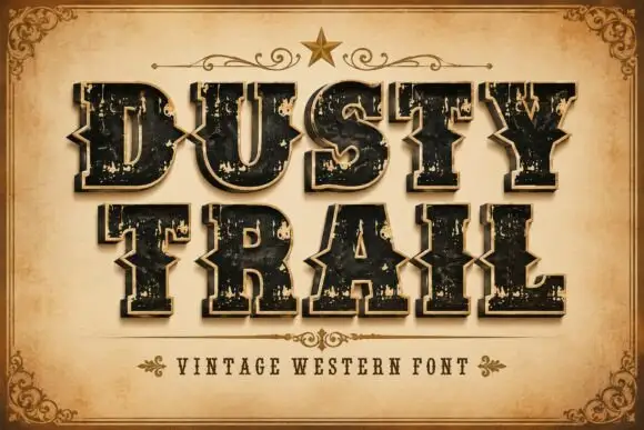
Notched western capitals with worn faces and a separate edge layer
Dusty Trail is a western slab capital alphabet with notched stems, a worn fill and a separate edge layer, so a word reads as a painted saloon sign with the paint coming off.
Ideas for this font
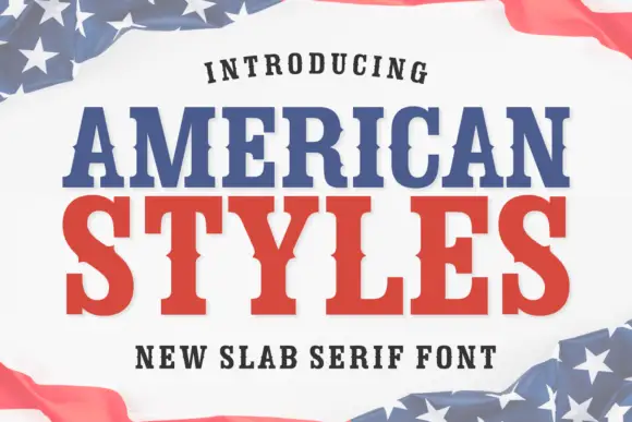
Bold slab serif with bracketed slabs and a wide even colour
American Styles is a bold slab serif in which the slabs bracket into the stems, the weight stays even and the fit runs wide, so a two-word title reads as a printed pennant rather than as a headline.
Ideas for this font
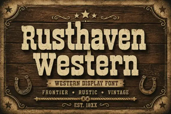
Weathered western slab display
Rusthaven Western is a weathered western slab in cream on dark timber: heavy slabs with softened corners, a chipped edge and a speckled fill, set in two lines with a ribbon banner, stars and horseshoes, so the pair reads as a brand burned into a barn door.
Ideas for this font
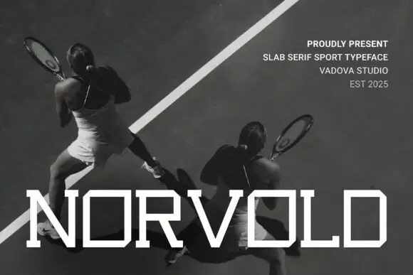
Thin wide geometric slab
Novoid is a thin wide geometric slab in white over a black-and-white photograph of tennis players: capitals with square bowls, small slab ends and thin even strokes, set as one large word across the foot with a four-line credits block at the upper right.
Ideas for this font
Same independent foundry
Allow optional Google Analytics to measure visits and catalogue actions. Your search words and notes are not included. Privacy & storage