Neutral Sans Workhorse

Jelly Groovy + Sailors
Lets Jelly Groovy own the focal silhouette while handling secondary copy, sizing and subheads cleanly.
Inspect Sailors specimenDisclosure: MakerFileHub may earn a commission from qualifying purchases via paid links on this page. How our links work.
Soft irregular bubble capitals with heavy rounded interiors and small counters
Jelly Groovy is a soft irregular bubble capital alphabet in which the strokes swell unevenly, the counters stay small and the letters lean slightly, so a phrase reads as a comic-book bubble rather than a geometric display face.
Paid link
Get this fontProject & layout blueprintsAt-a-glance maker compatibility
Sturdy stroke walls and open counters weed cleanly on adhesive vinyl, HTV apparel film, and cut cardstock.
Visual anatomy & craft review
The J is drawn as a heavy hook with a swollen bowl, the E holds three short arms that bulge at the ends, the L and the Y keep the same load and the G closes a small counter against its own bar. Nothing is symmetrical: the interior of each stroke widens and narrows by a hair, which is what gives the letters their jelly feel, and the whole phrase leans a few degrees forward so the stack has movement. Weight is maximal, corners are fully rounded and the letterfit is tight enough that a two-line stack reads as one shape. Small counters are the trade-off: they close below about 20 pt, so the face belongs on banners and covers rather than labels. The cream ground, the teal and coral fills, the star doodles and the two small bands are presentation; the lettering is the two words.
Bubbly · Irregular · Heavy
Two-font hierarchy recipes
Tested contrast partners — pairing Jelly Groovy with grounded secondary typography.
Jelly Groovy + Sailors
Lets Jelly Groovy own the focal silhouette while handling secondary copy, sizing and subheads cleanly.
Inspect Sailors specimen
Jelly Groovy + Orvelia
Grounds bold display lettering with classic typographic authority on posters, badges and apparel.
Inspect Orvelia specimenPractical applications
Concrete hierarchy, scale and production guidance tailored to Jelly Groovy’s stroke geometry.
The bubble weight fills a banner with a few characters and reads from across a room, and the comic lean keeps a printed banner lively without illustration.
Hierarchy & layout recipe
Set the greeting at 85 mm on a 1.4 m fabric banner, set the name at 55 mm beneath it, and leave 35 mm at each end so the swollen ends stay inside the hem.
Pre-production check
Fabric printing spreads a bubble face further; check a proof at final size and open the small counters before the run.
The comic weight signals a playful product at first glance, and the tight stack lets a two-word brand name fill a square panel on a box.
Hierarchy & layout recipe
Set the brand at 22 pt on a 90 by 90 mm box face, keep the weight in a 7 pt sans beneath it, and leave 6 mm of margin so no counter is cut by the panel edge.
Pre-production check
Small counters below 20 pt close on a printed box; check the box proof and keep the brand at 22 pt or above rather than opening the counters.
The chunky forms cut cleanly at topper size and read against a lit cake, and the swollen strokes hold their shape in acrylic.
Hierarchy & layout recipe
Set the greeting at 50 mm tall on a 150 mm acrylic topper, cut the thinnest part of each stroke at least 4 mm wide, and leave 6 mm of material around the outside.
Pre-production check
A swollen stroke can neck down to under 3 mm; check the vector at full size and thicken the neck before the file goes to the cutter.
Technical & licence verification
Confirm included OTF/TTF/WOFF formats, full glyph tables and licence coverage on the live store page before batch production.
Closest visual alternatives
Matched across letterform anatomy, stroke behaviour and craft applications.
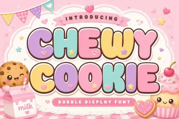
Squat bubble capitals packed tightly with heart accents between letters
Chewy Cookie is a squat bubble capital alphabet packed so tightly that the letters touch, with small hearts scattered into the gaps and a soft outline around the whole phrase.
Ideas for this font
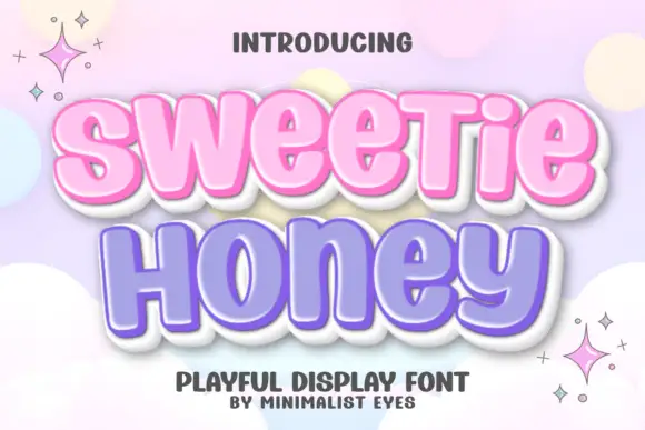
Rounded heavy display with a glossy edge
Sweetie Honey is a fat rounded display face with soft inward curves, drawn as a bubbly sticker: pastel pink and lavender fills inside a thick white outline with a soft grey shadow.
Ideas for this font
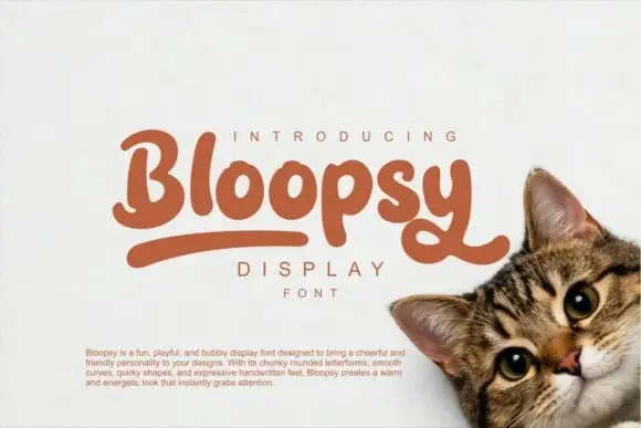
Soft chunky mixed-case letters with looping tails and a rounded skeleton
Bloopsy is soft chunky mixed-case lettering in which the letters keep a rounded skeleton, the descenders loop back up and the weight stays heavy and even across a phrase.
Ideas for this font
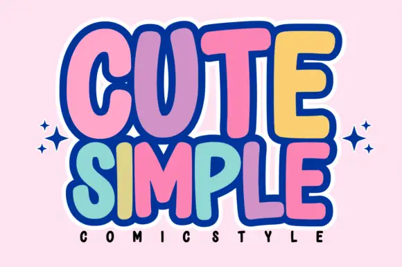
Tall rounded comic blocks with bubble outlines and per-letter colour
Cute Simple is a tall rounded comic alphabet in which the blocks stack tightly, the outlines bubble outward and each letter can take its own colour without breaking the composition.
Ideas for this font
Same independent foundry
Allow optional Google Analytics to measure visits and catalogue actions. Your search words and notes are not included. Privacy & storage